Sky and earth shadow, nine points hidden, one point exposed, indoor and outdoor, branches fluttering, flowers point green.
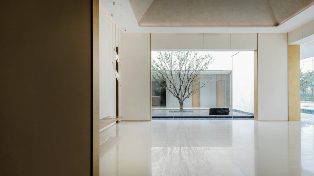
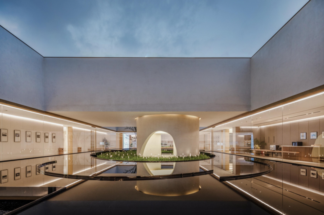
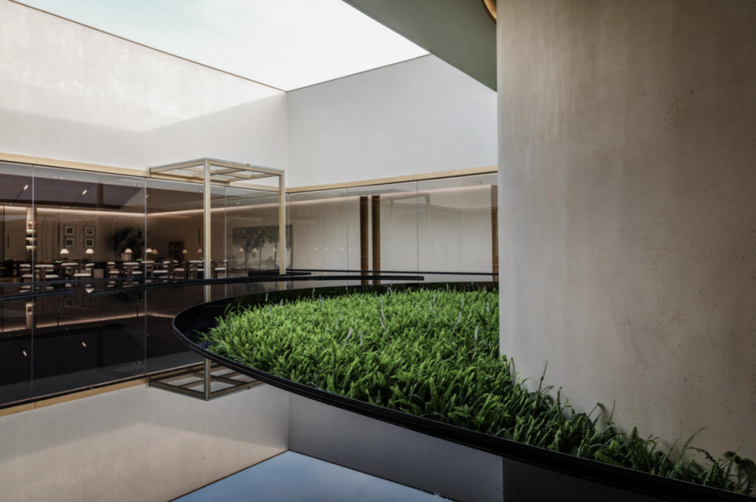
The waterscape and the interior window scenery overlap each other in a unified design context, presenting a logical system of space self consistency.
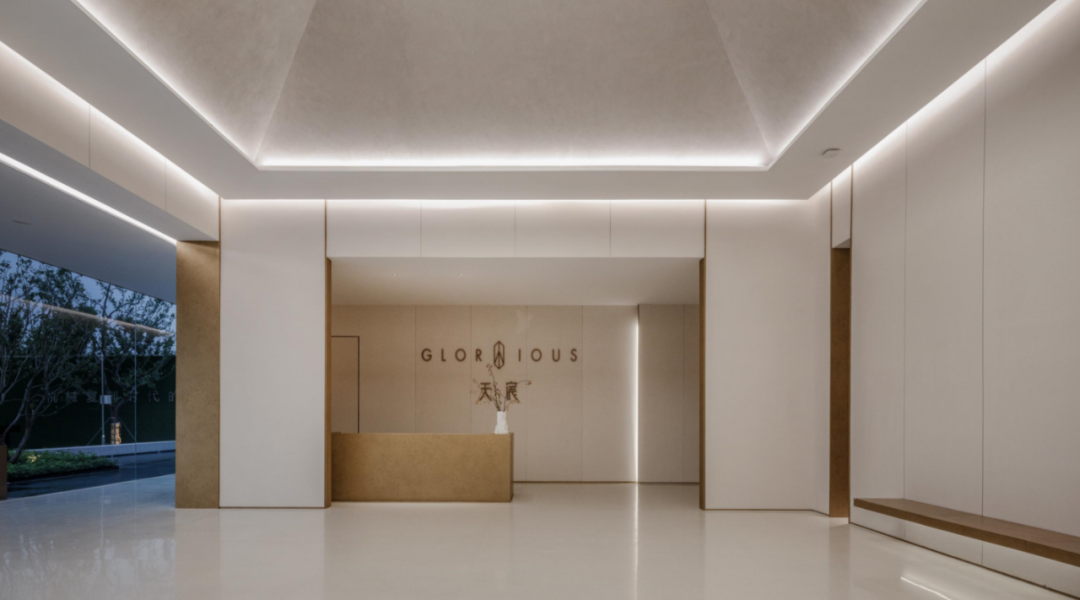
02 the prologue hall is concise, delicate and stretched, which is the preface of the prelude.
If you meditate, you may get it.
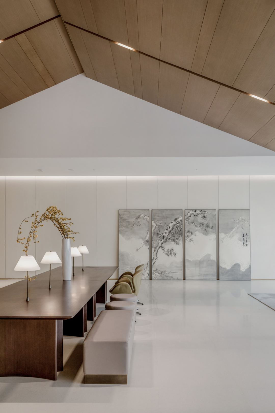
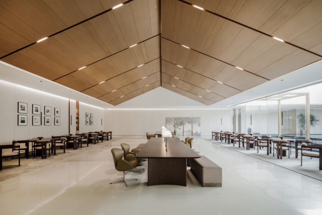
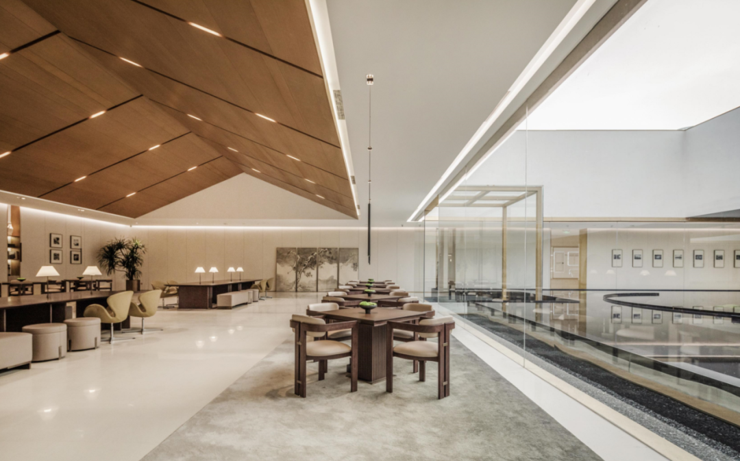
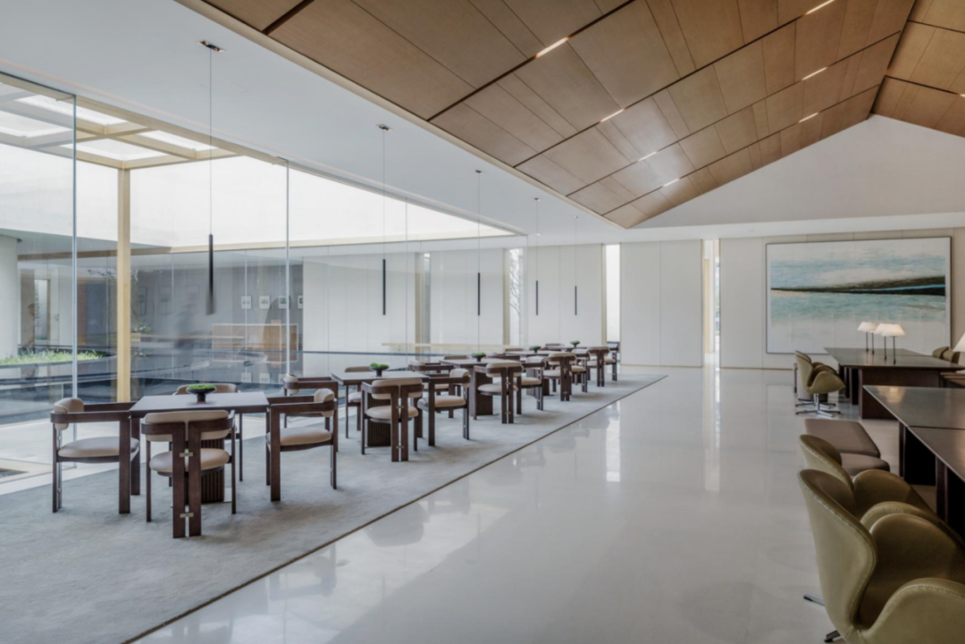
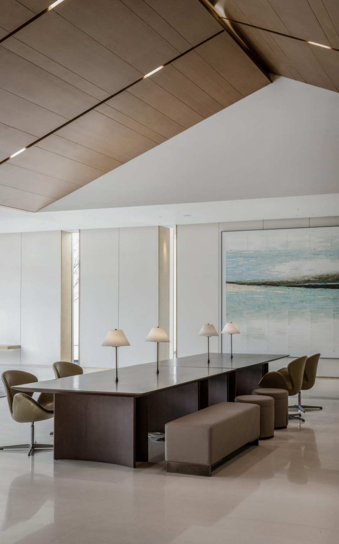
Adhering to the design concept of “design on the boundary” beyond the boundary, the designer introduced a large amount of wood at the top of the negotiation area, guided the future visitors’ line of sight to the atrium outside the window through the lines, leaving a blank breath for the space full of ritual feeling.
The designer drew a few lines to make the space lifelike.
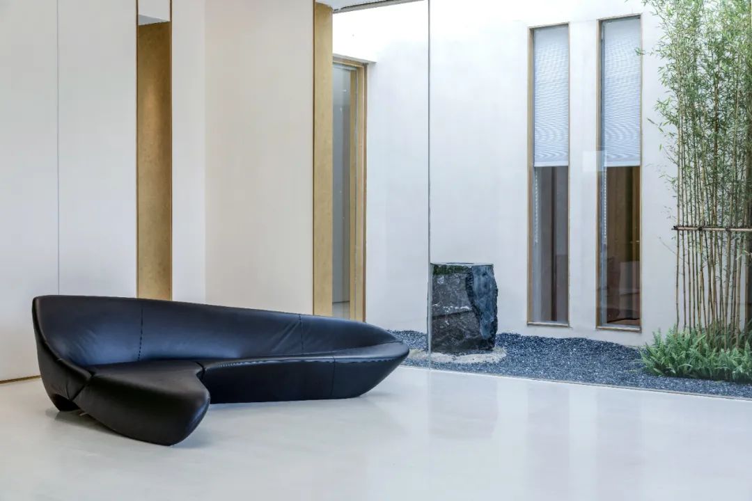
△ sofa jointly developed by Zaha and b&b.
01 choose a quiet place to hide in the City Sales Office, which is small and exquisite.
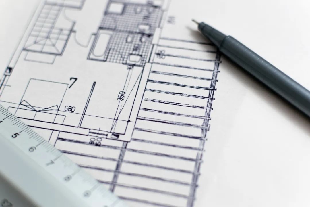
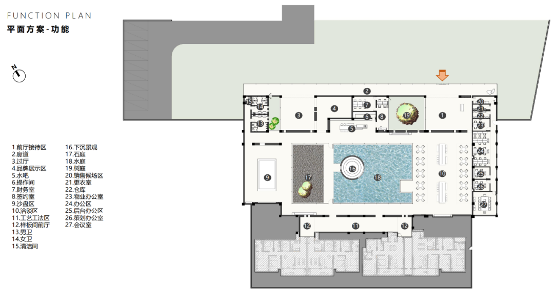
Night view ▽ plan ▽ project name: Nanjing Tianchen aesthetic Museum owner unit: Zhongtian real estate, Dajia real estate, Longguang real estate hard decoration team: boundless design Creator: Xie Fang, Hyman, Joyce, Zhu Wenjun soft decoration team: boundless design Creator: Feng Tingting, Lu Bo, Zhang Dian architectural design: Nine meter landscape design: building project location: Nanjing, China design area: 1440 ㎡ project Photography: Zhu Hai, Mira Octopus Jianzhu (Architecture part) / / set us as “star Mark ★ to receive the push at the first time ▼ design the official website together and point a praise point to see it..

The overall space is shaped like a circle, with the tone of “hiding in the city”.
The inverted V-shaped wood facing ceiling design defines the sense of space and highlights the ancient city characteristics of the plot.
It’s not pure western style opening and closing, nor pure Chinese style, but it’s clean and comfortable.
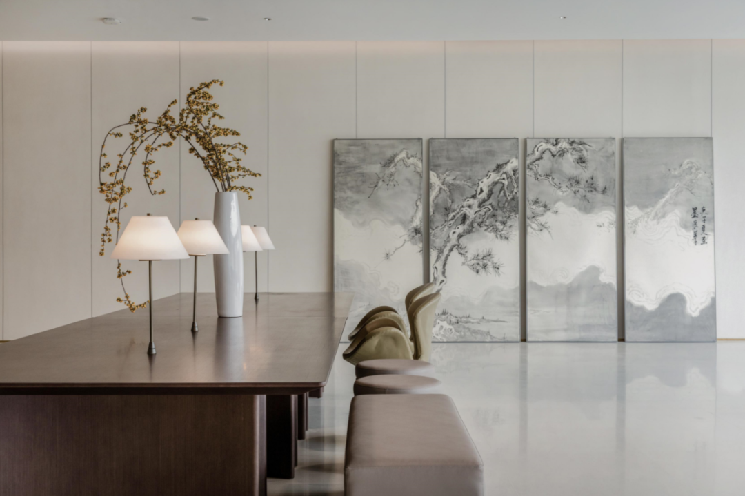
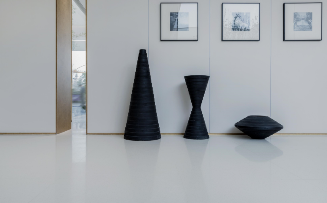
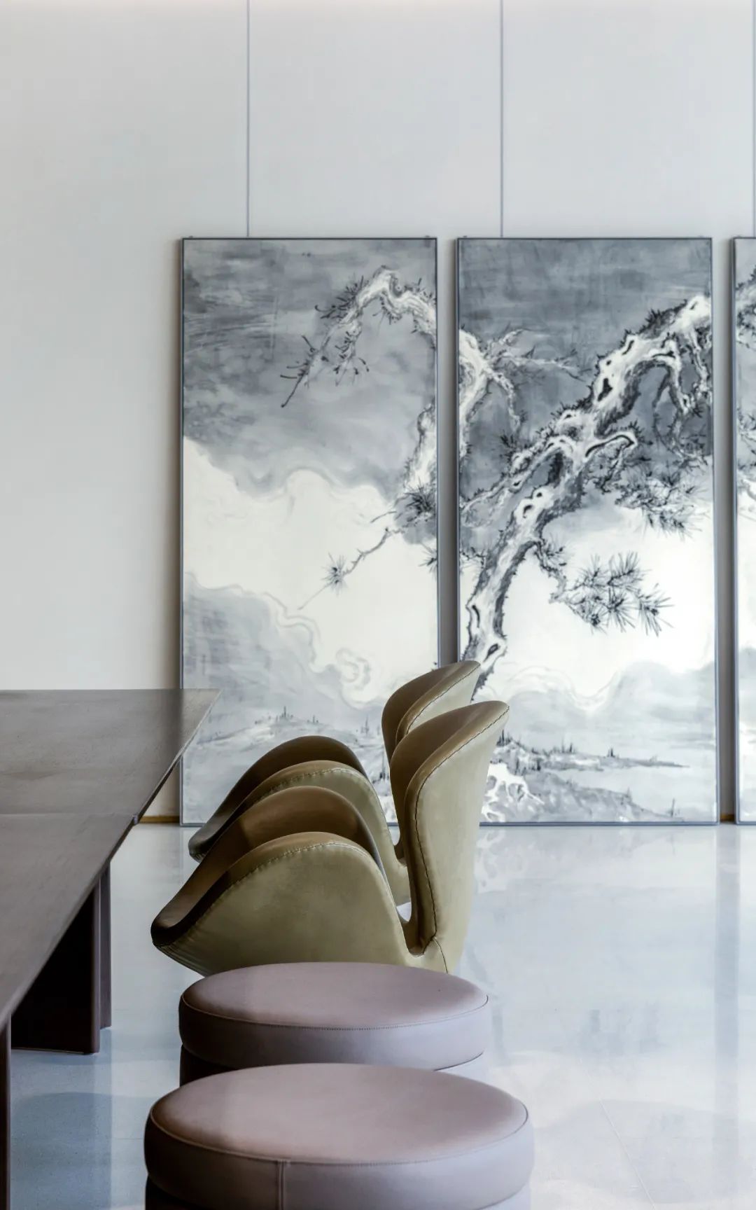
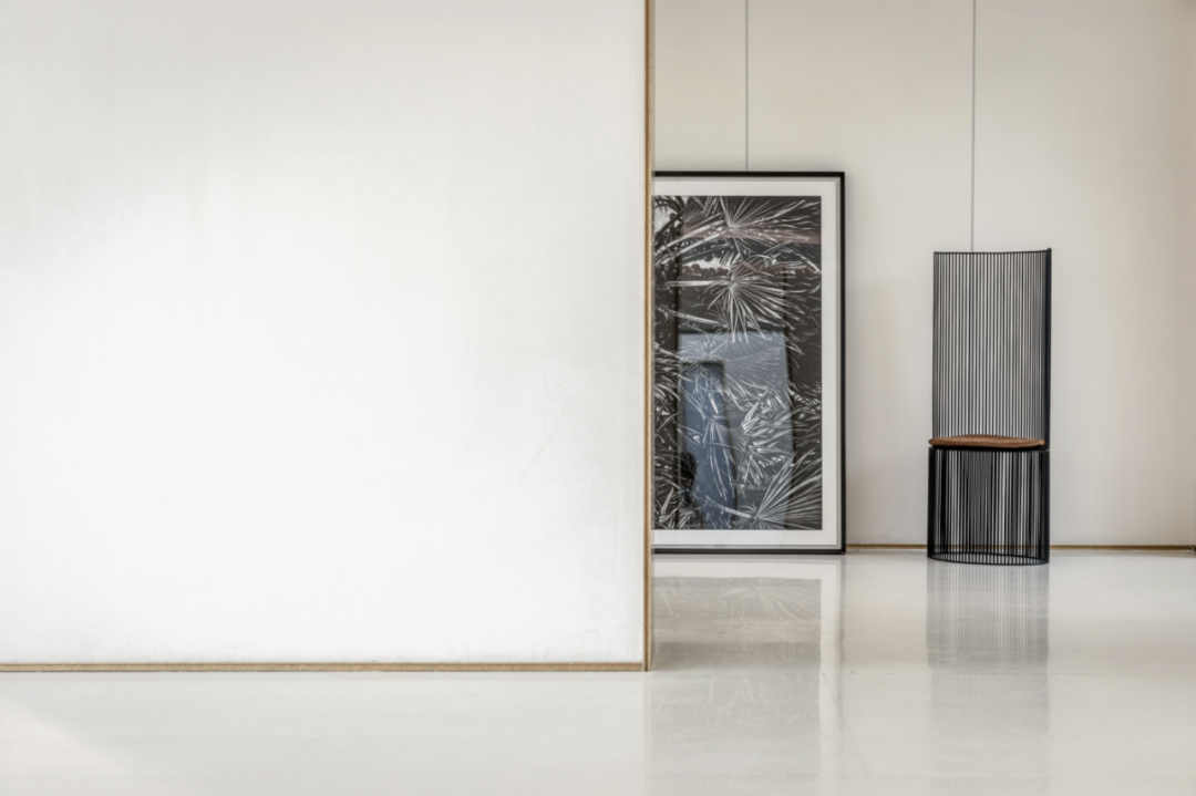
Leaning against the wall, the light and elegant ink painting combines modern and simple style with traditional Chinese elements, which has a unique charm.
However, the tone of the Sales Office of “Tianchen aesthetics Museum” can even drive away from the commercial attribute, and the lingering sound is lingering in “beauty” and “art”.
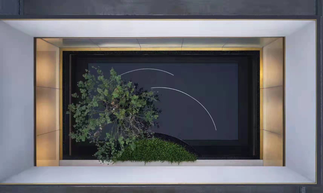
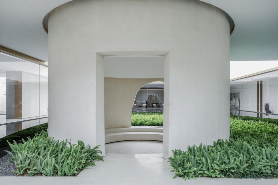
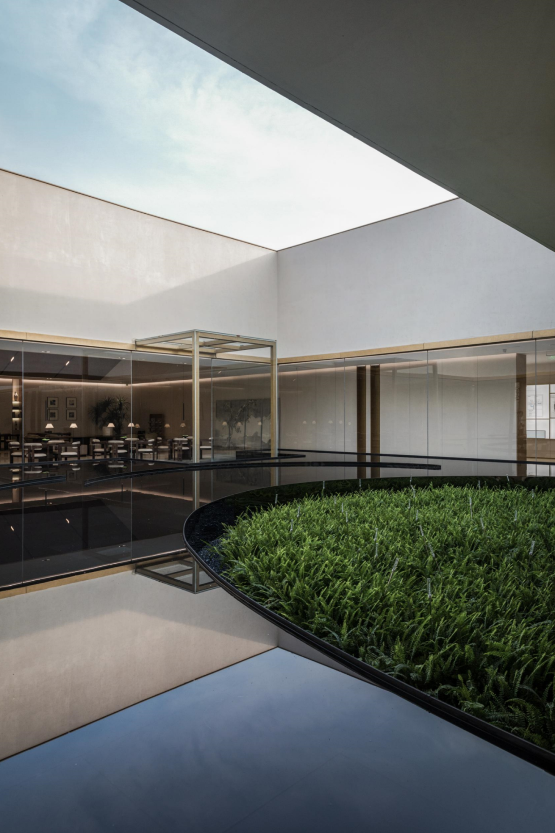
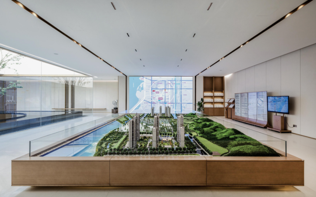
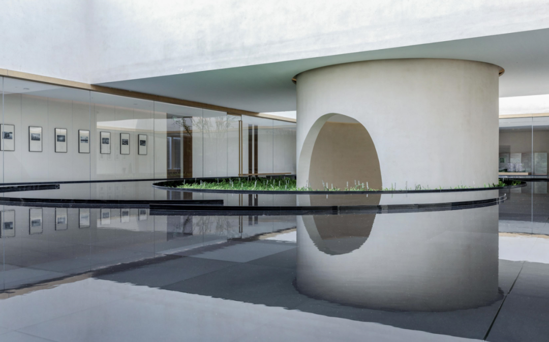
Sand table area ▽ 05 atrium Waterscape the atrium position of the endless poetic and picturesque echo building is built into a waterscape with “circle” as the element.
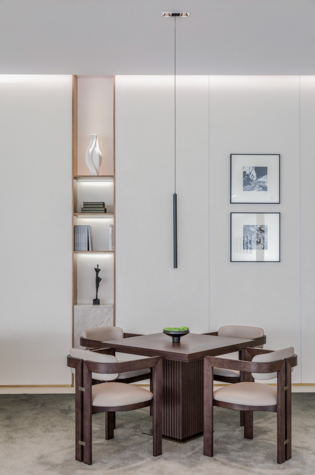
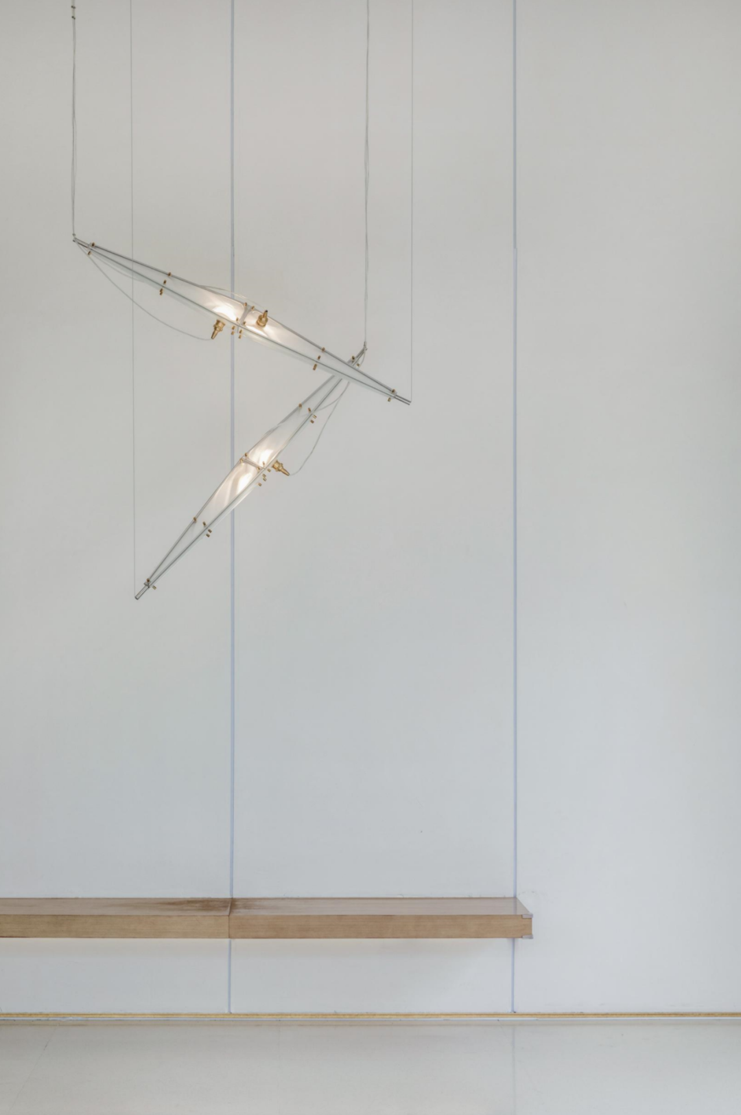
In artistic display, the linear sequence of chandeliers emphasizes the depth and level of space; The flower art made for different seasons combines the field with nature, giving off a breath of vitality; Together with the ink painting leaning on one side, it eases the overall spatial rhythm.

03 the tension of the lines in the negotiation area is like the climax of the movement.
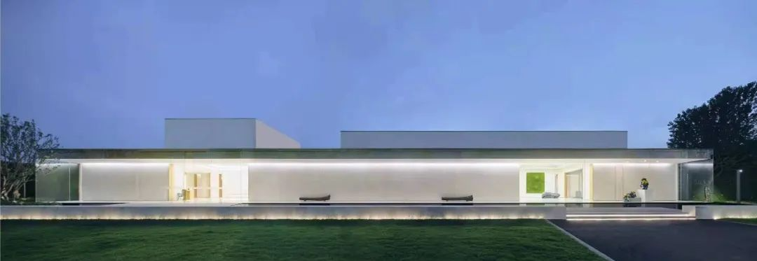
Because the original building is a temporary structure, the structure has certain limitations due to the restrictions of land and cost, but this also allows the designer to show his strengths and avoid weaknesses in the space.
The water is as flat as a mirror, and things reflect each other.
This tone is either consistent with the style of Loushu copywriting, or consistent with the brand tone of Fangkai.
The melody here is a balanced and echoing classical music.
If you are hidden in the market, you should do so.
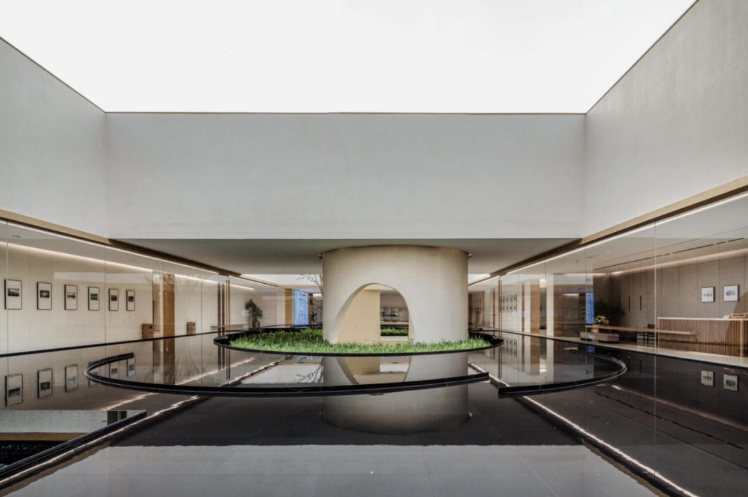
There are landscapes in the buildings, and buildings in the landscape, which is like Jinling City, which flows back to the river.
Different types of seats, accompanied by the ups and downs of the roof lines, perform their respective functions in the space, breaking people’s stereotype of the meeting space.
Chen Xingyu’s artistic lamps seem to come from birds outside the window.
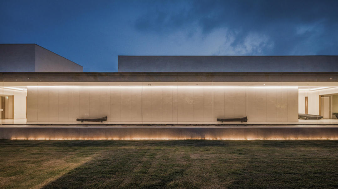
The “design in the world” participates in the interior design of hard and soft integration.
The arc divides the dynamic and static areas, and the central cylinder pulls out several planes from another dimension.
It is a representative work of the cooperation between “everyone real estate” and “Zhongtian real estate”.
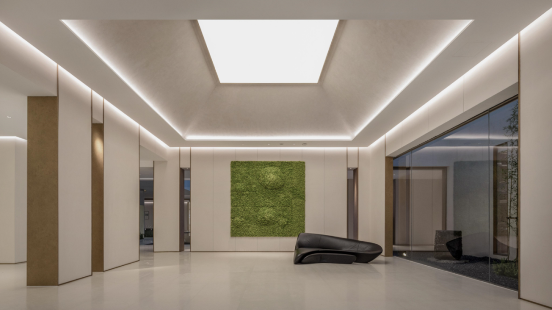
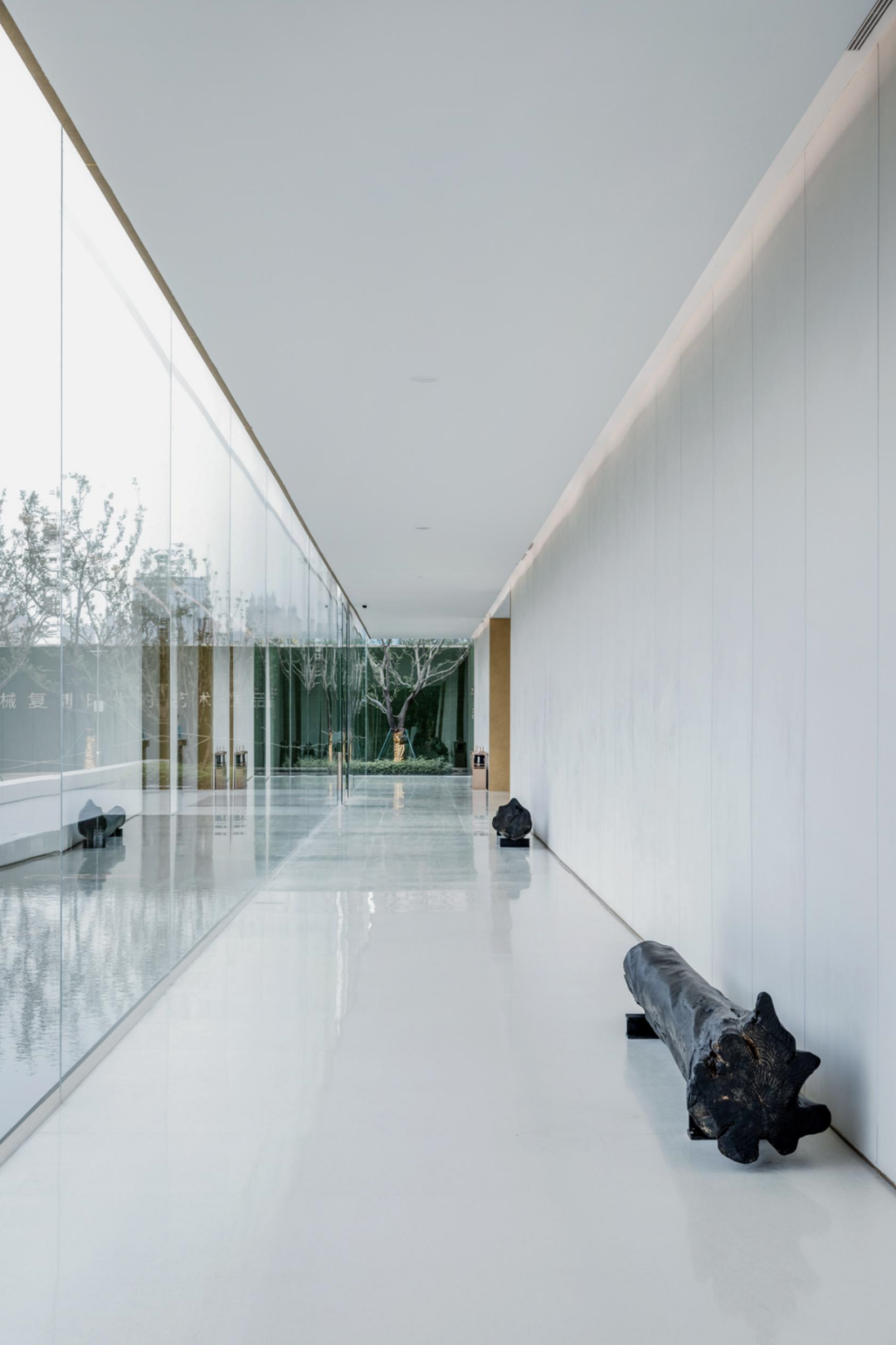
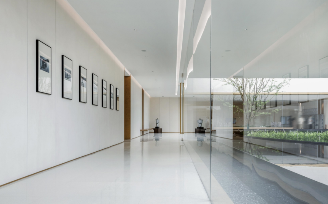
The long indoor corridor transformation device exhibition hall also reflects the original intention of “design in the world”: through the integrated design of space, soft decoration and artistic furnishings, it conveys the concept of transcending boundaries and boundless design.
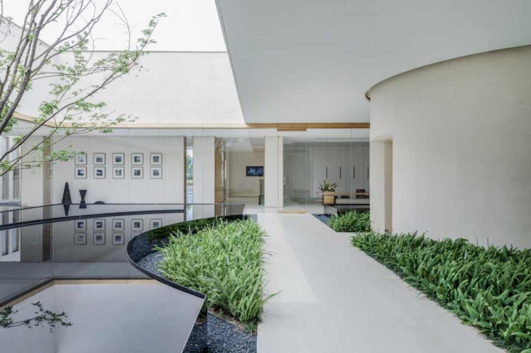
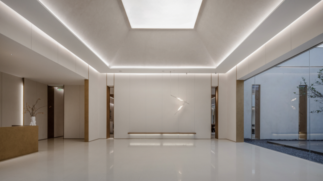
04 corridor passage goes beyond the boundary, and designing boundless installation works often means breaking through the boundary.
The lower landscape ▽ buildings surround the water, forming an inward space.
Preface the premble sales office should have a tone.
Like a pebble, space is the carrier of life and the container of beauty.
Don’t empty, stretch as usual; Not fancy, still immersed.
The project is located in Nanjing, with a total area of 2000 square meters.
