After the site was given a new plan, the stone that was previously reserved was returned to the site in the form of “returning to Zhao” and placed in several landscape spaces.
So we chose a good and complete stone to temporarily place beside the site to preserve the “memory” of this stage, and then use these stones in the landscape to vaguely reproduce the memory of the site, and better anchor our park on this site.
The sunken tree-array square is paved with three levels of elevation difference.
The base and square are parallel to the building volume and the facade, and the landscape design is also involved simultaneously.
▲ Original stone excavated on the site © 2.
A ten-year egg flower transplanted from the pond of the old park is placed in the central tree pool of the sinking square, which also means the inheritance and development between the new park and the old park.
▲ Elevation details © After the adjustment of the facades of the two main towers and podiums, Zhang Chao has created the single exhibition hall with the highest publicity in the park, forming a U-shaped layout together, echoing and honoring the semi-enclosed layout of the old park.
We have “luxury” to link individual buildings through a series of wind and rain corridors to form a veranda type building, which can not only protect against wind and rain, but also protect against the sun.
At the same time, the combination of the storey height of the industrial building scale and the corridor and the wall creates an unconventional sense of spatial scale, which makes the project have a certain degree of commemoration.
▲ Facade form analysis © The interior facade of the building ▲ © The color of Zhang Chaoli’s face brick is a customized matte off-white color, which will change slightly in different lighting environments, making the building like a canvas showing the passage of time.
1.
The establishment of the site and stone project aims to expand another park for the original headquarters park 10 minutes away.
In order to meet the requirements of fire evacuation and the organization of daily goods movement line at the same time, the whole outer circle of the park is planned as a lane, which naturally circles the scope of the central square.
▲ Eggflower and architecture © The double courtyards of Zhang Chao’s first floor square and the terrace on the fifth floor are set up, quiet and moving.
Its addition fills the gap in the existing layout, defines a clear interface to the outside, and gives the park a certain sense of domain; Internally, welcome every employee with a hug.
Thanks for the sharing of good by architecture.
Our first task is how to reduce the oppressive feeling brought by the 60-meter-high building volume and inherit the garden-style atmosphere of the old park.
The guidance of the moving line and the landscape wall allows the view to return to the landscape from the surrounding area.
.
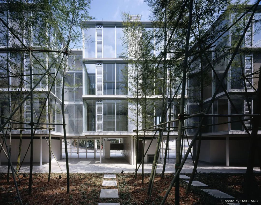
▲ West facade © On this basis, the building volume emphasizes the decoration of the corridor, podium and tower on the first floor through the linear cantilever plate of the facade, forming a classic three-section facade; It further weakens the tightness brought by the 60-meter-high building volume, strengthens the horizontal facade expression, and visually makes the connection of individual buildings become a unified whole.
▲ General layout © The predecessor of the construction project site was the quarry, and many underground boulders were found after the basement excavation.
At the same time, the combination of the storey height of the industrial building scale and the corridor and the wall creates an unconventional sense of spatial scale, which makes the project have a certain degree of commemoration.
We have “luxury” to link individual buildings through a series of wind and rain corridors to form a veranda-style building, which can not only protect against wind and rain, but also protect against the sun.
▲ Square entrance space © Zhang Chao surrounded the park with high and low marble walls, and guided the streamline ingeniously, winding and secluded.
The cool ventilation treatment alleviates the tiredness of employees in daily work due to the subtropical monsoon climate in Lingnan.
▲ Aerial view of the square © Zhang Chao ▲ sinks the square © Zhang Chao ▲ Plant configuration on the first floor of the site © The plant configuration of the building ▲ five-floor terrace © The terrace on the fifth floor of the building is surrounded by crape myrtle and steps to divide the courtyard into three entrances, creating a three-dimensional landscape for the teahouse on the east side.
Combining the fountains and waterscape, it creates a progressive static square inner courtyard, providing employees with a place to rest daily.
© The facade design of Zhang Chao’s building originated from the arcade.
▲ Square space © As Zhang Chao mentioned earlier, the quarry is the “memory” of the site before.
▲ Facade segmentation and tiling details © At the same time of the building’s deliberation on the way of tiling, the gray seam color is customized according to the true color of the brick to achieve a unified and hazy facade texture.
With the iteration of the industrial park, different from the old park, the project needs to make an “expansion” volume of 3.0 plot ratio and 60 meters of building height under the area of 30 mu.
For this special “site heritage”, our first reaction is that it needs to be preserved and utilized.
Therefore, the design work starts from the adjustment of the exterior facade, to the combination of architectural landscape, and then to the public interior nodes, and gradually combs and integrates, finally making the park become an organic and unified whole.
▲ Park entrance © Zhang Chao ▲ round hole of guard box © Building ▲ Landscape wall at the entrance of the park © When Zhang Chao took over the project, the relationship between the general layout and the volume has been basically finalized according to the functional requirements.
The cool ventilation treatment alleviates the tiredness of employees in daily work due to the subtropical monsoon climate in Lingnan.
The arrayed small leaf olive kernels have a sense of sightseeing by borrowing scenery from each other.
▲ Single entrance space of exhibition hall © Zhang Chao 3.
The facade design of the facade and enclosed building originated from the arcade.
▲ Stone placement in the site © We believe that in this way, the spirit of the place can be awakened and reappeared, and the past and the present are juxtaposed.
▲ Axonometric drawing of the park © The height of this single building is 6.6 meters, which is flush with the height of the first floor of the main building.
▲ Square entrance space © The flat raised square on the first floor of the building anchors the scattered individual buildings like a base, giving the park a consistent and upright temperament.
▲ Top view of the square © The elevation of the first floor of Zhang Chao’s building and the horizontal upward layout of the landscape wall not only avoid the risk of rain irrigation, but also enrich the dynamic experience of the park, which is different from the flat space experience of the surrounding parks.


