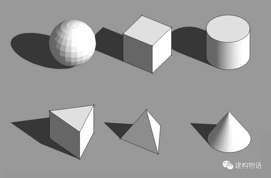
The logic of simple and single geometric block is the most simple and clear
. 
The whole building has only one individual block, such as square box, sphere, cone and cylinder
. 
Due to the simplicity of the block form, the focus of architectural form design lies in the level of detail processing of the block itself (such as local subtraction without affecting the overall sense of the block) and the detail processing of the facade
. 
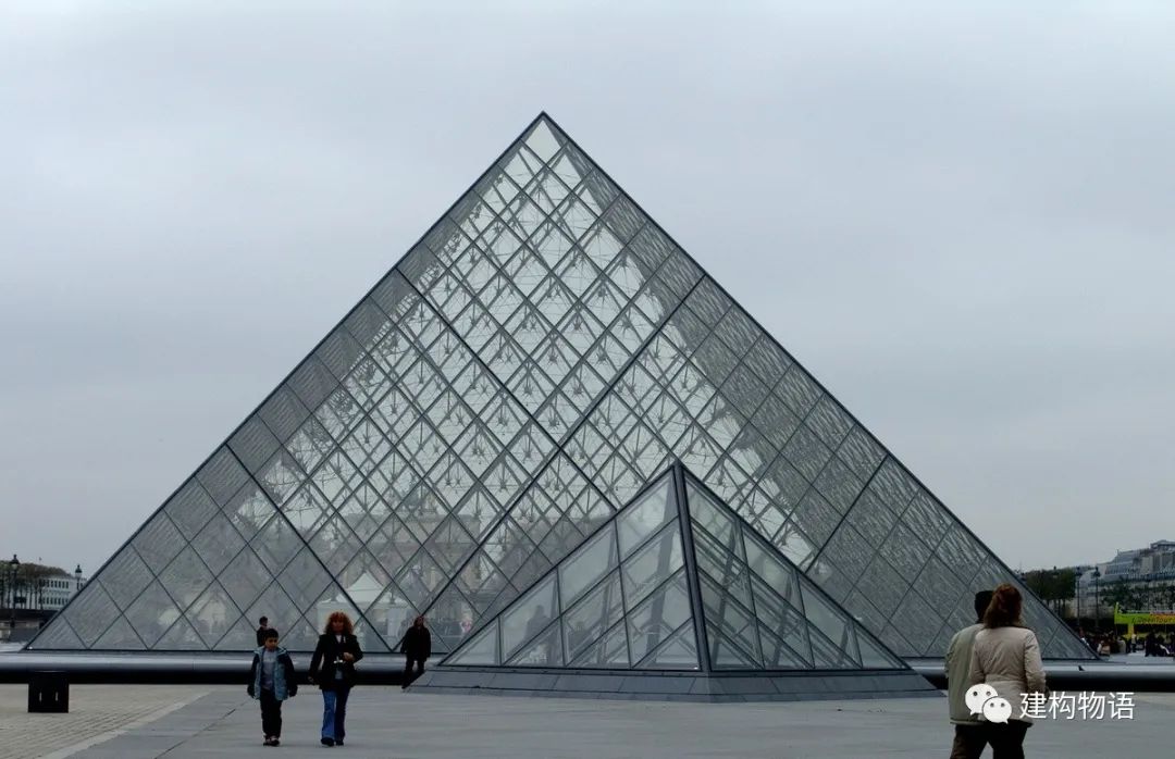
Common simple geometry ﹥ Wang Xiaochuan glass pyramid on the Louvre Plaza in Paris, France Architect: I.M
. 
Pei’s minimalist block form is also an efficient means to achieve harmony with complex environment
. 
Due to the lack of the contrast between the blocks, this simple and single block building is easy to be monotonous
. 
In order to achieve good results, we must design from the perspective of virtual reality, level, proportion, facade texture, texture and so on, reflecting the richness of a simple body block
. 
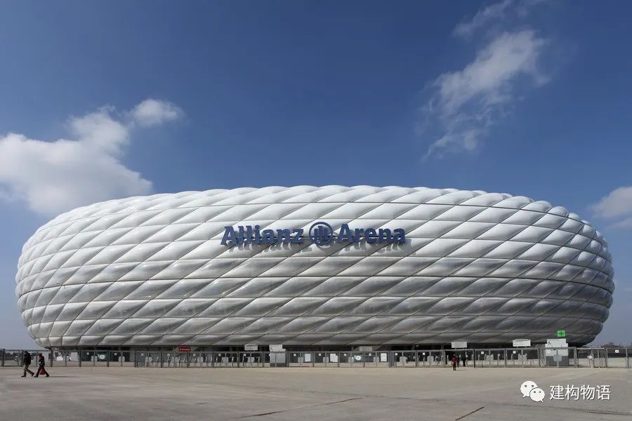
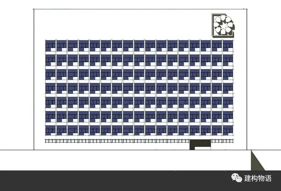
Window opening form / contrast between virtual and real / proportion ﹥ Campo Baeza, head office of the savings bank of Granada, Spain (2001) architect: Campo Baeza, the simple form of cube makes people feel more powerful, the repetition of single proportion window opening forms rhythm; the proportion of contrast between virtual and real is just right, making people feel “comfortable”
. 
This relatively simple and classic design form has less “content”, which tests the architect’s ability to control the proportion
. 
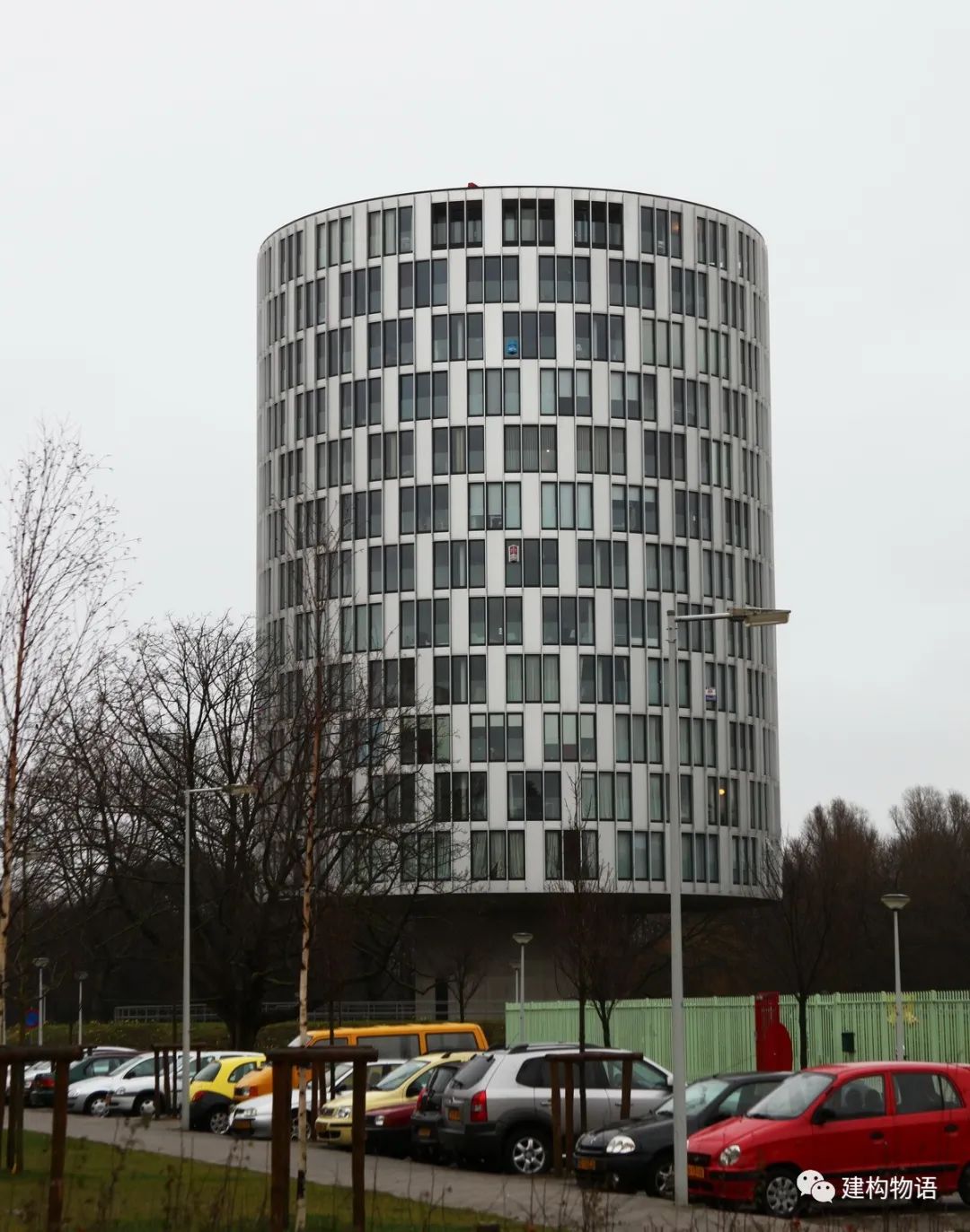
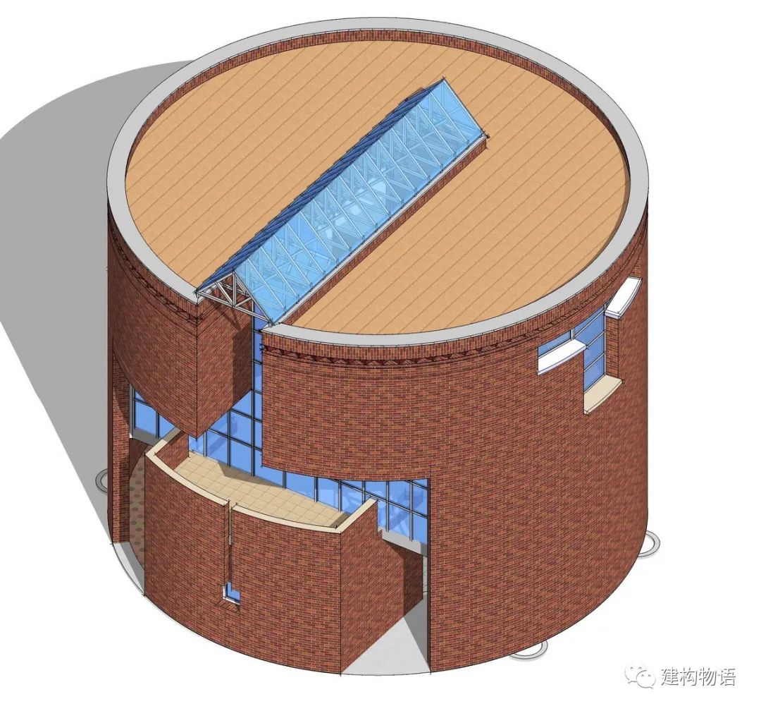
? Chu Zhiyong the staggered windows of a cylindrical building in Amsterdam, the Netherlands, enrich the form
. 
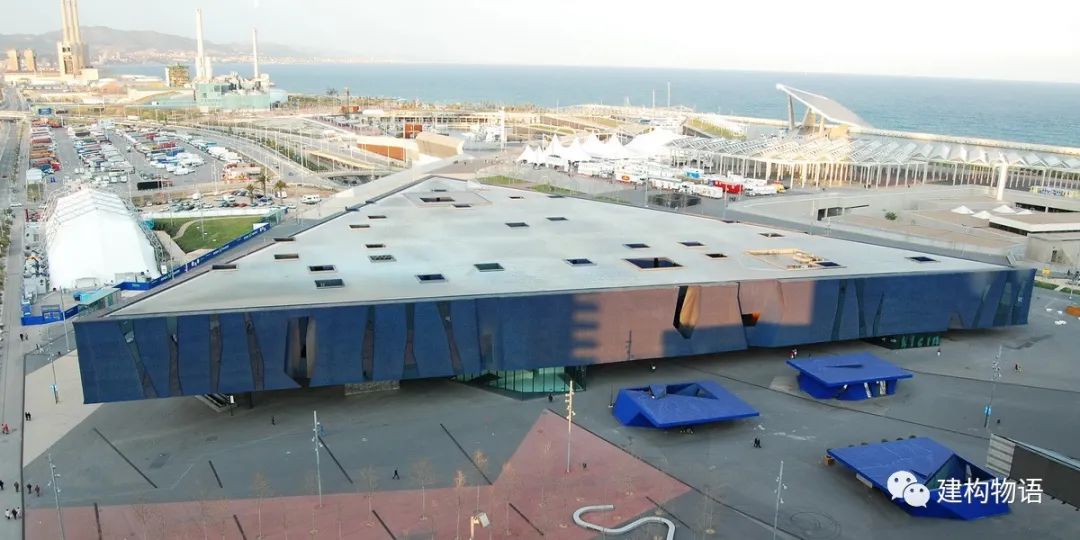
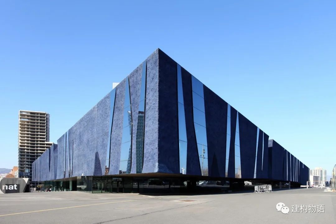
? illya kondratyuk (ccby2.0)} Chu Zhiyong 2004 Barcelona forum architects: Herzog & de Meuron’s simple triangular prism shows richness due to vertical irregular facade
. 
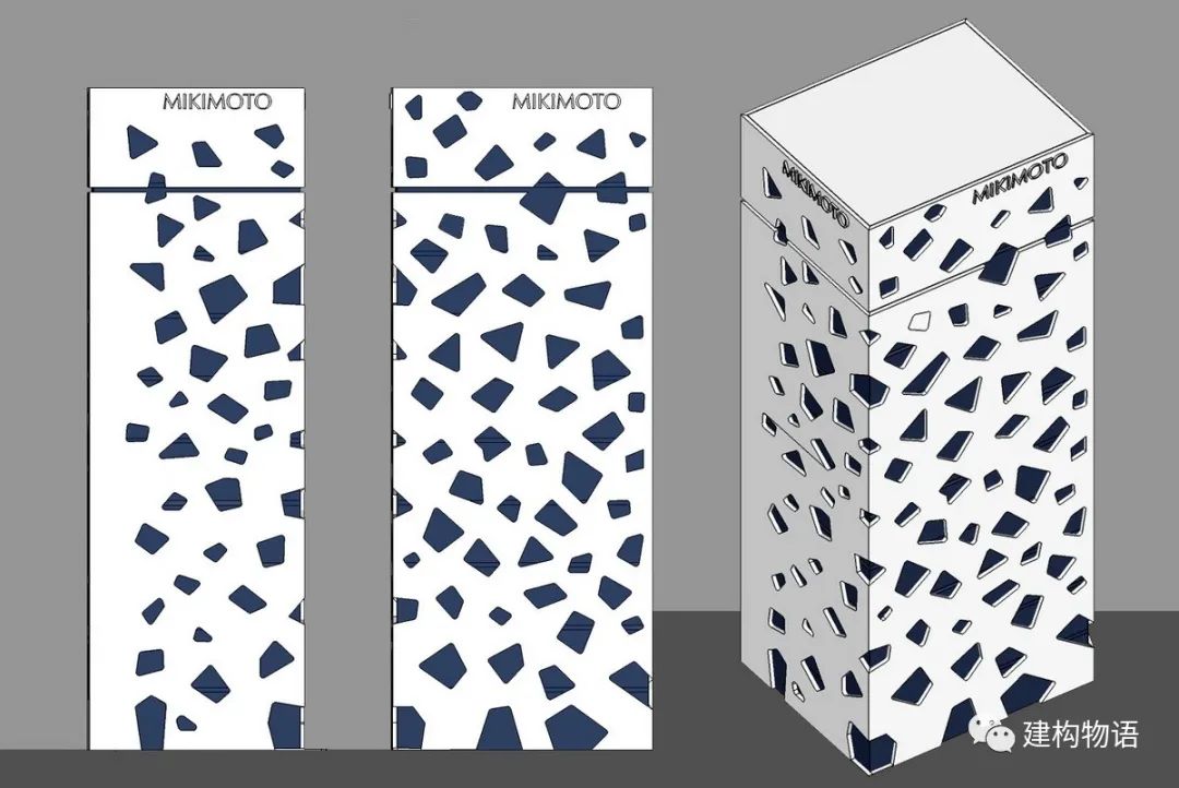
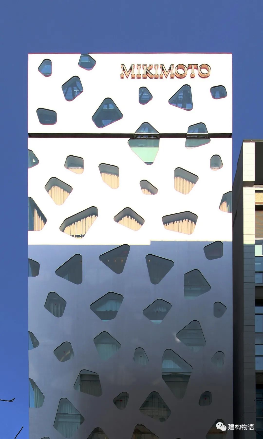
) Chu Zhiyong architect of Mikimoto shop in Ginza, Tokyo, Japan: Toyo Ito’s simple square column block building, the special form of the window opening is “unexpected” and unforgettable
. 
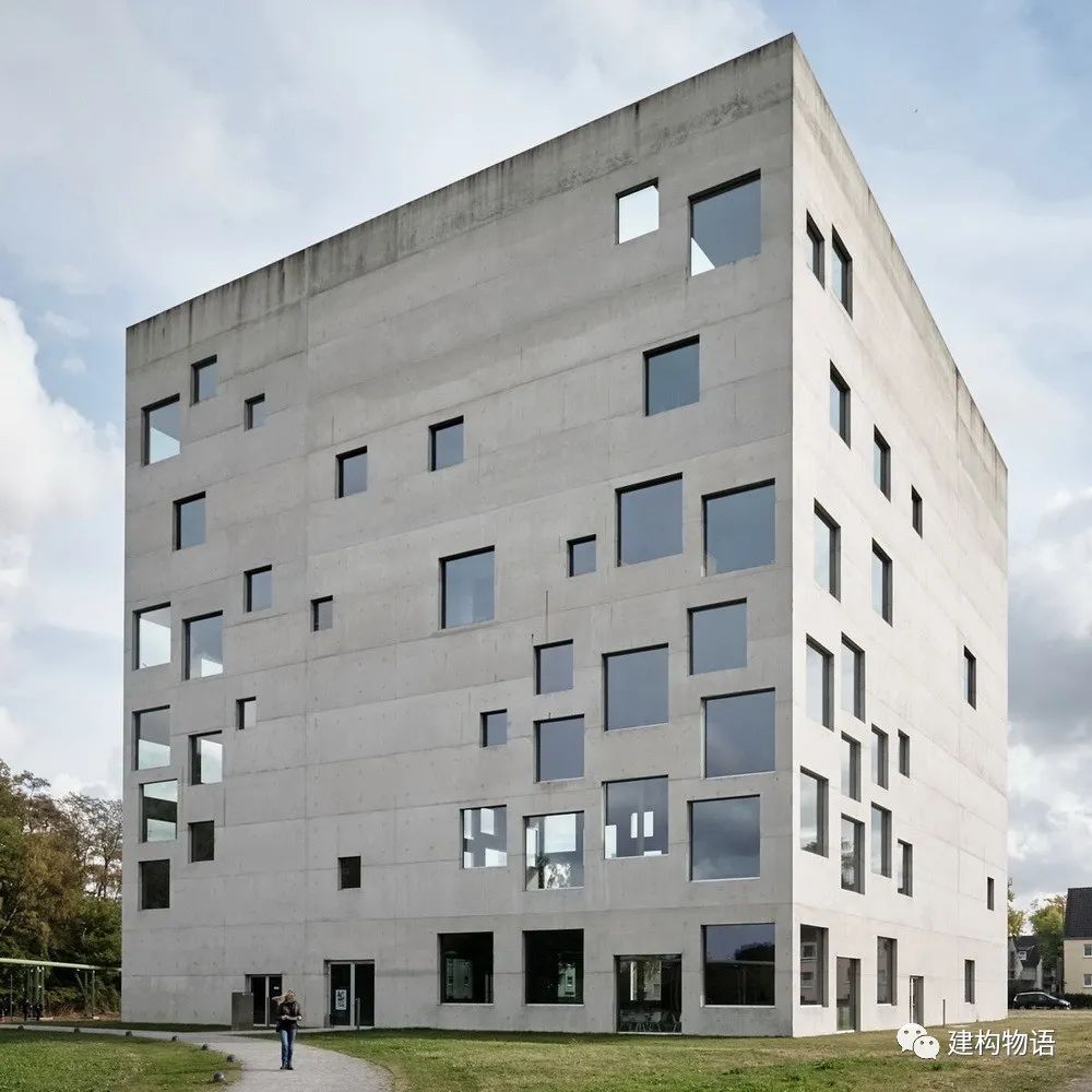
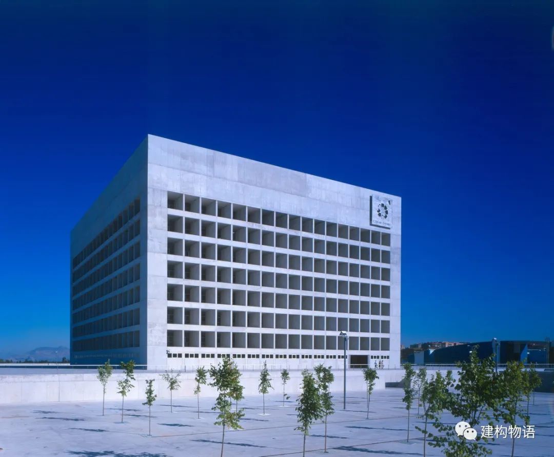
) augustfischer (ccby-nd2.0) zollwerein School of management and design, Essen, Germany (2006) architect: Yoshima Hoshi + Sanaa architects cube has its own characteristics due to the free and disordered rectangular window openings
. 
It seems random, but it tests the architect’s “skill”
. 
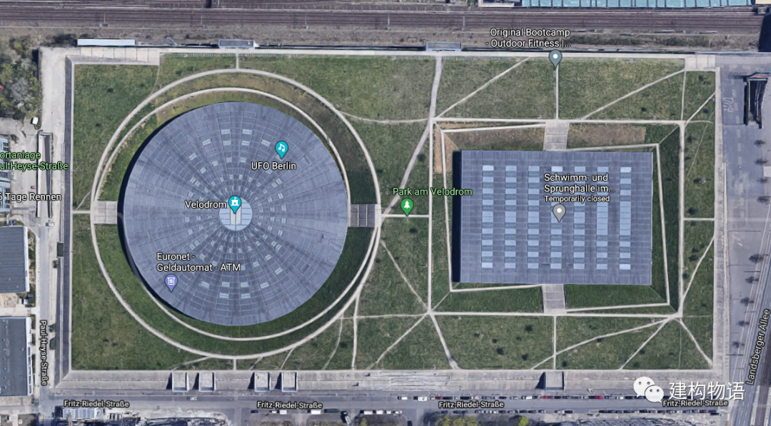
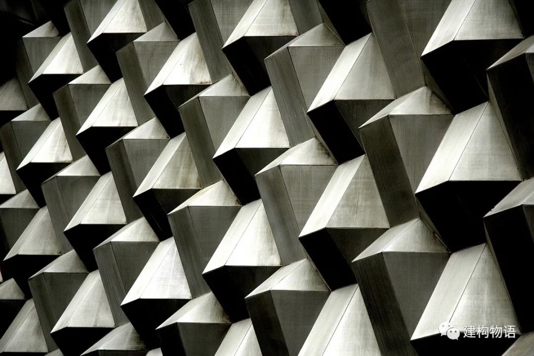
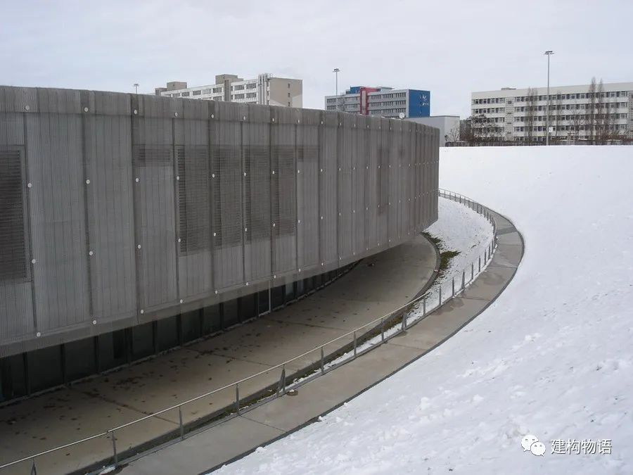
Facade material, texture and texture architecture in Google map ﹥ Google ﹥ Jochen Teufel (ccby-sa3.0) Velomax (ccby-sa4.0) ﹥ Wang Xiaochuan German Glass Olympic cycling Hall (square) and swimming hall (circle) architect: Dominic Perot’s Square and round building is covered with stainless steel Weaving silk screen, simple form is not simple
. 
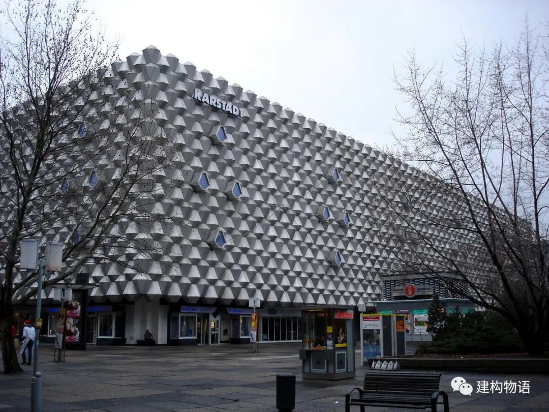
? Wang Xiaochuan ■ Christian Scholz (ccby-nc2.0) Dresden central shopping center, Germany (completed in 1978, demolished in 2007) architects: Frenc Simon, evanc Simon, Ivan fokvari) the building built in 1973-1978 has left us no less shock than the works of today’s trendy architects
. 
The pineapple shaped surface made of natural color aluminum alloy plate has become the symbol of architecture, which proves that the richness of architecture can be achieved through simple blocks and rich surface material texture
. 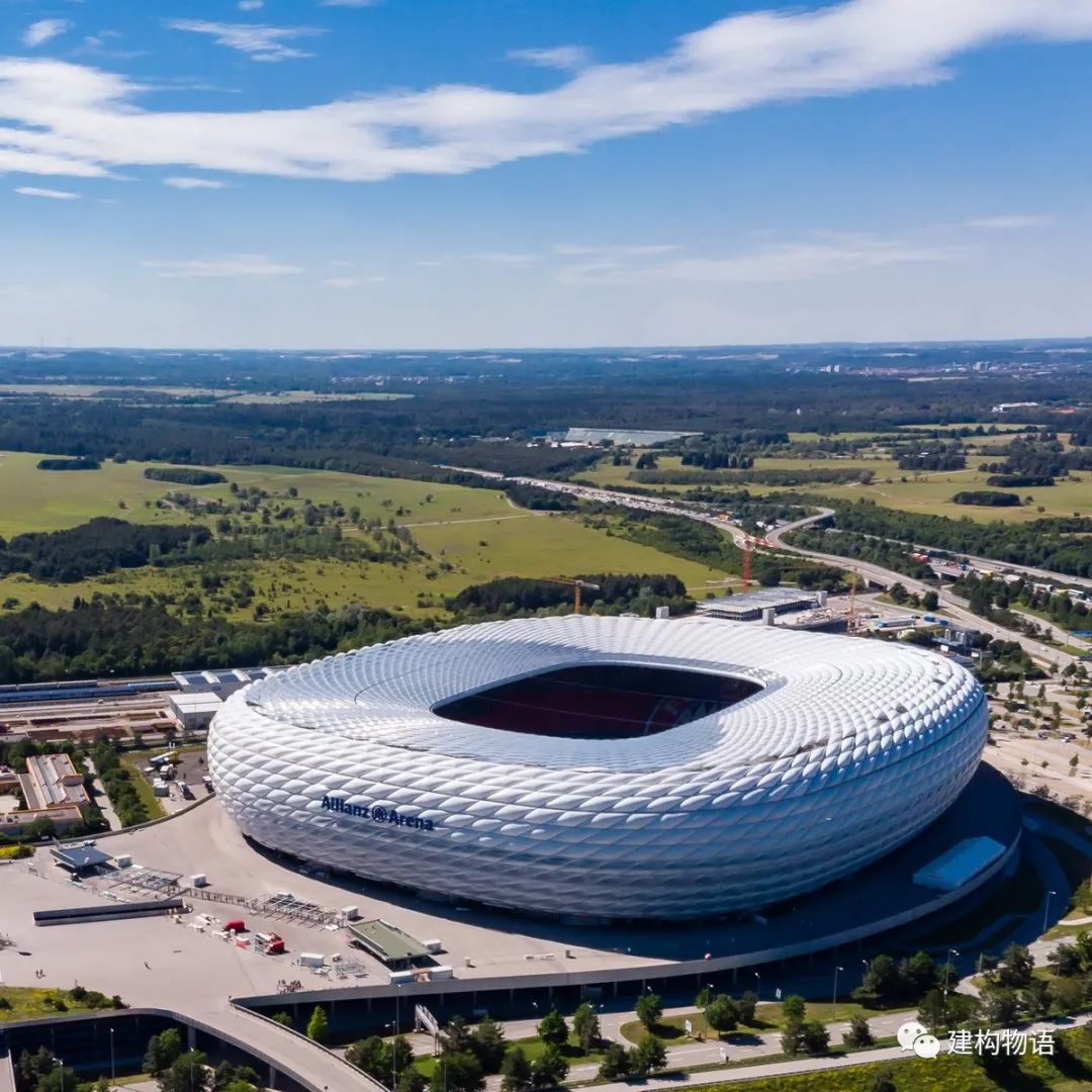
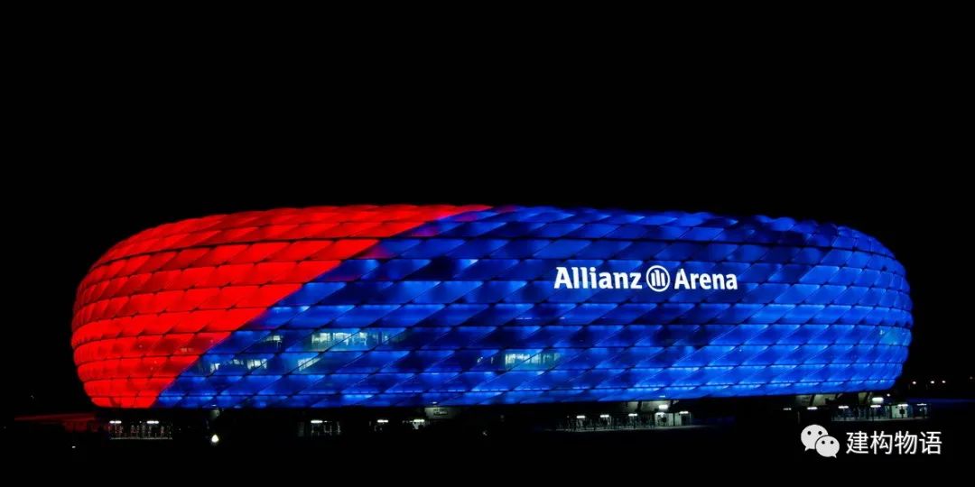
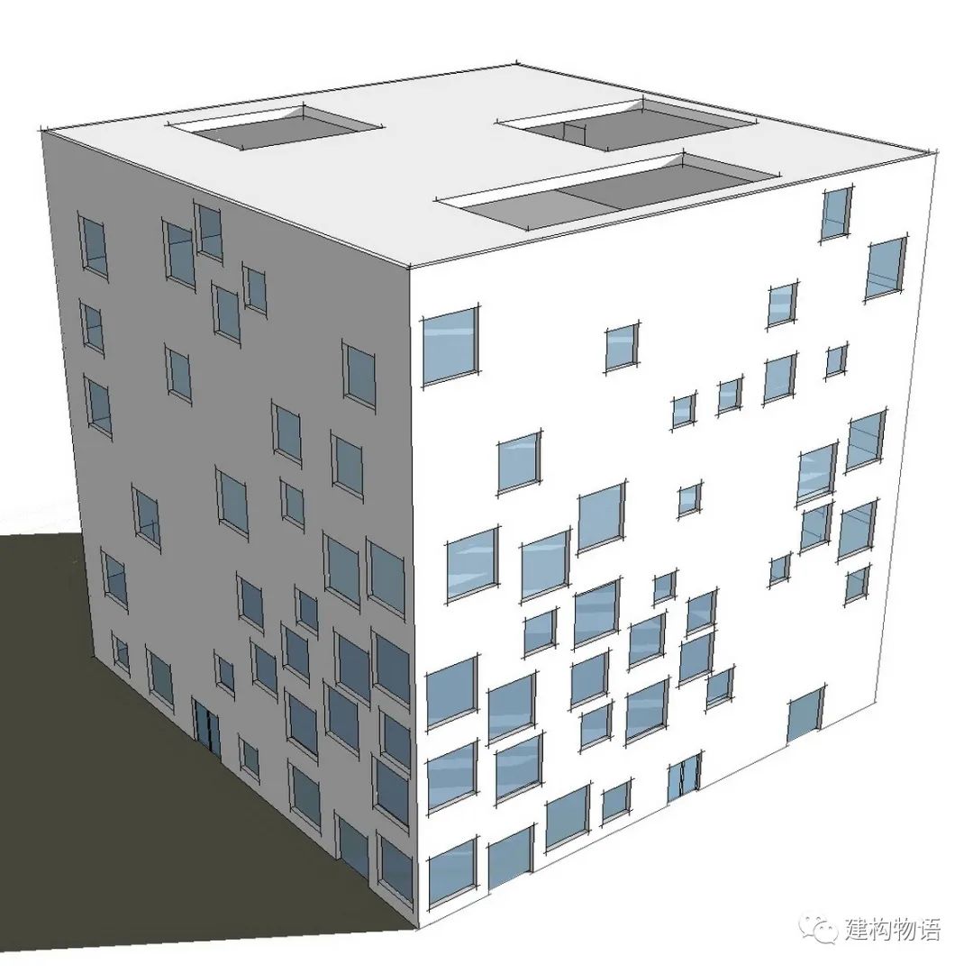
Architect of Allianz stadium in Munich, Germany: Herzog & de Meuron’s simple doughnut shaped block
. 
Due to the diamond ETFE air bag’s facade, people don’t feel monotonous, and the night light makes the building more dreamy
. 
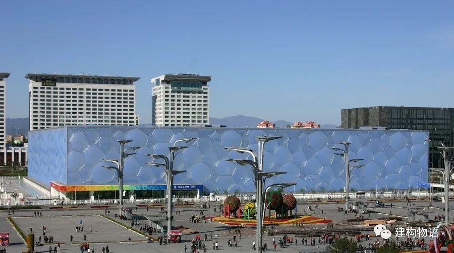
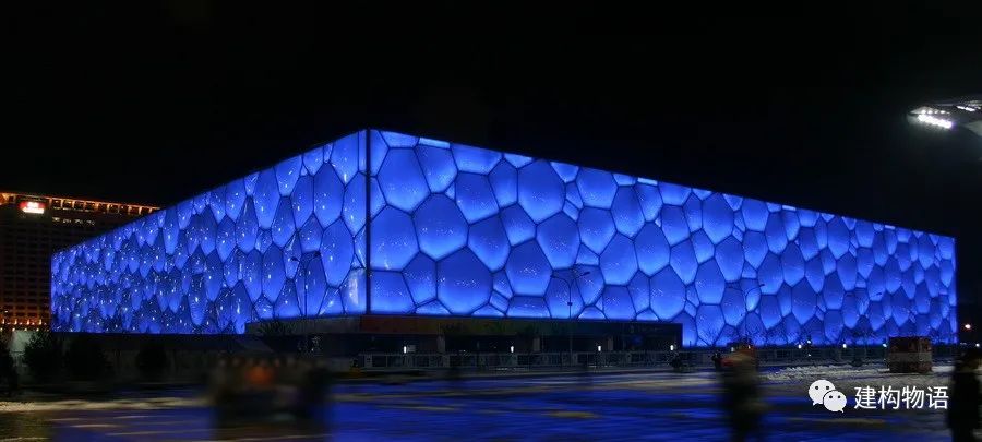
Architect of Beijing National Swimming Center: CCDI + PTW of Australia, covering the building with irregular bubble shaped ETFE air bags, the simple square box building also makes people feel rich and reverie
. 
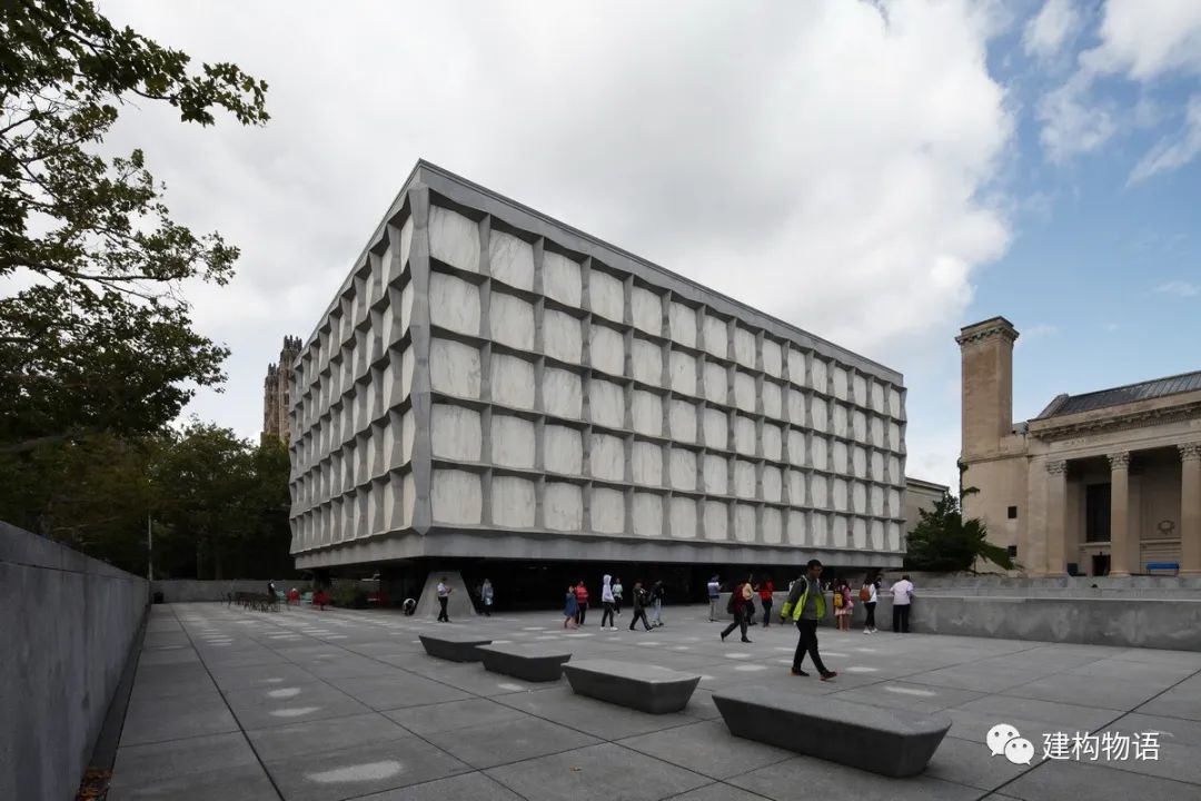
(1963) architect: Som office’s facade details form layers, and the marble (transparent) cube is like a delicate and classic “jewelry box”
. 
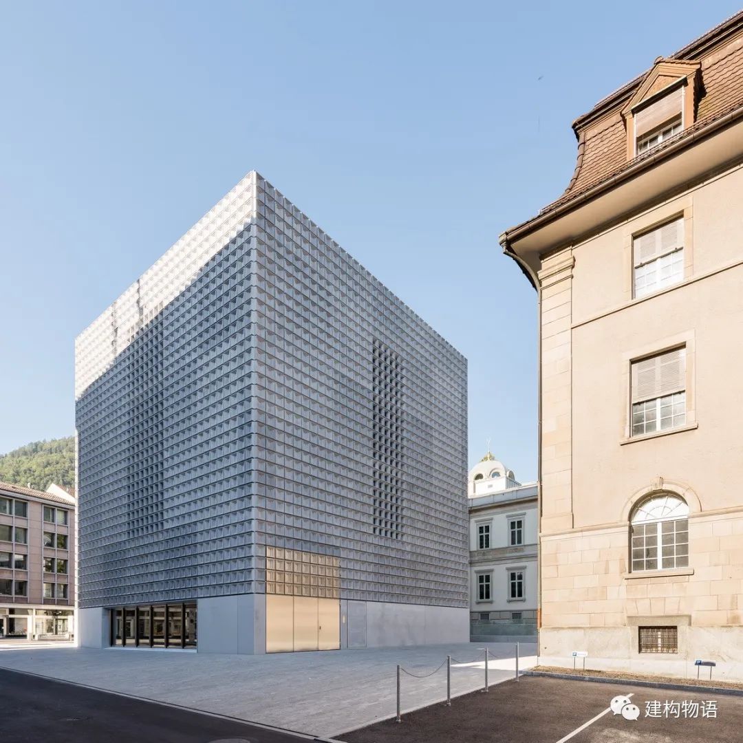
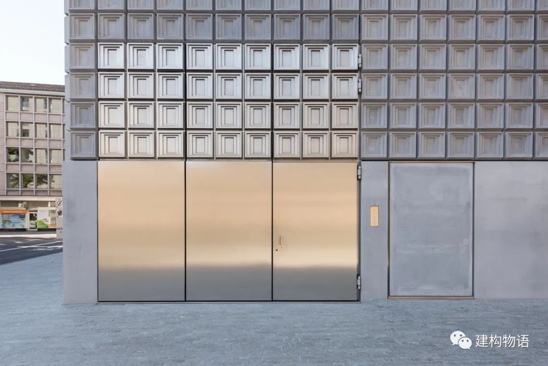
? voltaik (ccby-nc-sa2.0)? Voltaik (ccby-nc-sa2.0) architect of B ü ndner Art Museum (2016) in Chur, Switzerland: barozzi Veiga architects seem to be a pile of concrete blocks, but in fact, they use special molded precast concrete slab units, which eventually form a relief decoration effect, and also let people feel some classical “charm”
. 
The subtraction of the block forms the local concave of the block through appropriate cutting and cutting, so as to form a certain context, shadow, gray space, virtual real contrast, proportion re division, etc., which enriches the level and form of the block, which is often called the subtraction of the block
. 
On the premise of ensuring the integrity and singleness of building blocks, subtraction can form a more complex relationship of building blocks and layers in the overall framework, and then show the richness of architecture
. 
Mario Botta, a Swiss architect, is the representative who knows this well
. 
Many of his works are single in body, but rich in layers through subtraction
. 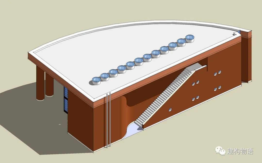
Redaelli villa in bernalegio, Italy — typical subtraction, rich in layers, but the integrity of single block is very good
. 
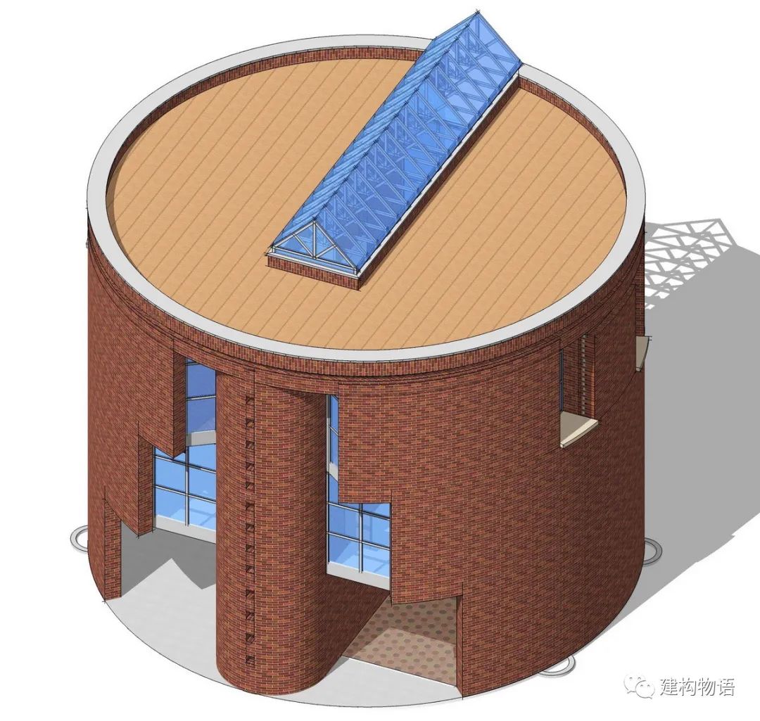
Architect: Mario bota, small house of stabio, Switzerland — rich space and form derived from simple cylinder through subtraction Architect: Mario bota, the formation of architectural richness of single geometric block (2) Follow up will continue to send! “Architectural design technique” more past articles: the transition of space – “gray space” design technique – subtraction of body block classic case: the turning point of body block – Design Technique of Rotterdam shipping and Transportation University (STC group headquarters) – rhythm in architectural form, texture of Building Facade “break up” or “break up”? Beauty of proportion in architecture, feast of color “forget architecture” — learn from artists! Give people roses, hand fragrance If you approve the content of this article, please forward it to more people in need! Website of “building materials u selection” WWW.BML365
.
com contact email: SERVICE@BML365.COM Wechat service number: bml365 QQ: 1601990015 Tel: (010) 5985618513220119036 all rights reserved for words and pictures..
.
