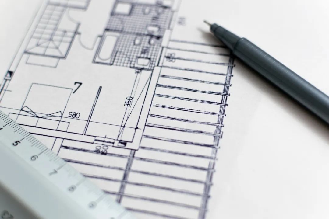
Retro, cutting-edge, vibrant, active, modern and avant-garde color group images are “keepitfun” together with interesting linear schematic diagram
. 
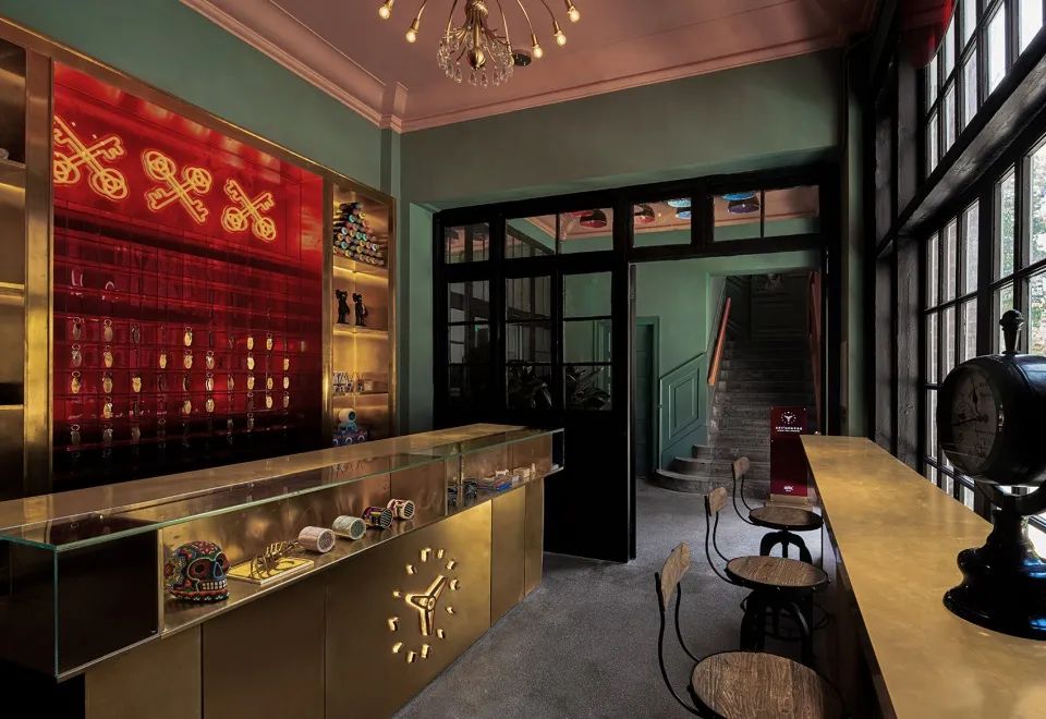
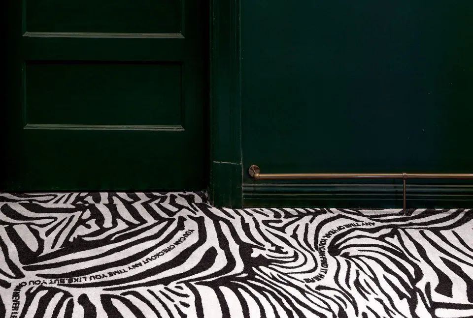
The old black frame glass door opens the entrance of time, and the line of sight enters the metal color of future feeling from the retro gray green space
. 
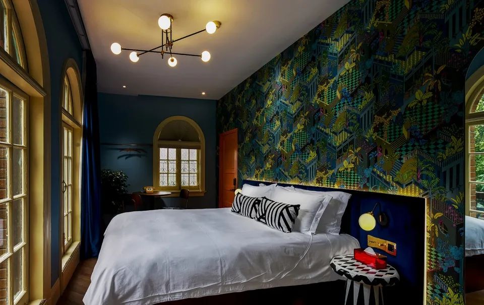
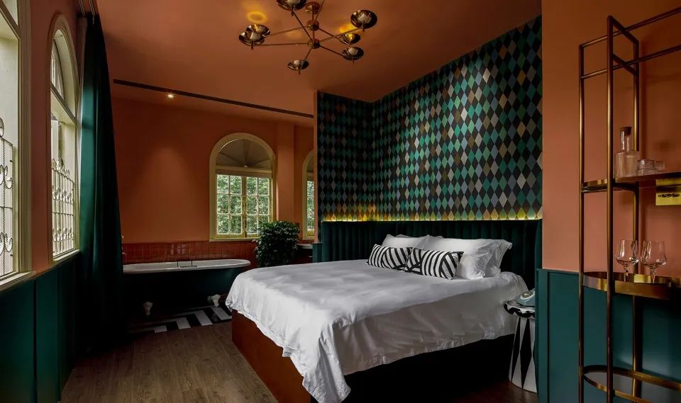
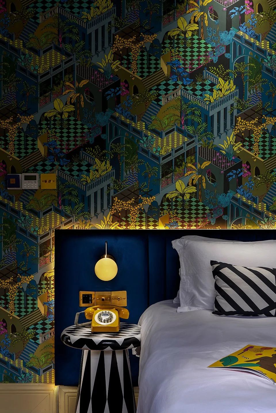
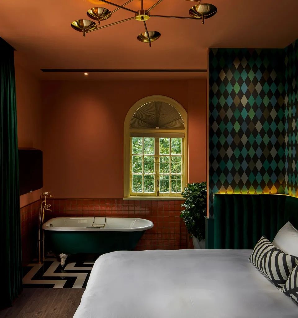
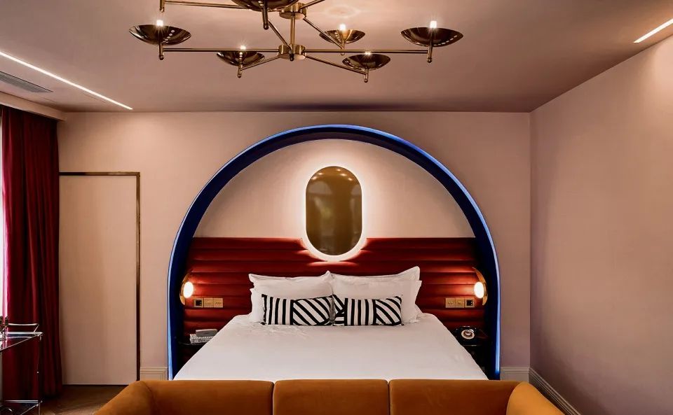
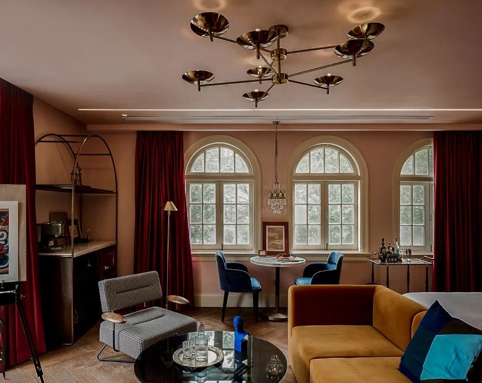
▼ arteco style bedroom ▼ bedroom details “ The warm stop of “coming back traveler” is composed of countless details
.
The psychological hint brought by color guides the guests to have a good mood, which is where the creativity lies
. 
It has always been a landmark representing the young trend of Hangzhou for every generation
.
▼ on some small things to improve happiness, the color from the space appears in every corner of the youth hostel
.
The youth travel space is connected with the game half occupancy experience, which gives personalized expression to the design
. 
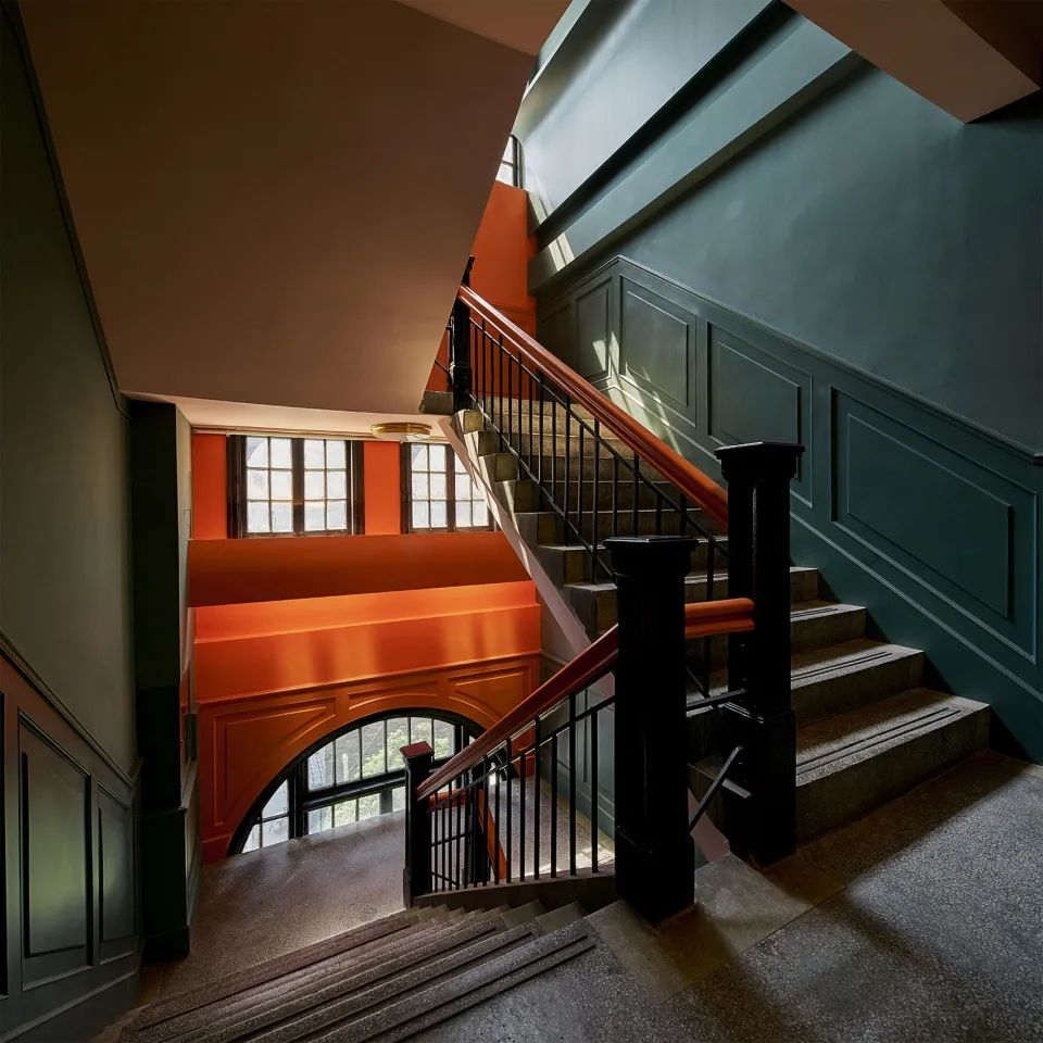
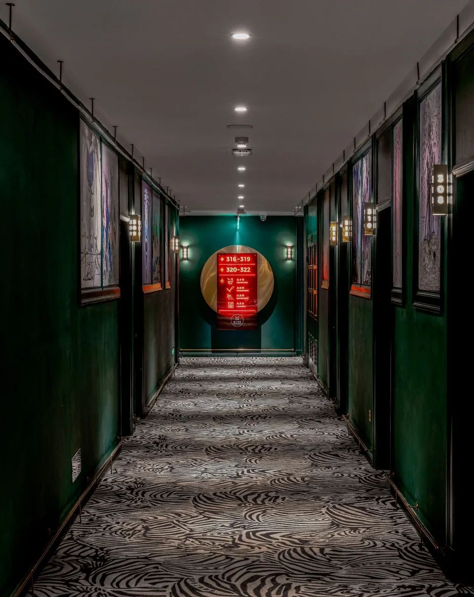
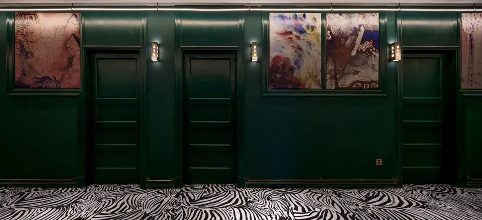
A large area of Retro Green is used in the corridor, and acrylic and brass in the corner show orange red halos with different textures
. 
▼ the introverted green stair corridor and orange handrail ▼ the psychological hint brought by the color guides the guests to have a good mood, which is where the creativity lies ▼ the corridor uses a large area of retro green, and the acrylic and brass in the corner area show orange red halos with different textures ▼ the corridor ▼ the details of the corridor “ Every inch of “no duplication” is unique, which is obtained by the superposition of multi-level colors, materials and elements
. 
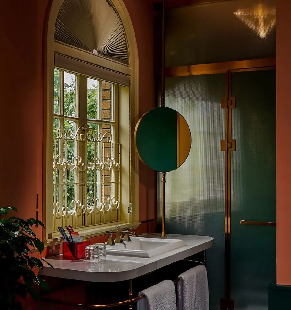
Brass is cheering in every corner, and well preserved arch windows and fancy protective railings are quietly telling the story of a century
.
Walking into it is not only a hurried registration area, but also a bar waiting for guests to settle down and rest from morning to night
. 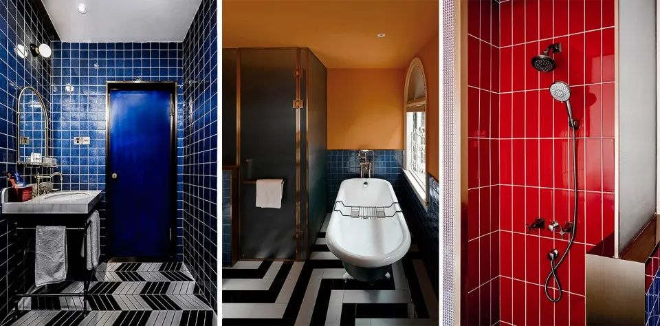
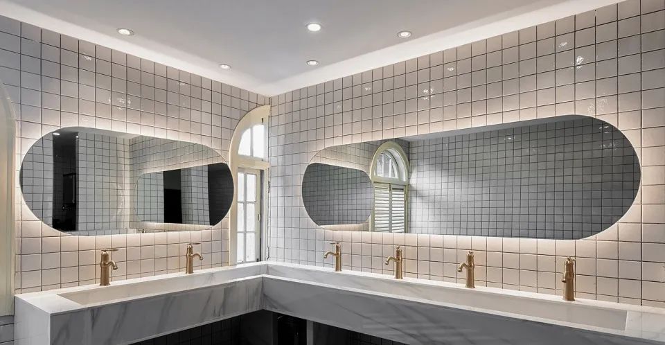
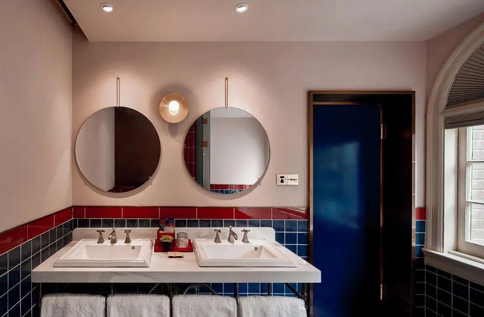
▼ color group images in the bathroom ▼ the public bathroom has vision and pursuit, is unwilling to repeat, does not cut the same, is pragmatic but tired of uniformity, and remains childlike while being exquisite
. 
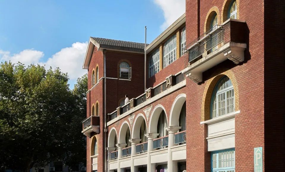
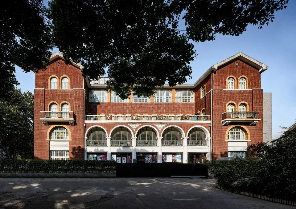
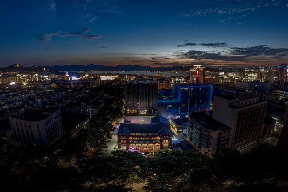
▼ overview of the hotel’s appearance, retro architecture and dynamic personality, and the sense of “interest” generated by contrast and contradiction run through the whole design
. 
The hidden wall delimits a quiet place in the old urban area and turns inward
. 
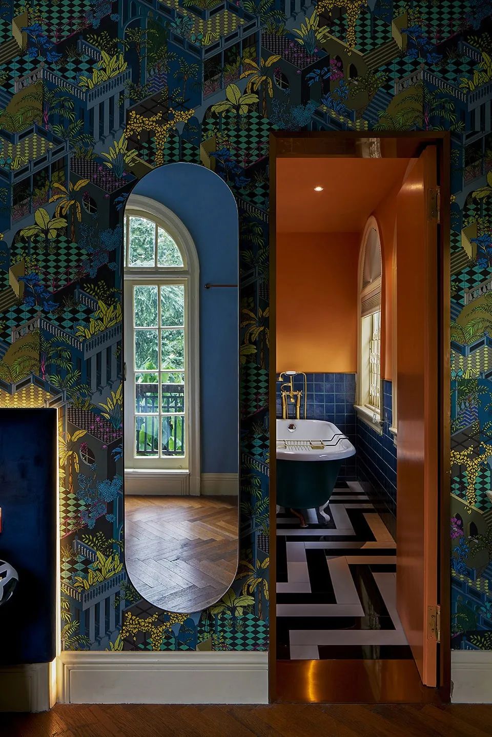
▼ use LeCorbusier Le Corbusier’s color scheme ▼ interesting multiple spatial levels ▼ the detailed color and smell of the bathroom make the nostalgic smell stronger, form an old space carrier, and collide with new dialogue through modern design elements to produce collision and new energy
.
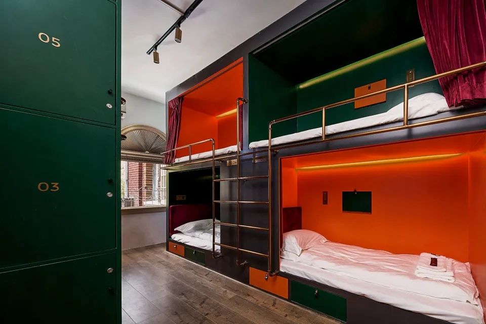
Non standardization + sense of humor + surprise is what we want to give it a new look and turn YMCA into a boutique youth hotel with 66 rooms
It was once a western restaurant, a dance club room and the first playground in Hangzhou
. 

Let the “young” old buildings continue to have a young appearance
. 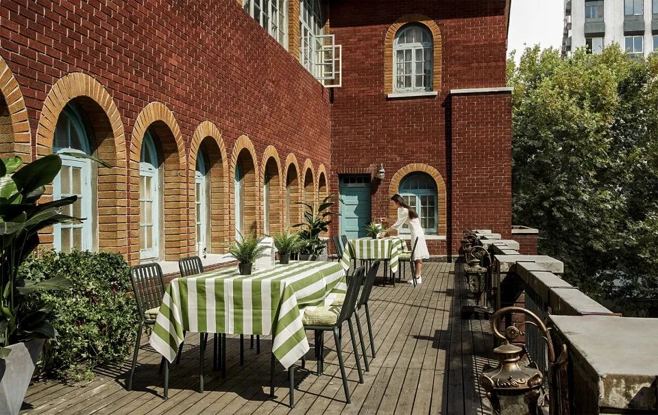
What brings in is this vibrant orange building
.
When walking in the long corridor, timely surprises and accidents guide the pace of progress
.
The Hangzhou YMCA, built in 1918, is an American classical old foreign house and the location of the “walking and YMCA Hotel” of the project
.
27, Qingnian Road, Shangcheng District, Hangzhou completion time: 2019 / 05.
.
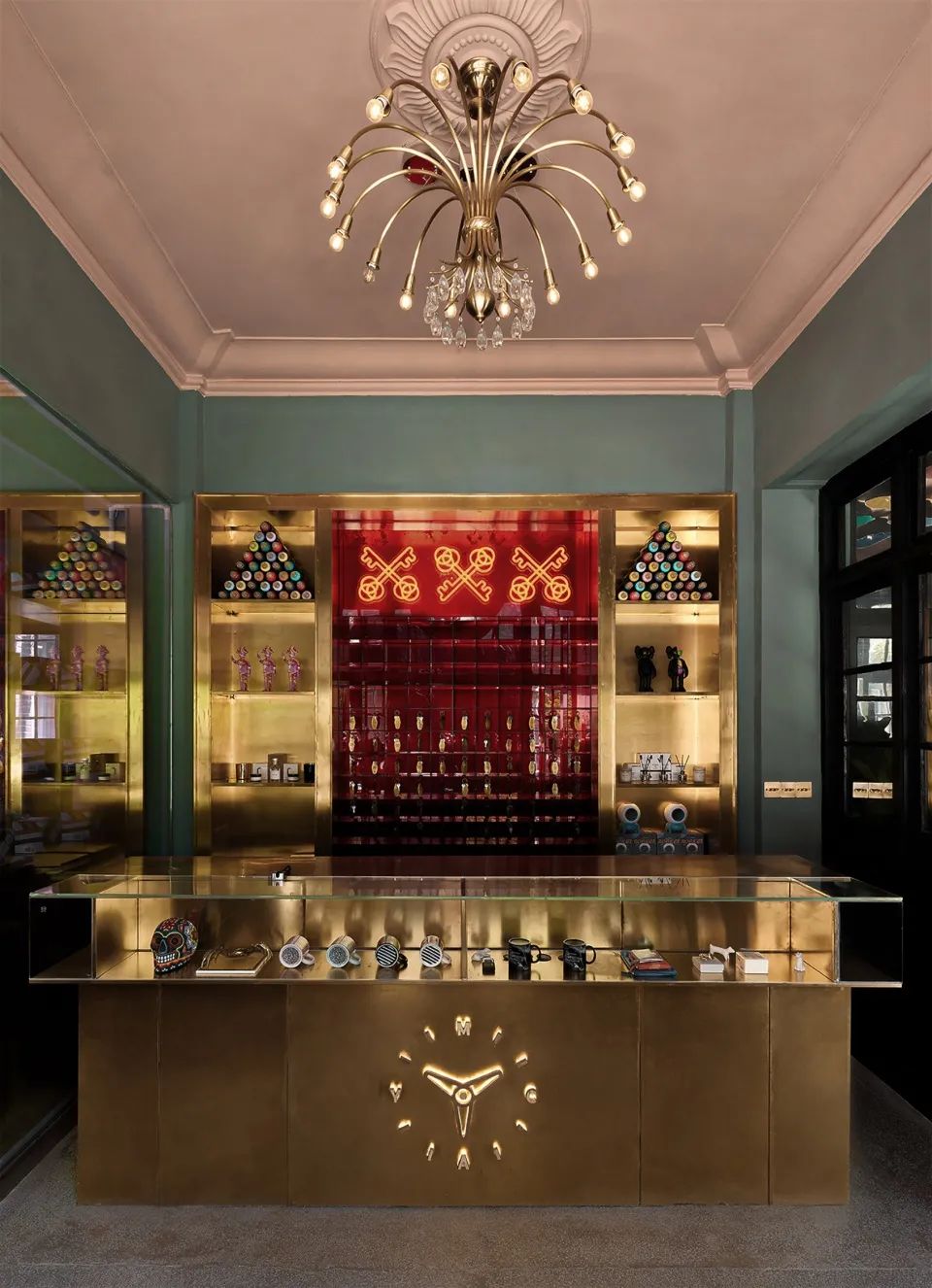
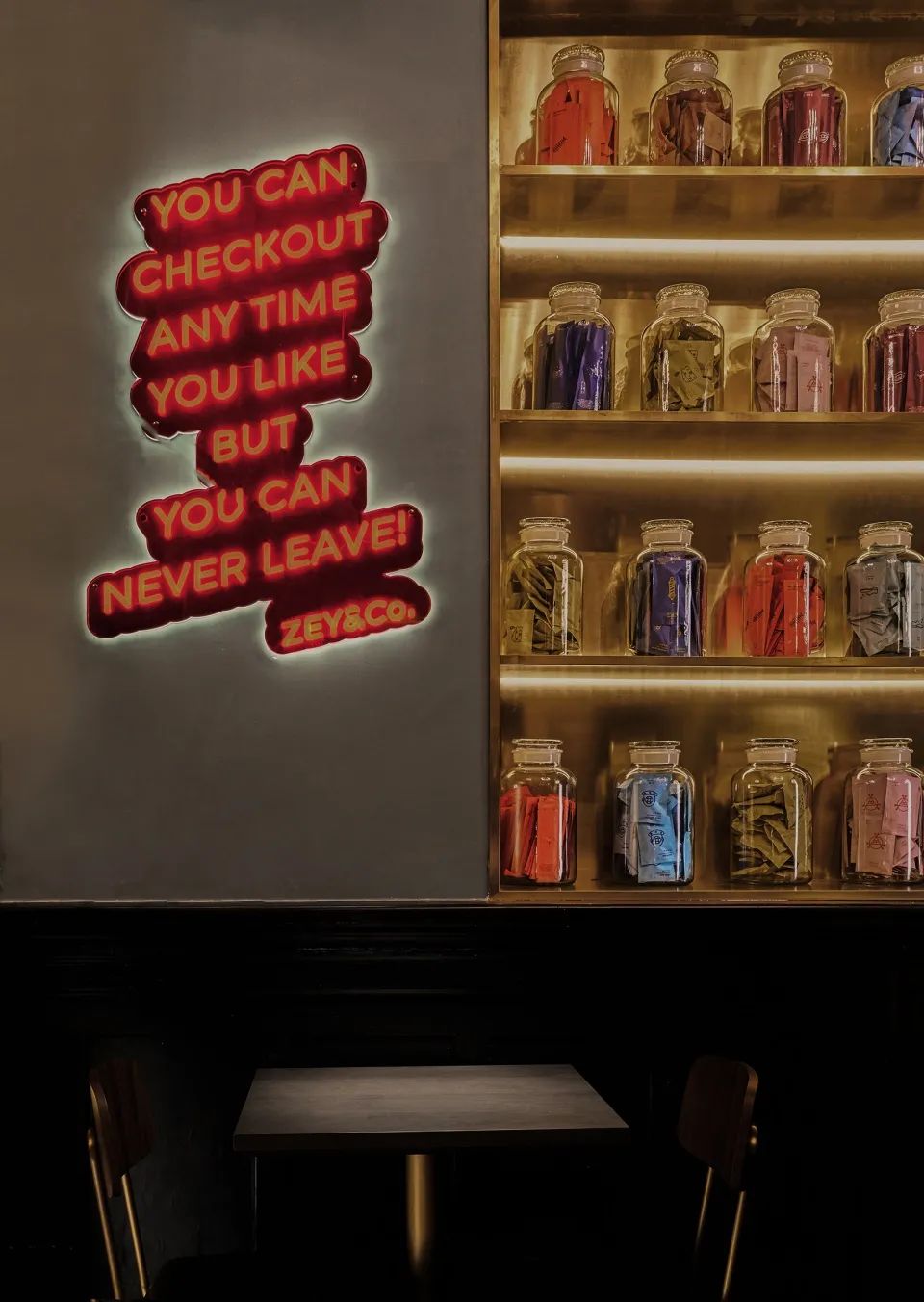
The golden bar and red neon lights extending to the wall have become non standardized in the space
. 
Each space seeks a strong color system
.
▼ night view project name: zoeryou ymca hotel design unit: Pan domain design content: hotel design main scheme design: Zhu Xiaochen design team: Lu Qianlan, Ling Zongsheng, Chai Erhuan, Jiang guanhang soft decoration team: Chen Lin Ruan Saishan brand design: mubai brand creativity and design project scale: 1986 ㎡ construction unit: innerfix Yifu construction project Photography: Shi Zheng / aoguan architectural vision project address: No
.
Several square lattices of contrasting colors are superimposed in each other’s color composition
. 
“Keep interesting” and “keepitfun” sit on the lakeside scenery and hide in the downtown lane
. 
The color scheme of Le Corbusier Le Corbusier adds specific colors to the old buildings to form confrontation, achieve balance and change the birth mechanism, and burst out a variety of more interesting spatial levels
.
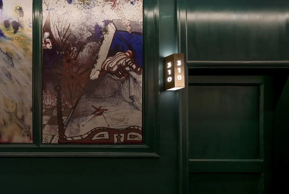
Between the two front lines of the lobby and the guest room, we painted countless points – paintings embedded in the wall, which provided a reason for each stop
.
▼ color and smell make nostalgia stronger ▼ bedroom details we integrate arteco style and geometric elements of the same age as the old buildings into the space, and integrate with each other in the jump to produce a “new” and “retro” space and describe the sense of humor of playing with the space
.
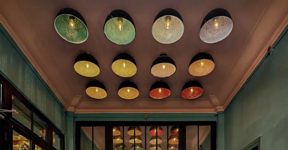
▼ overview of the lobby ▼ the golden bar and red neon lights have become non standardized in the space ▼ decoration details ▼ the details of hall lamps are a very introverted green corridor and orange handrail, which seems to be entering another world with a sense of ceremony
.
▼ facade details ▼ outdoor terrace “ The “human touch” lobby area retains intact historical details
. 