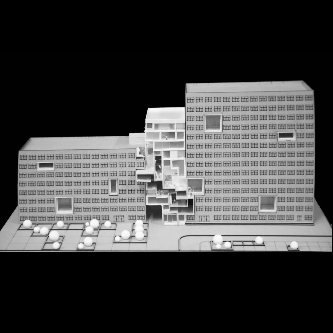
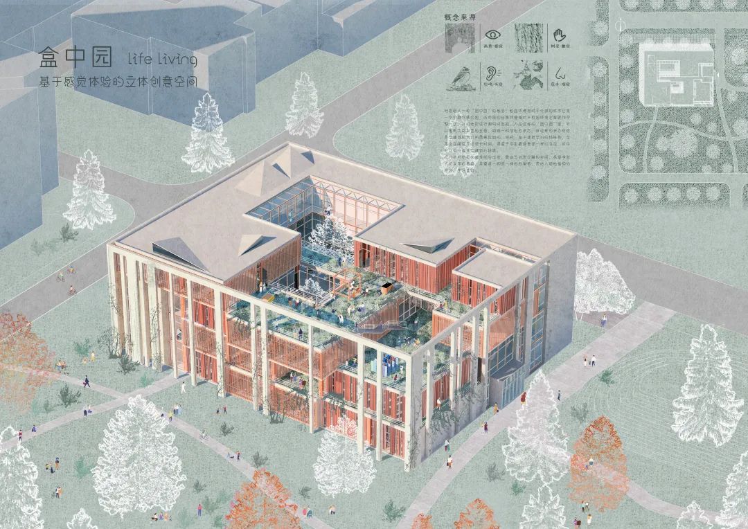
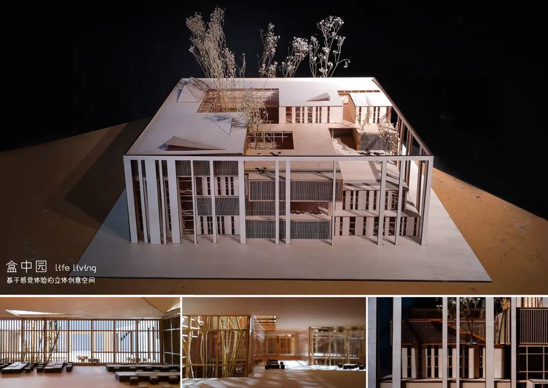
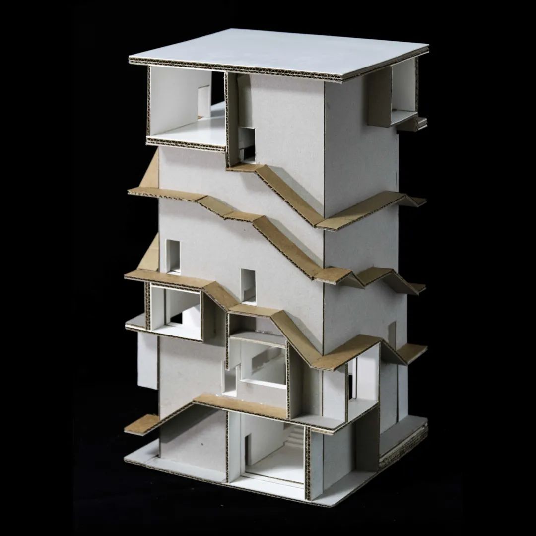
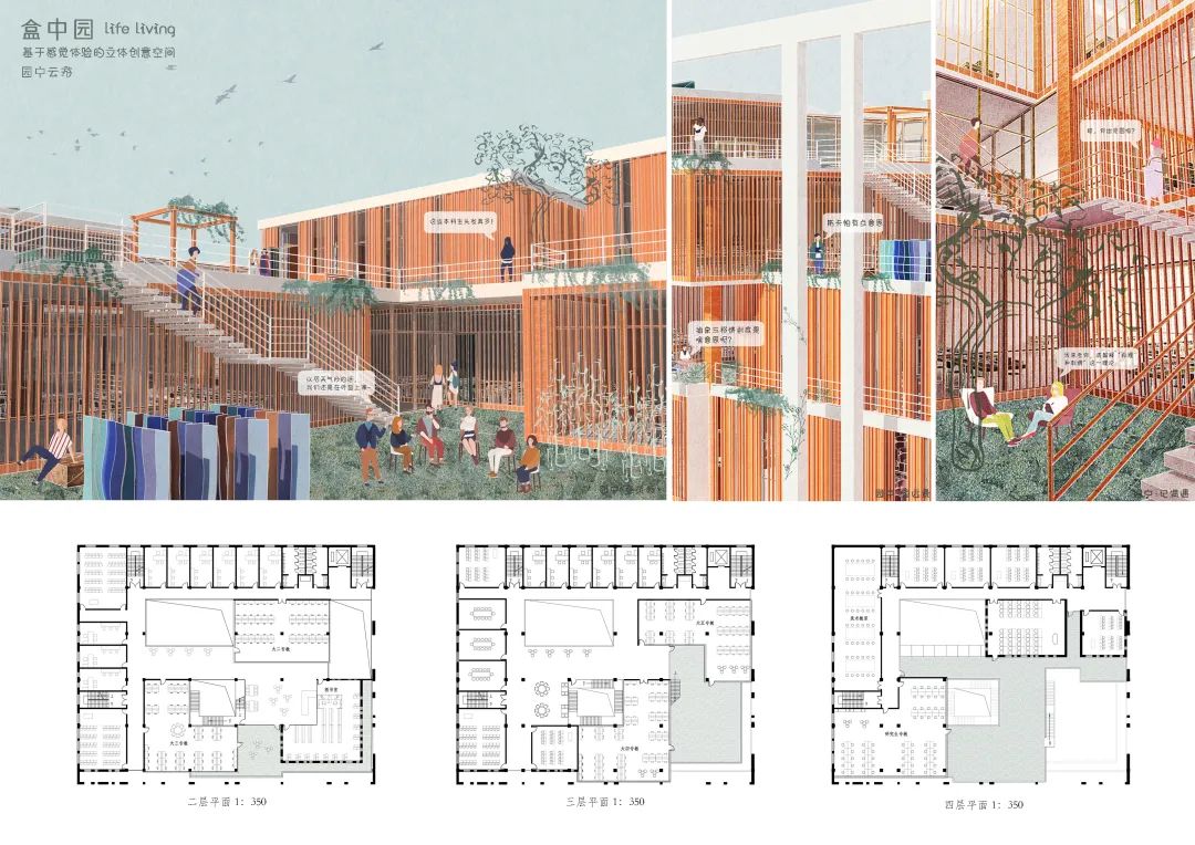
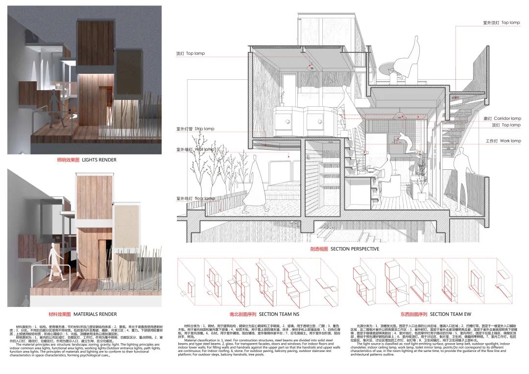
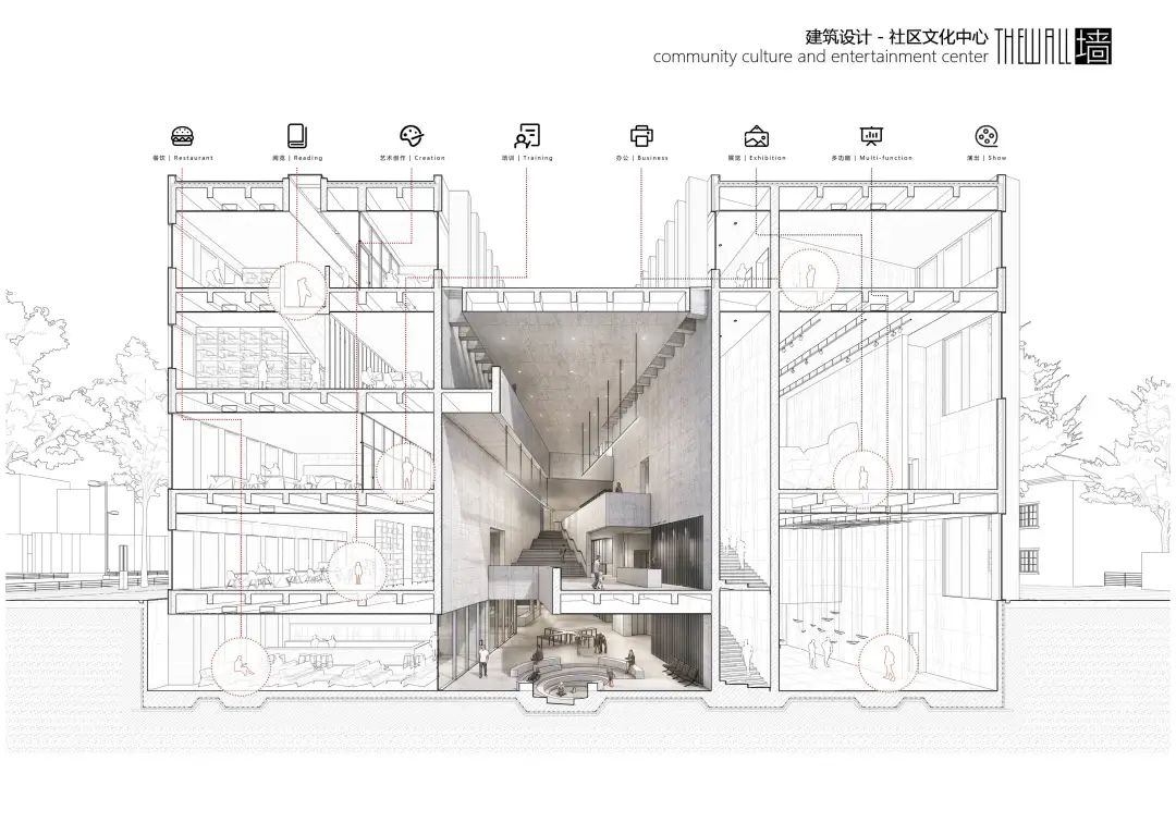
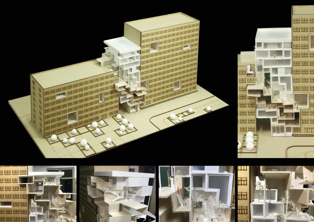
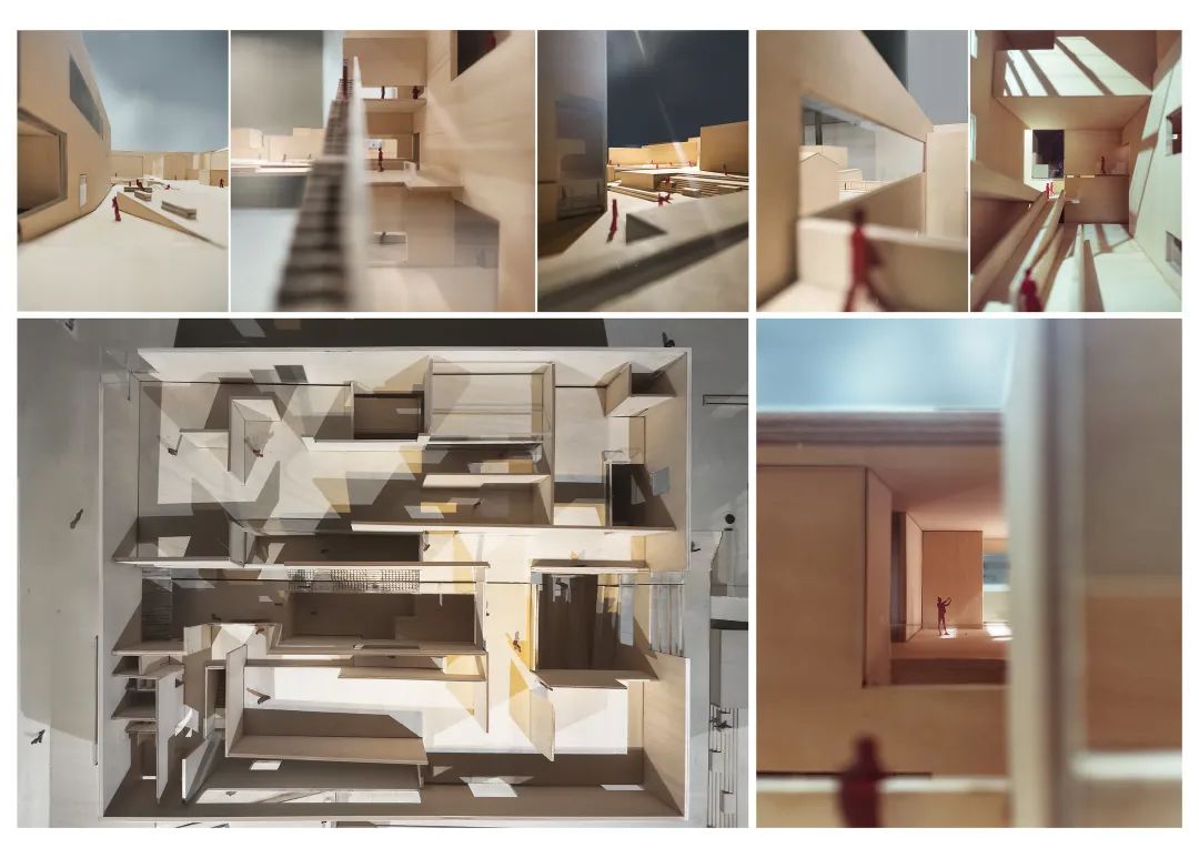
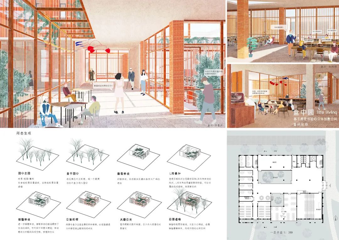
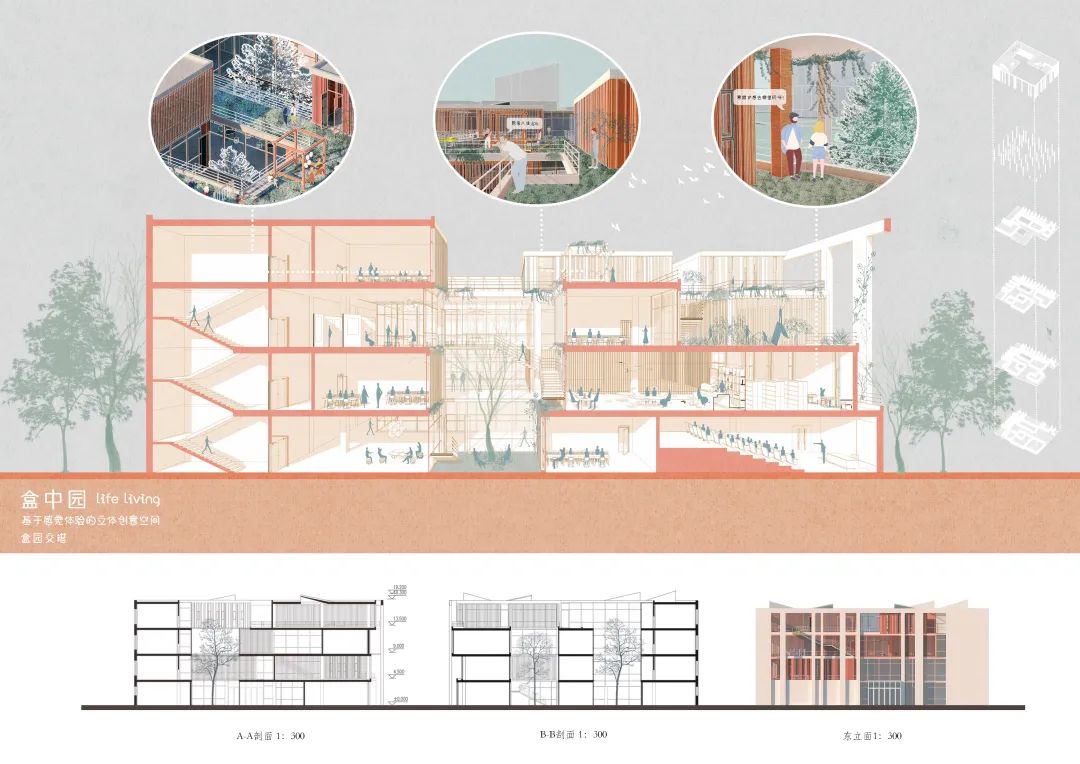
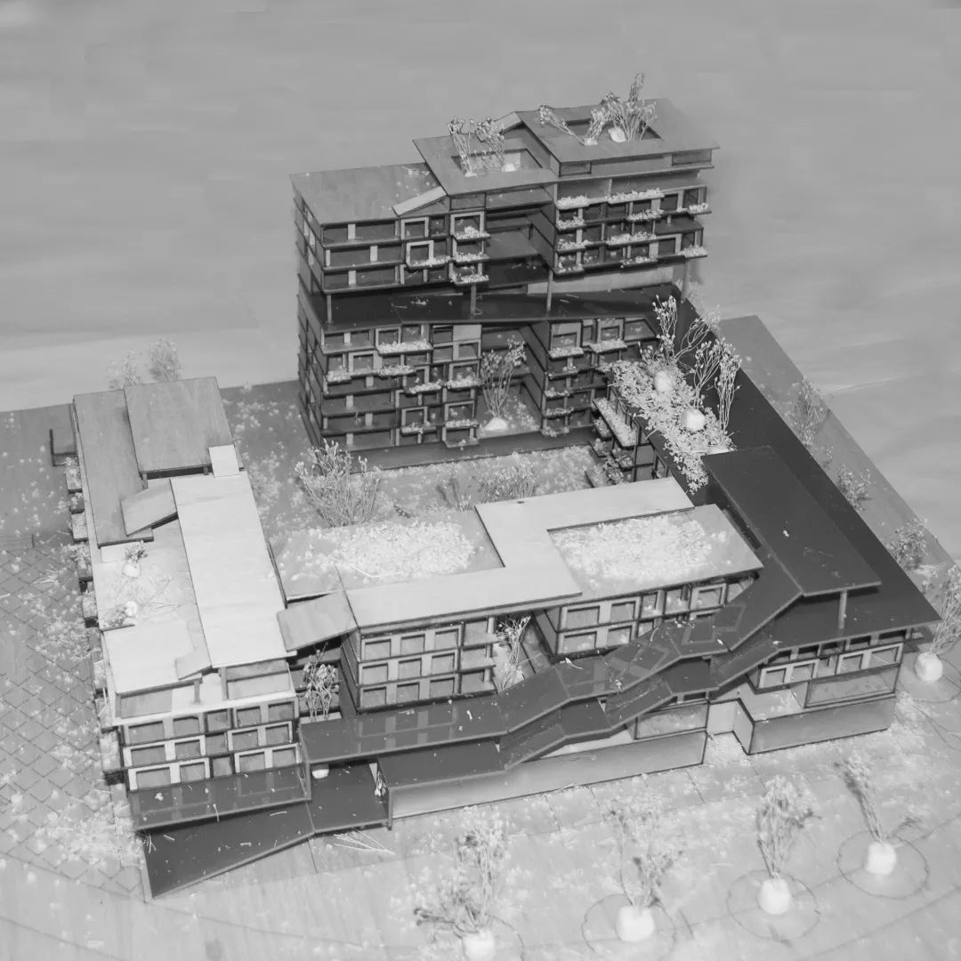
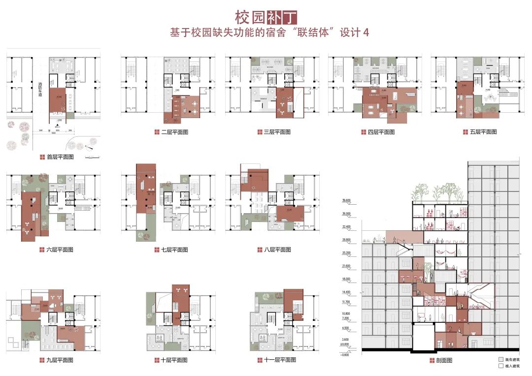
In terms of operation methods, the superposition of “boxes” is adopted, and the boxes move staggered with each other to form the space of platform retreat, courtyard and atrium, forming the “garden” between the boxes“ “Box” is a relatively serious and quiet place for study and office, where people have classes, design and office“ “Garden” is a relatively lively and lively leisure and relaxation space where people talk, rest, enjoy the scenery in and outside the “garden”, perceive the beautiful moments in the changes of the four seasons, and get inspiration from relaxed thoughts“ People in the “box” can catch a glimpse of the sunshine in the “garden” when they are busy, and people in the “garden” can also watch the hurry in the “box” when they are leisure
. 
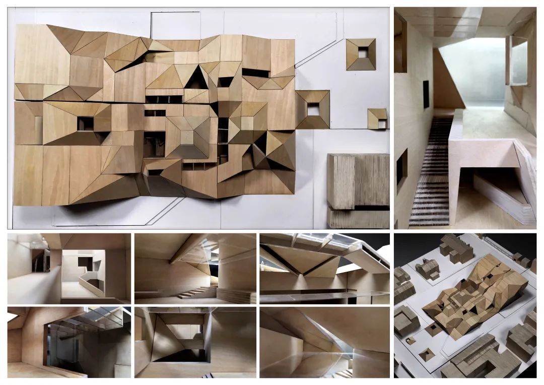
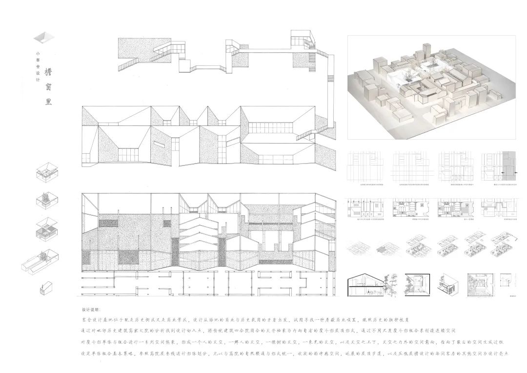
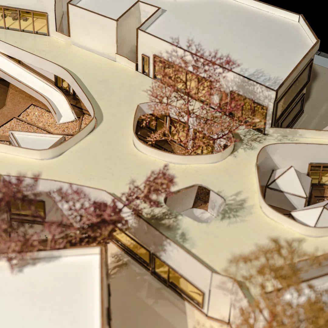
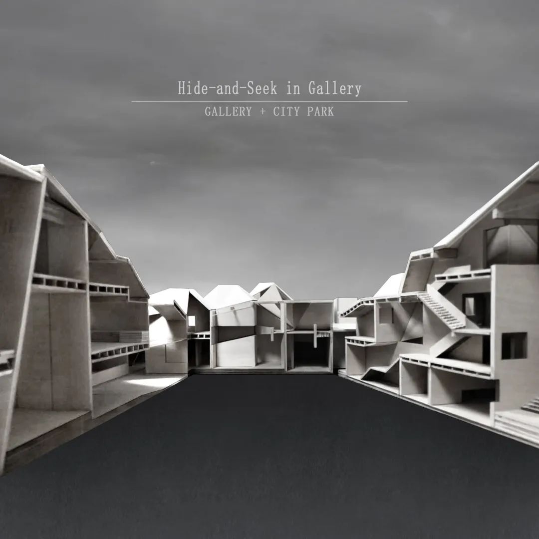
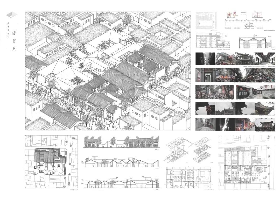
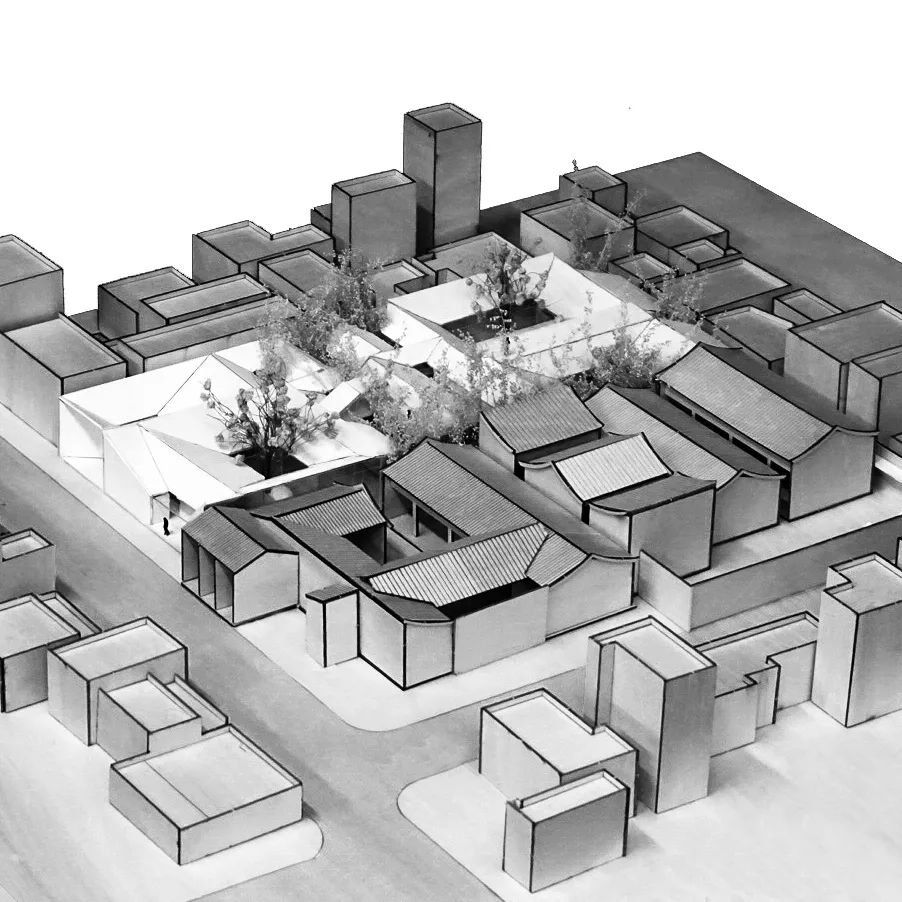
The courtyard surrounded by the traditional building quadrangle is abstracted as an introspective bucket shaped roof form, and the continuous space is created through the combination of bucket shapes of different scales
. 
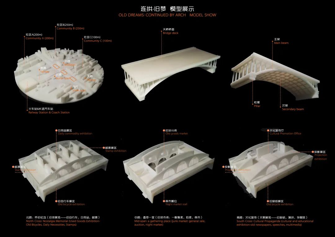
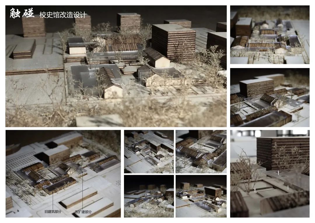
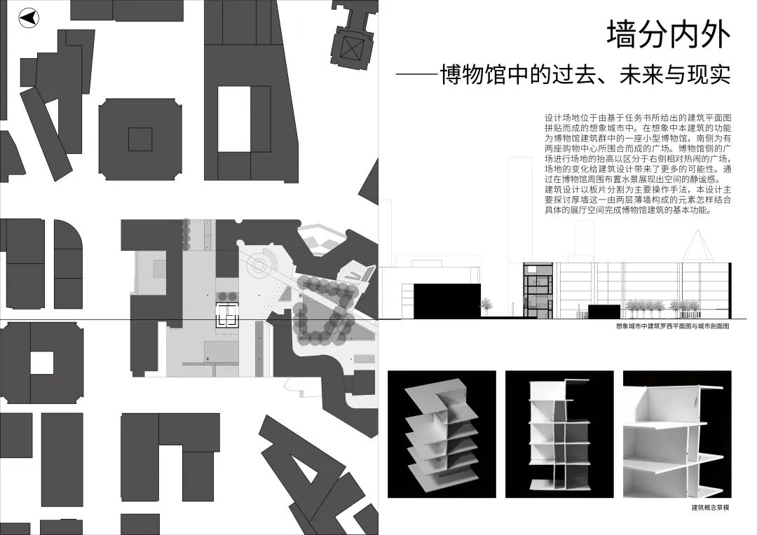
In the imagination, the function of the building is a small museum in the museum complex, and the south side is a square surrounded by two shopping centers
.
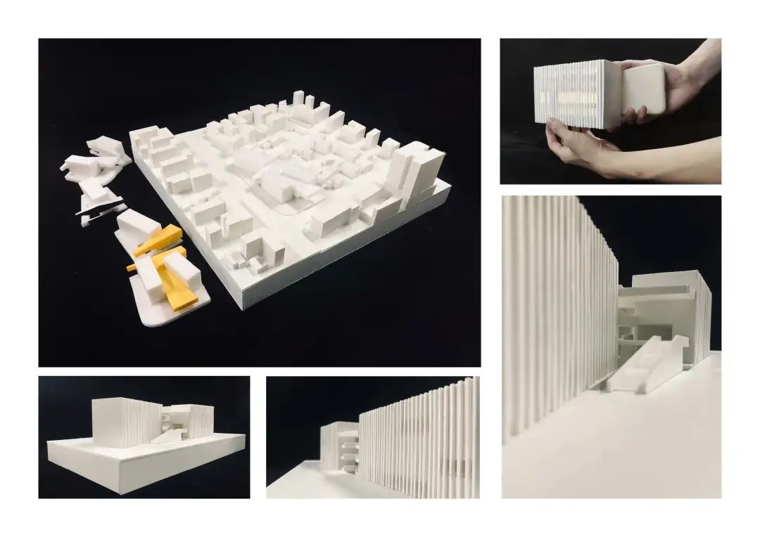
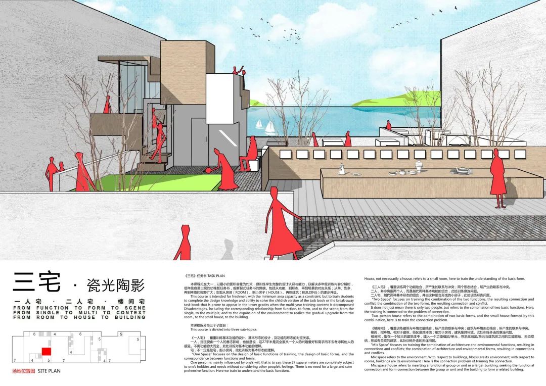
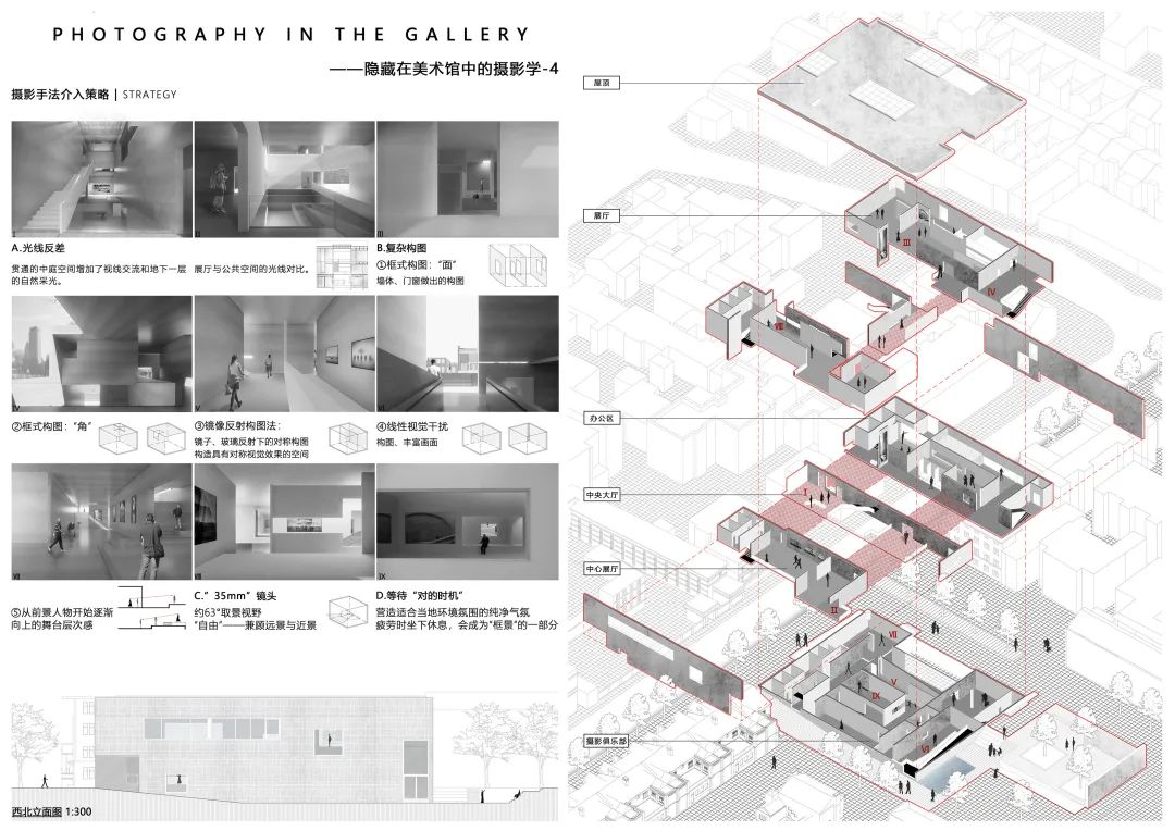
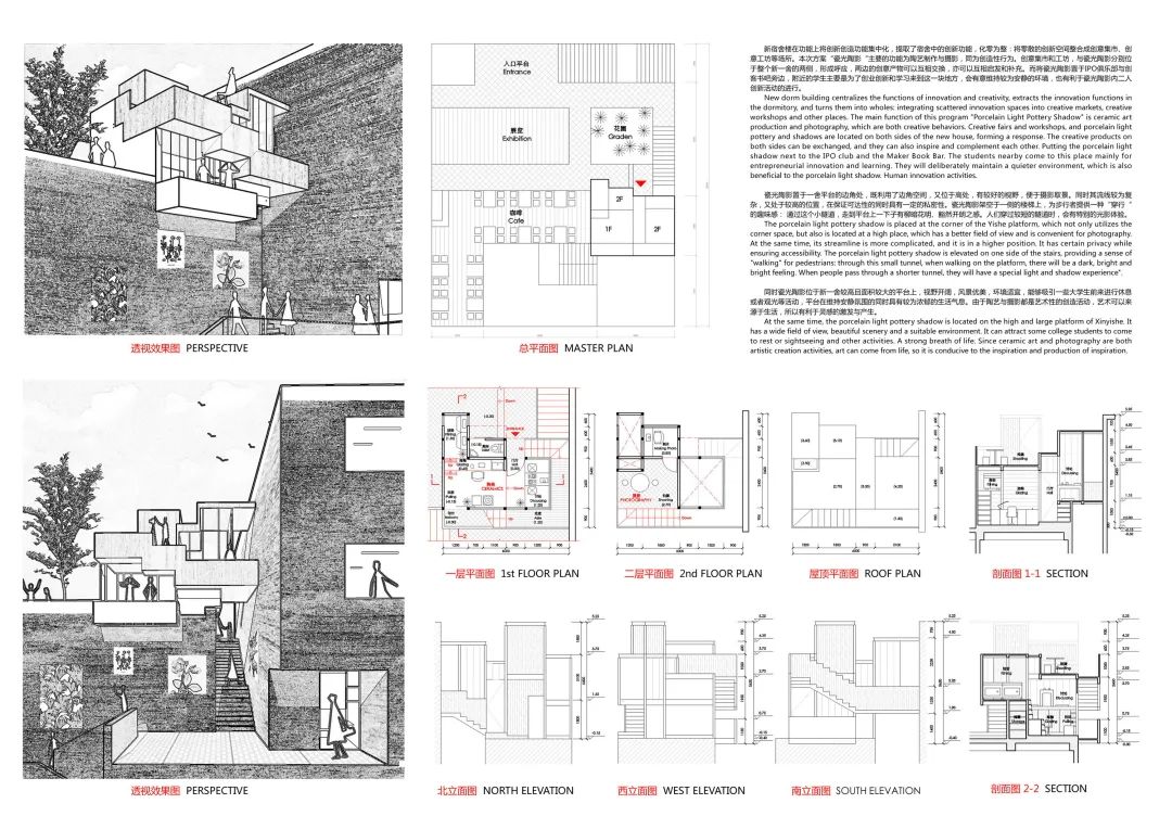
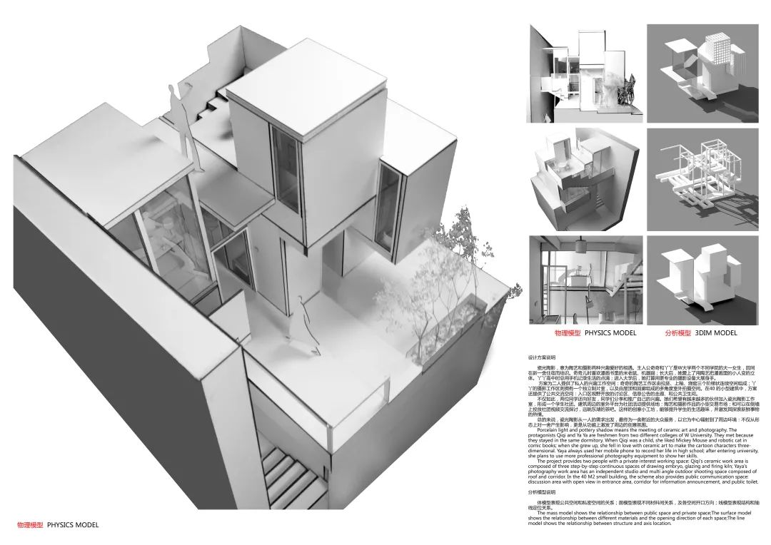
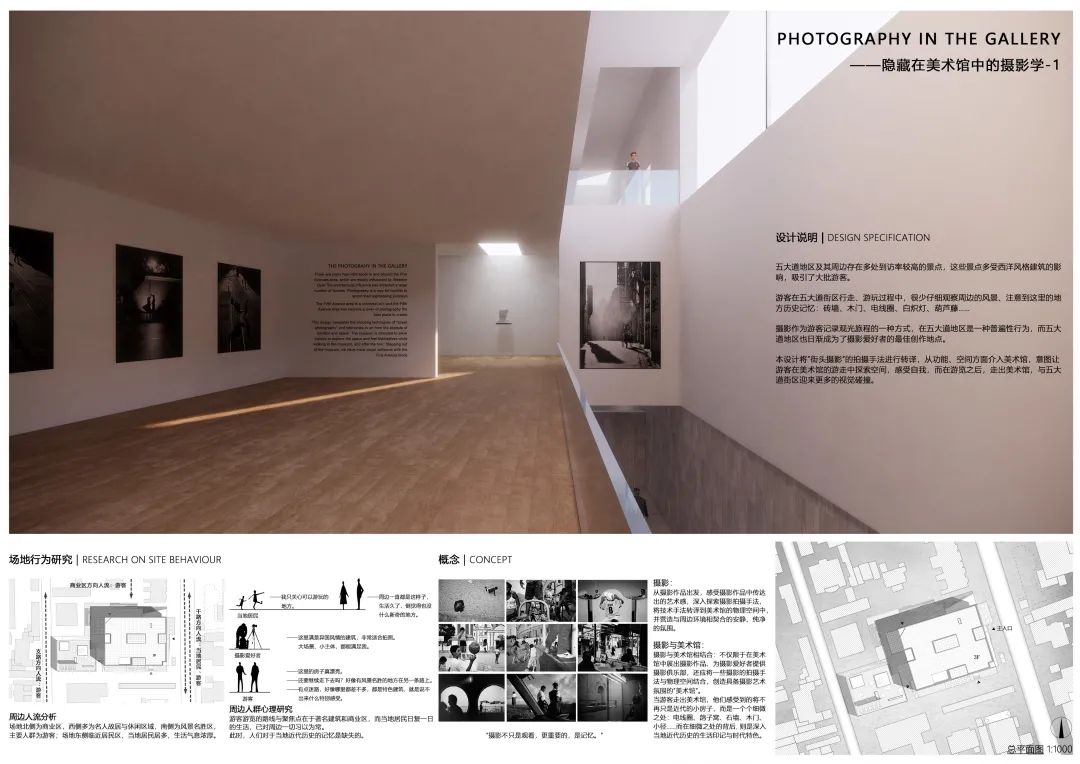
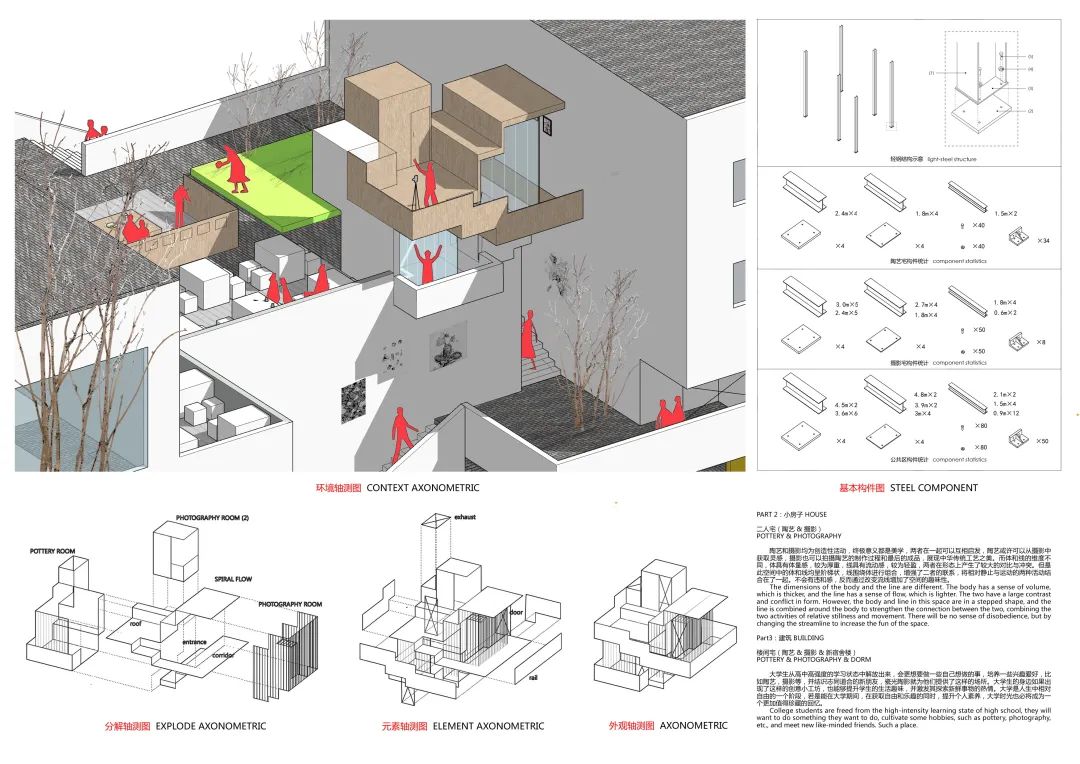
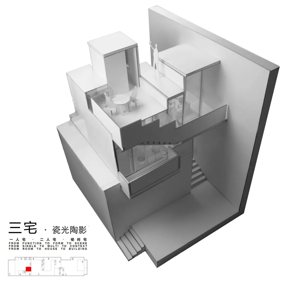
Let’s work together ~ work No.1 sanzhai · porcelain light and pottery shadow, Zhu Qi, Chen Zhuoya – freshman – porcelain light and pottery shadow of Wuhan University, which means the meeting of two interests and hobbies of ceramics and photography
. 
At the same time, it also further enriches the interest inside the exhibition hall space, making the actually not spacious exhibition hall more open under the connection with the outside world and the mutual space hint between the exhibition halls
. 
Building the museum is more like a home for students
In order to ensure the purity of the building facade, the building adopts double-layer doors in line with the concept of thick wall in the selection of doors
.
Different from the functional zoning of the main space and auxiliary space of general buildings, the staircase as a thick wall is not a relatively negative element in this building
. 
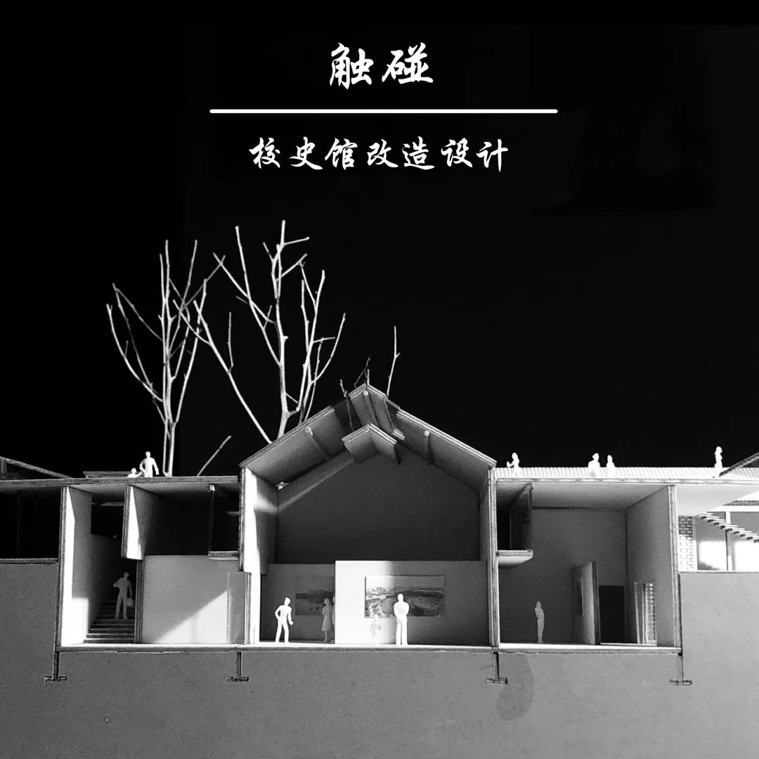
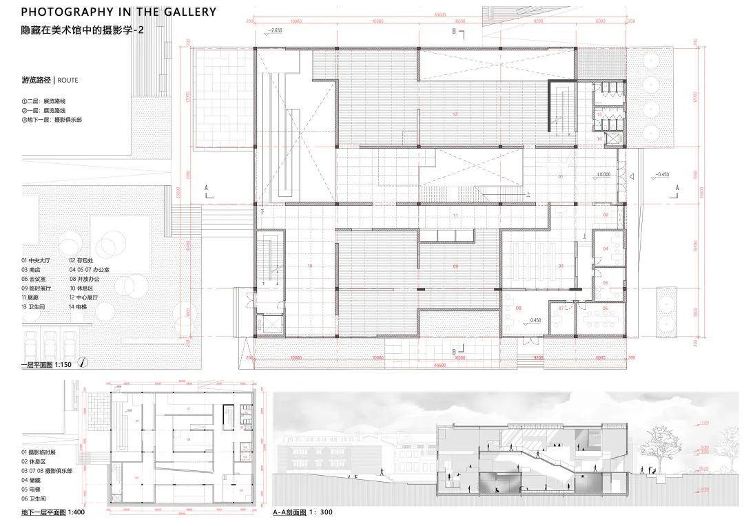
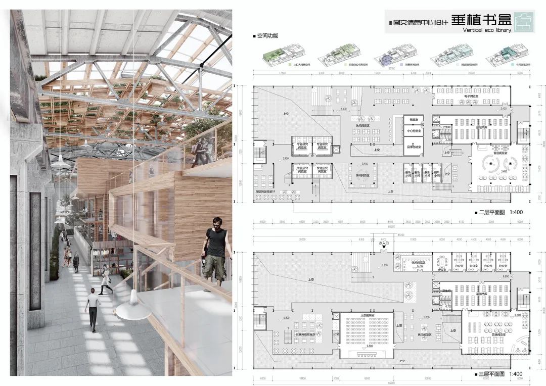
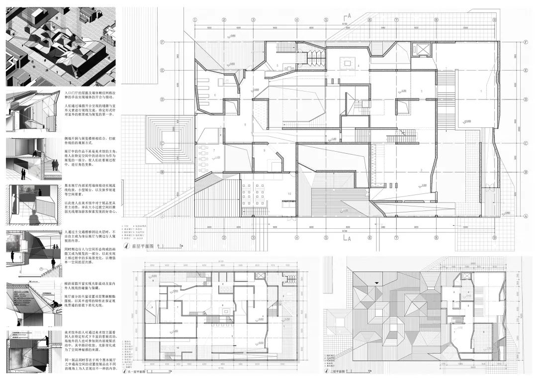
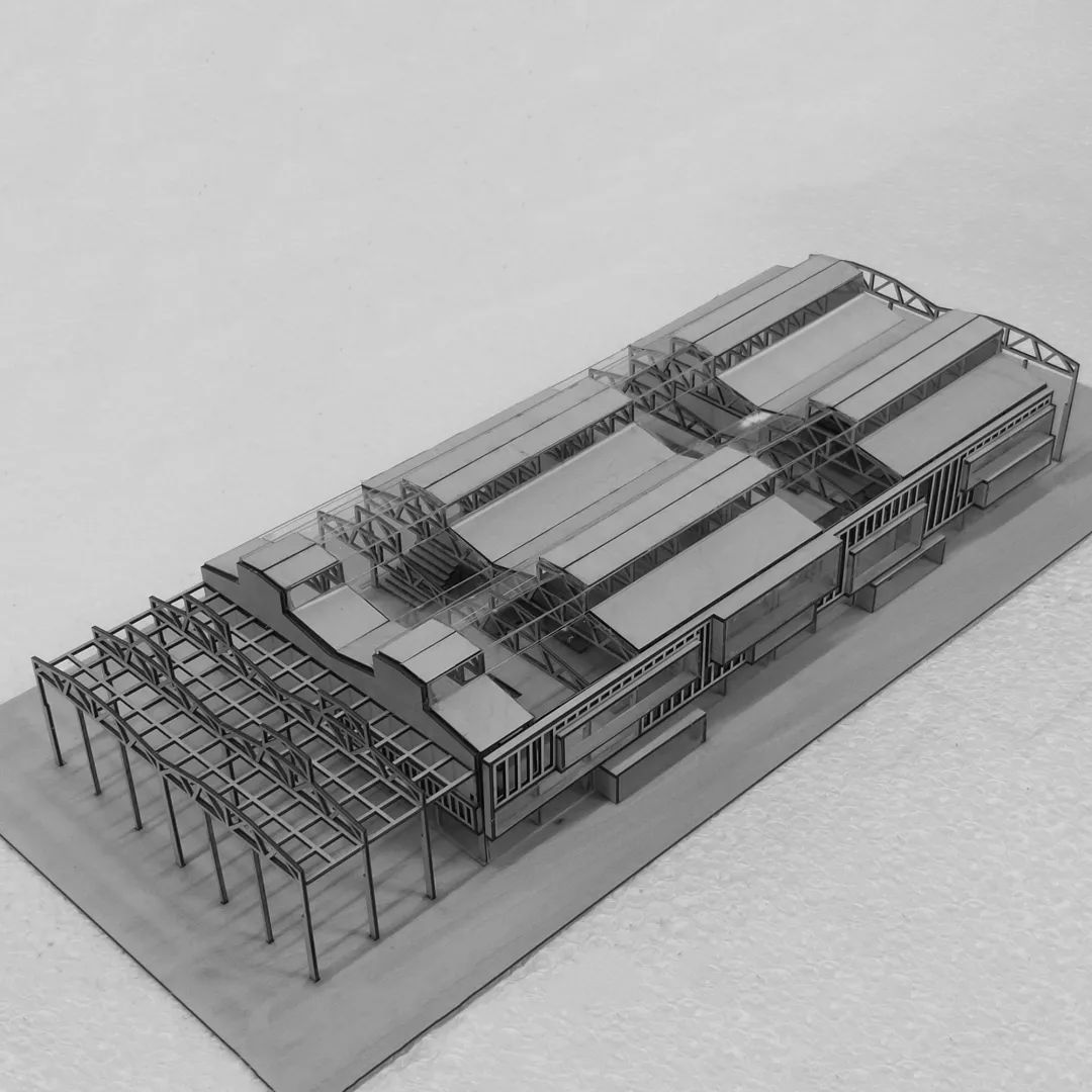
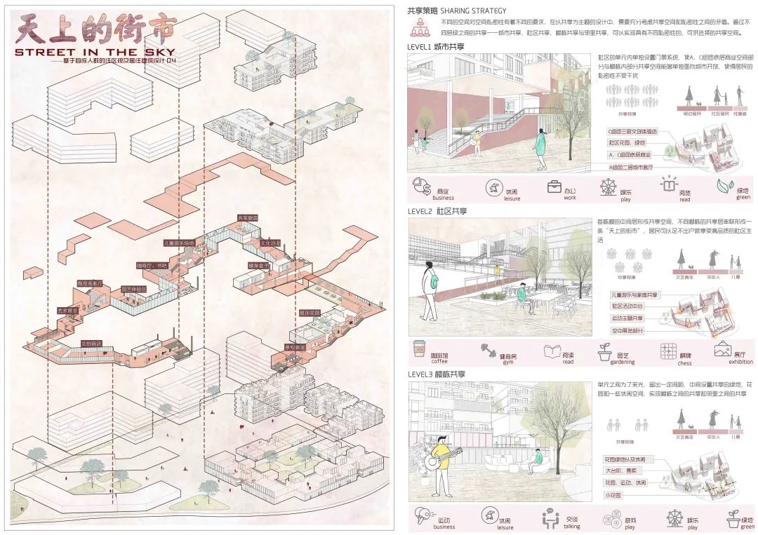
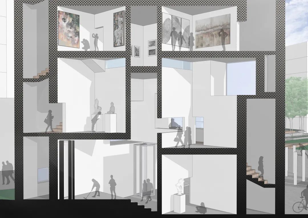
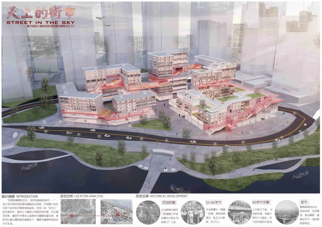
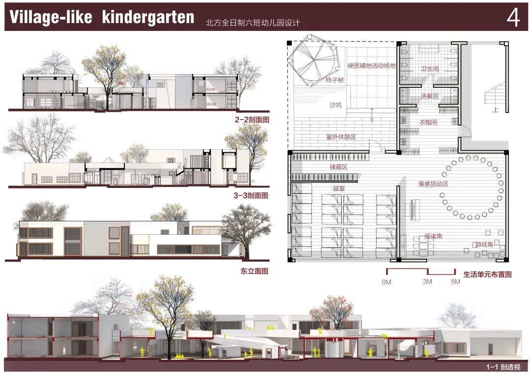
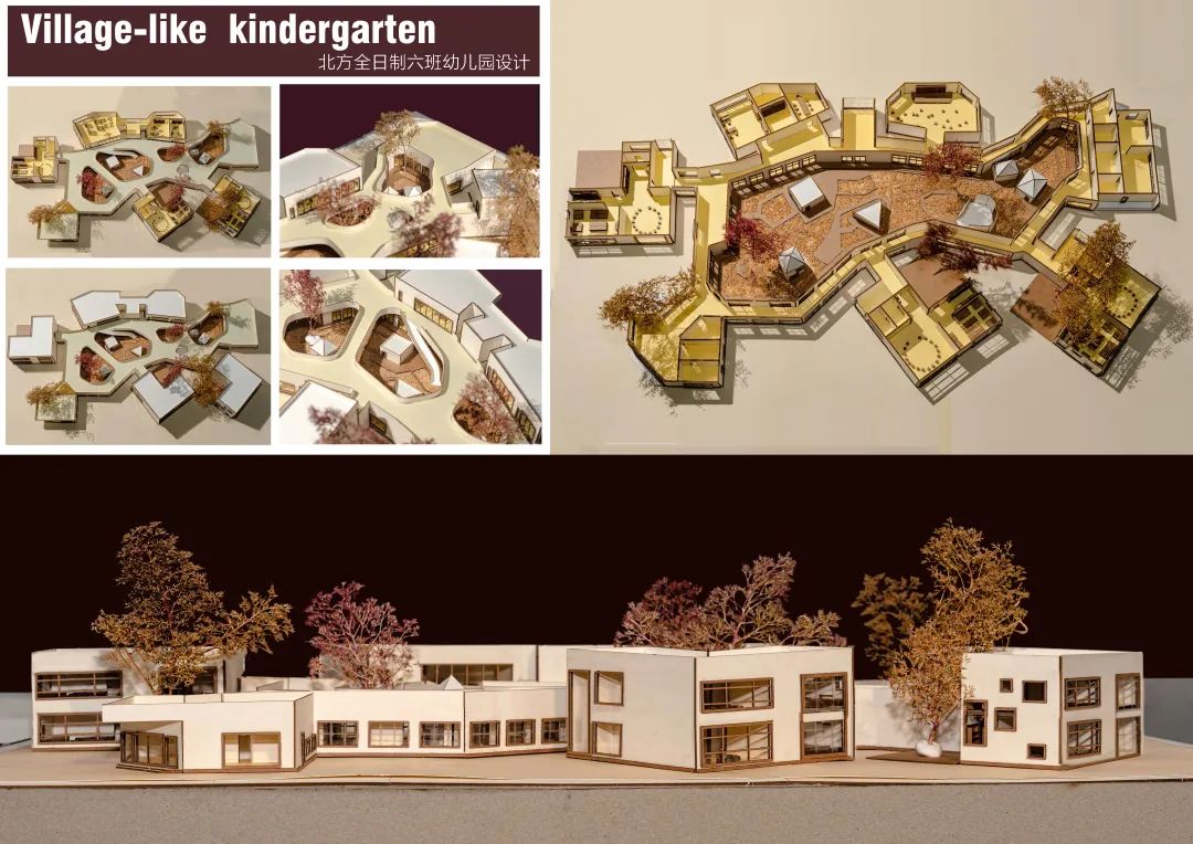
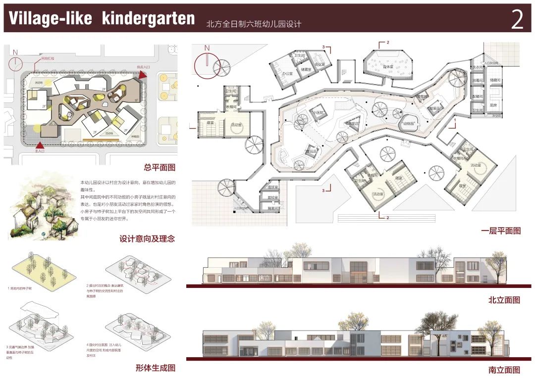
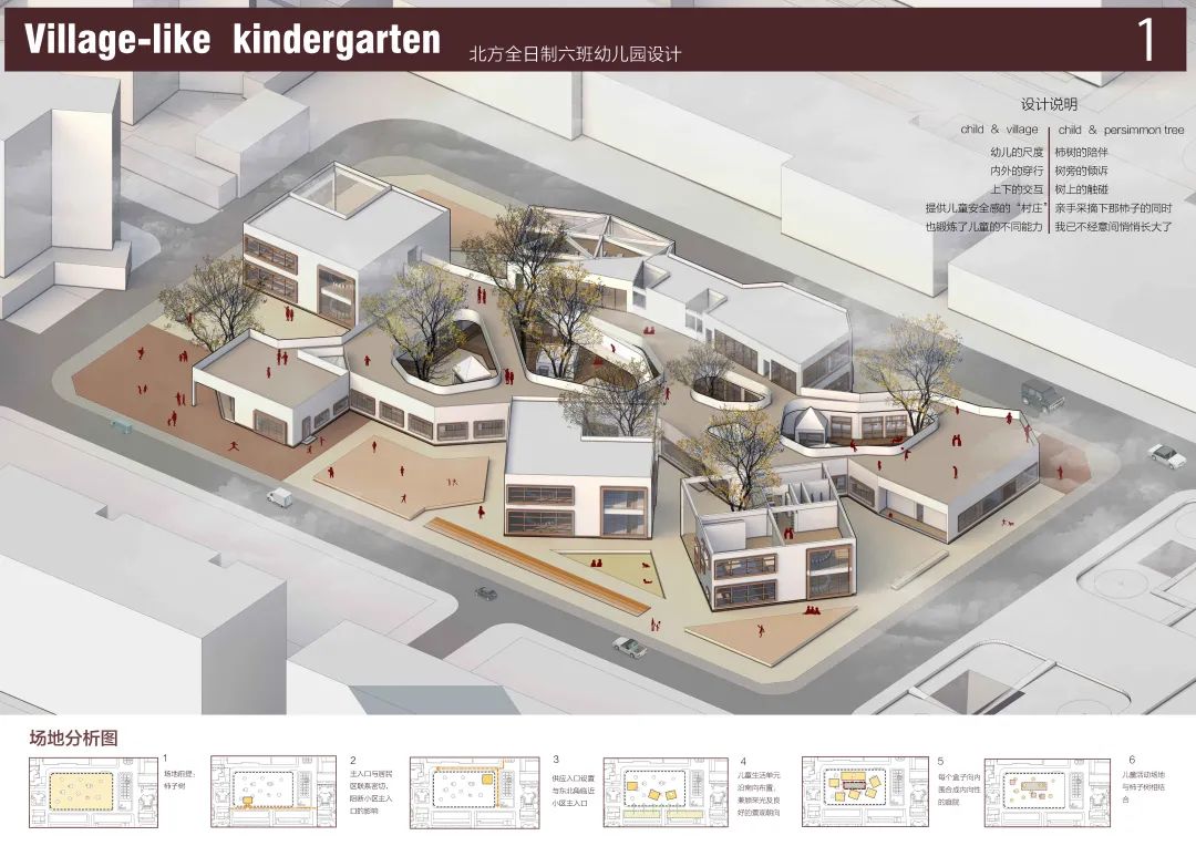
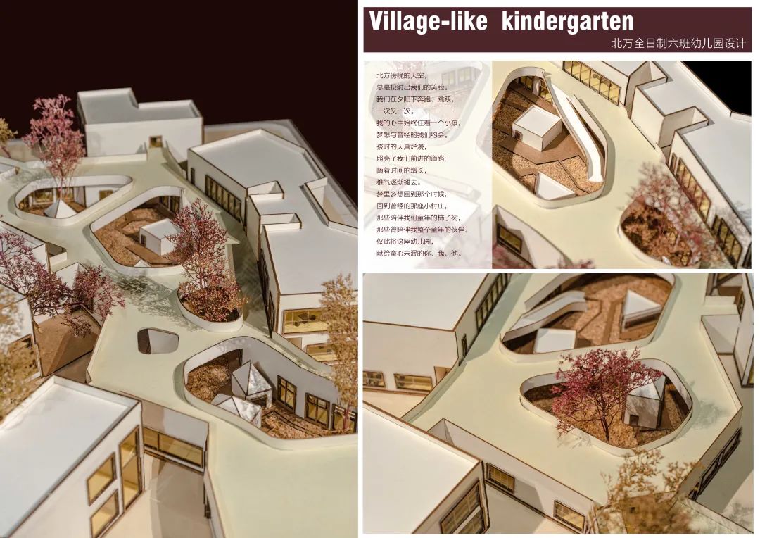
In terms of shape, six classes are separated by three volumes, each class has one floor, and each class has enough outdoor activity space through the design of the second floor platform.
. 

During the investigation of the area, I felt that the five senses that are becoming numb day by day were awakened: people who paint from life make people see the visual painting; The thick bark makes people feel the gloomy texture; The song of birds makes people hear the sound of freedom; It has the smell of plants and trees, which makes people smell the smell of nature
. 


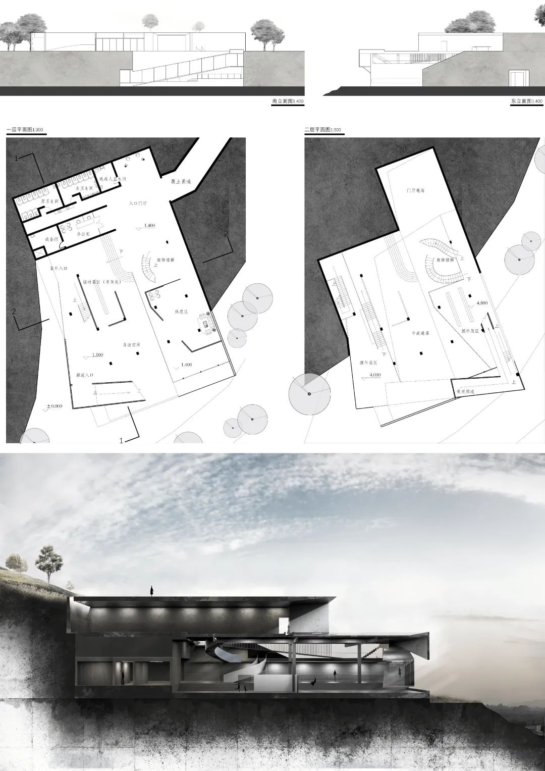
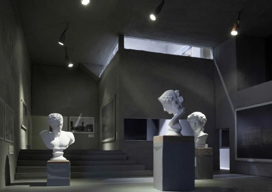
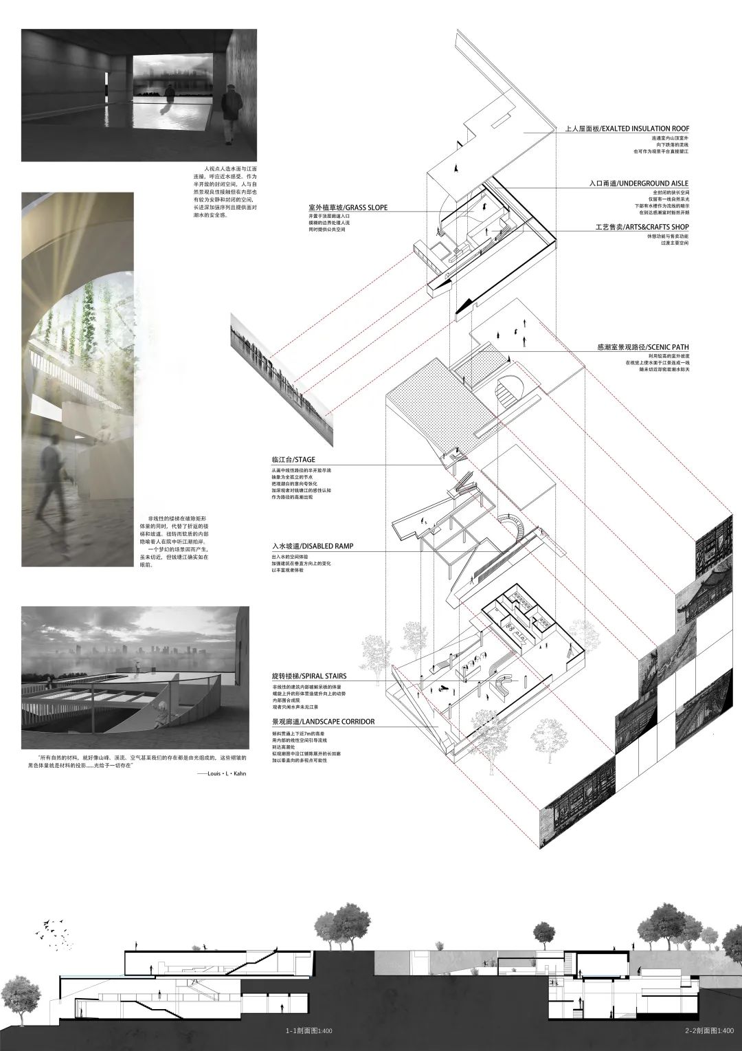
The exhibition hall represents the “history” or “future” shown by the works of art in the museum; The light in the staircase and the occasionally visible outdoor scenery represent “reality” and “here”
.
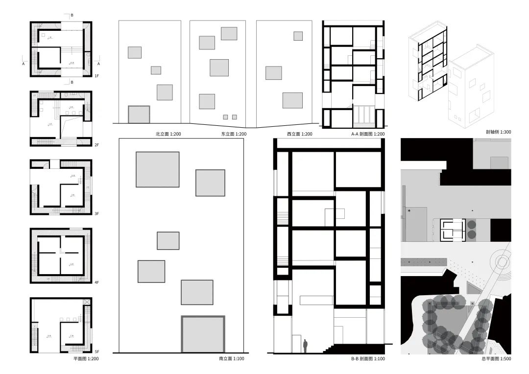
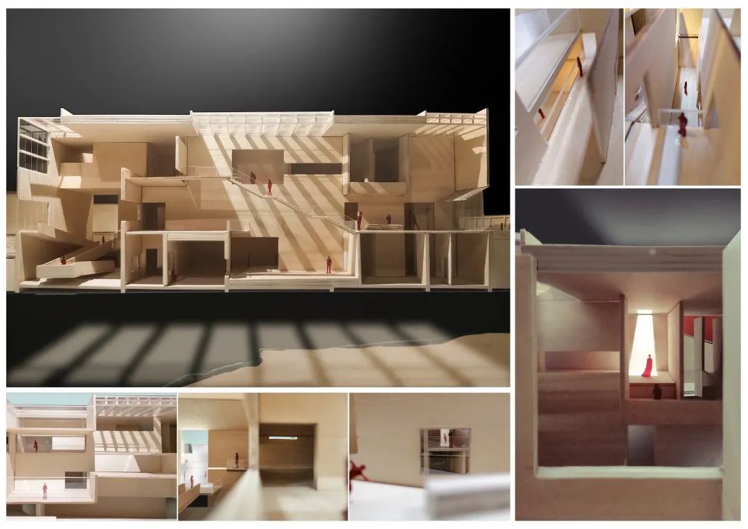
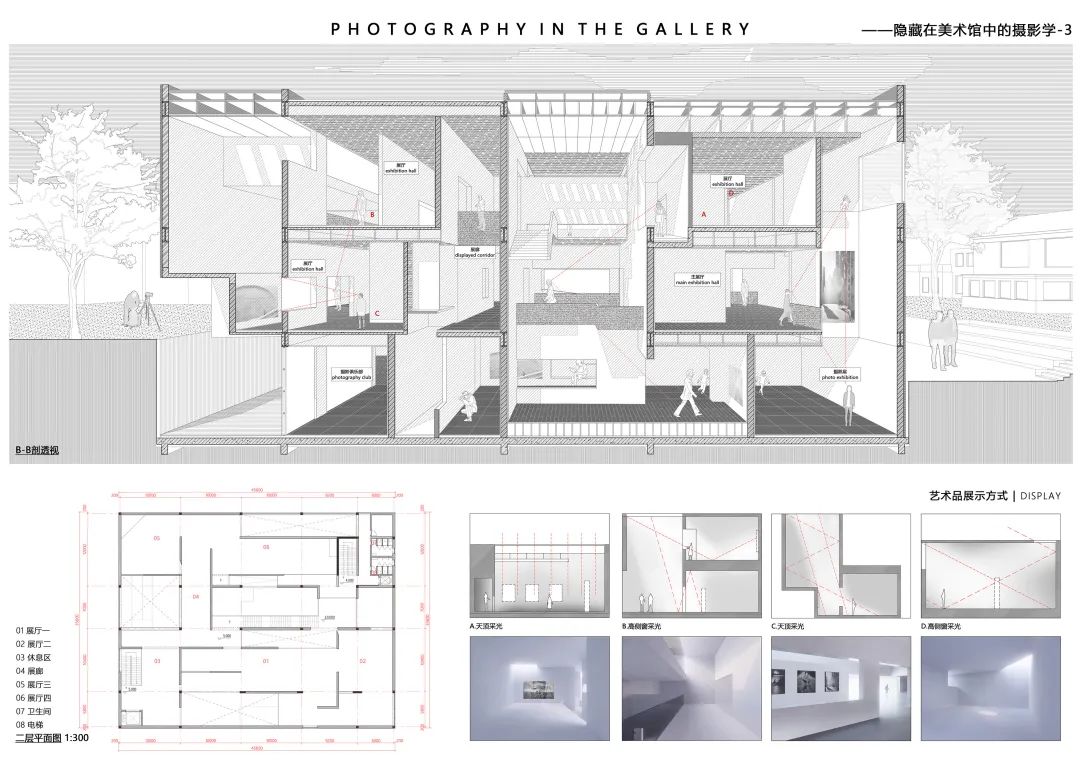
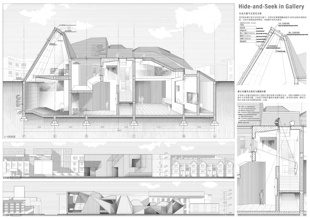
This design mainly discusses how the thick wall, an element composed of two thin walls, combined with the specific exhibition hall space to complete the basic functions of museum architecture
. 
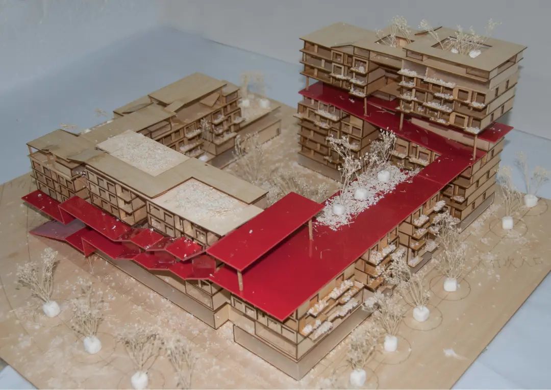
The building plan is generally “back” style
. 
The top 100 list of 2021 rookie competition has been released and is about to enter the finals! Today, we bring you the works of top 16 in the preliminary selection stage of the 2020 rookie competition
. 
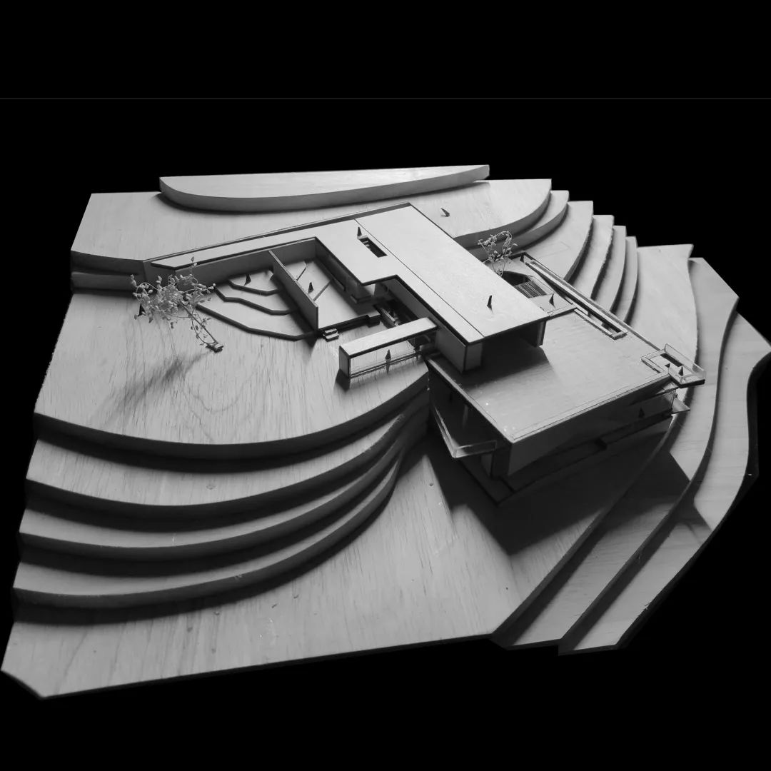
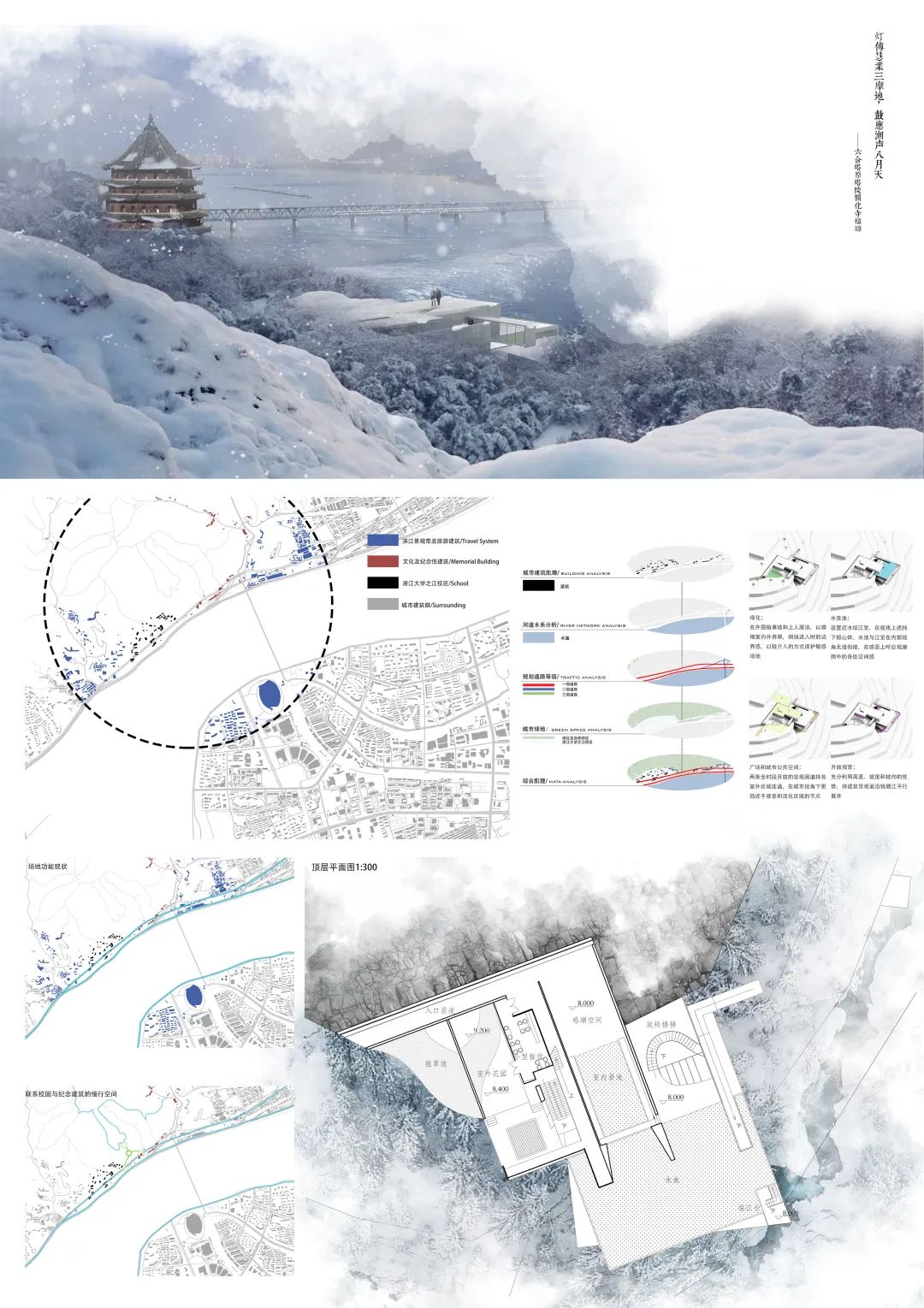
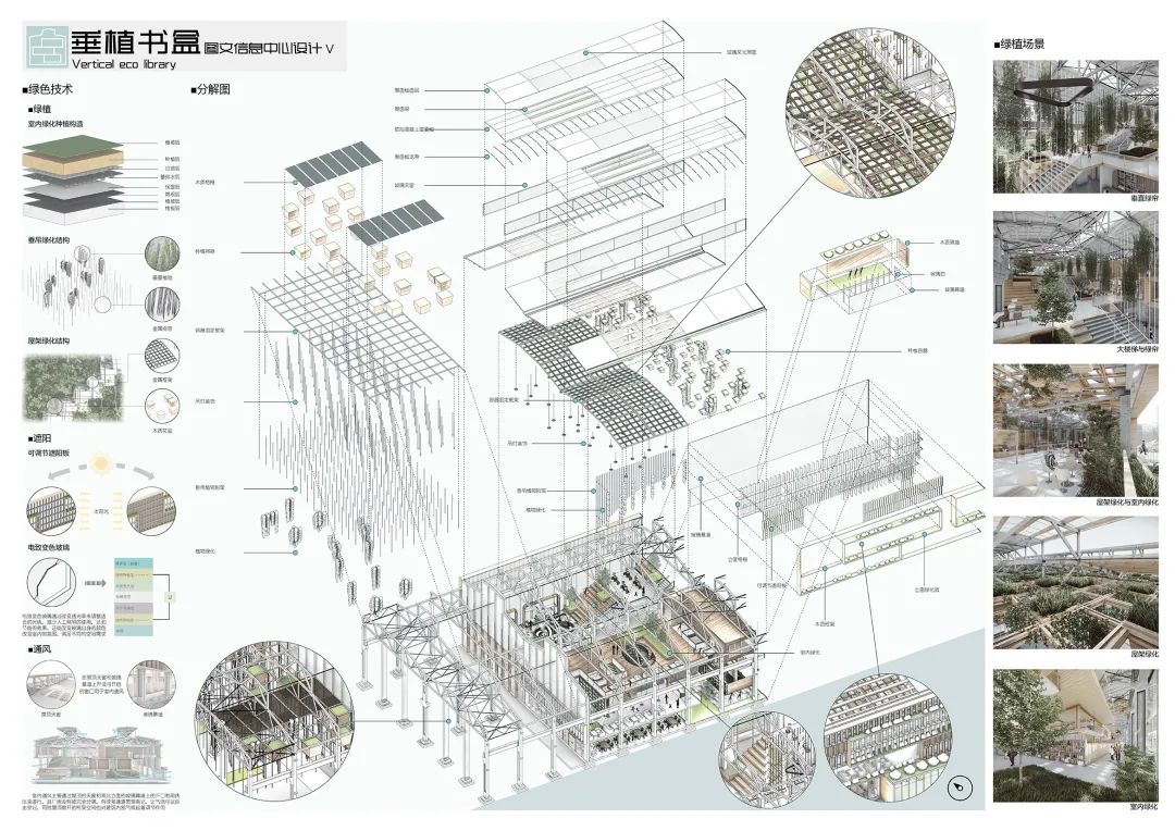
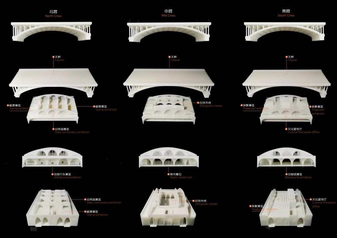
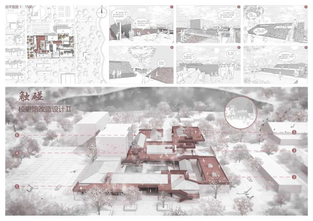
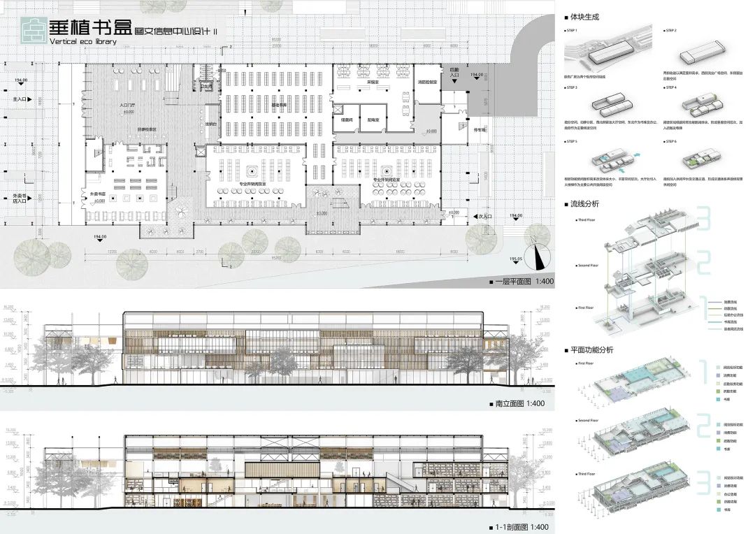
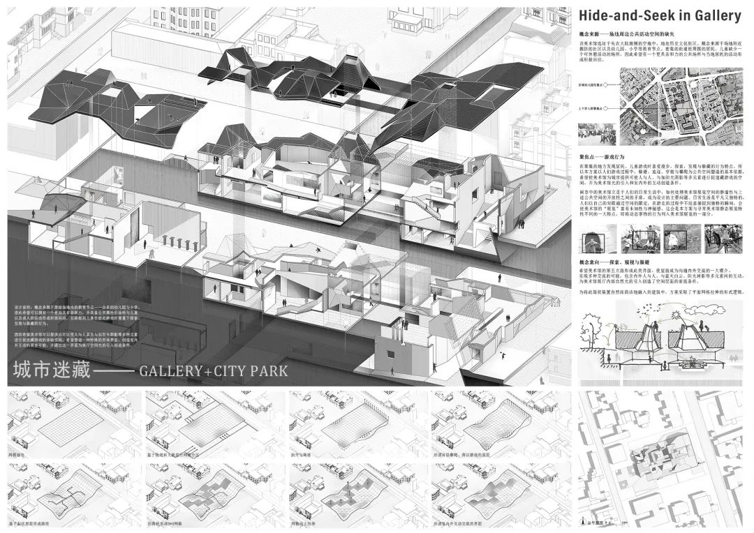
Work 5 No.5 village like kindergarten Kang Shilong sophomore Shandong University of architecture this scheme takes “village” as the design intention, and aims to create a “village” for children that meets the scale of children’s activities
. 
The interlaced sight is a busy and casual life state
. 
The No.2 wall of work 2 is divided into interior and exterior
.
Outer rotation The door is to ensure the consistency of door and window language on the facade, and the sliding folding door on the inner layer is the real climate boundary of the building
. 
The design places the staircase and other auxiliary spaces in thick walls
.
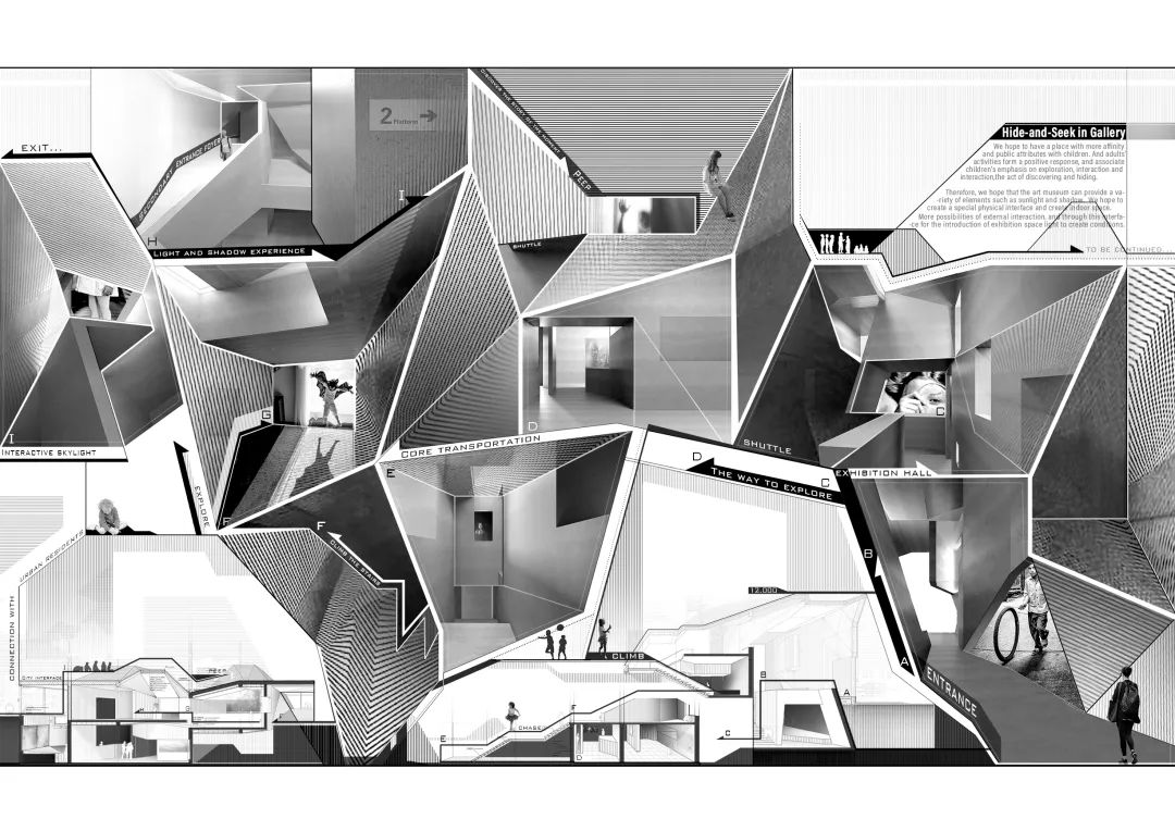
Based on the above considerations, the design hopes to create a three-dimensional creative space based on sensory experience
. 


The change of the site brings more possibilities to the architectural design
.
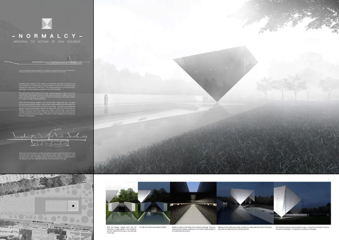
The tranquility of the space is shown by arranging waterscape around the museum
.
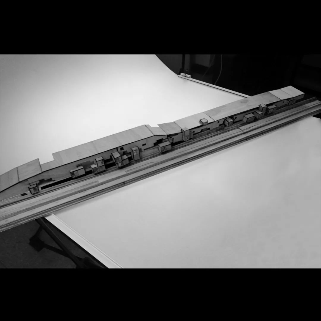
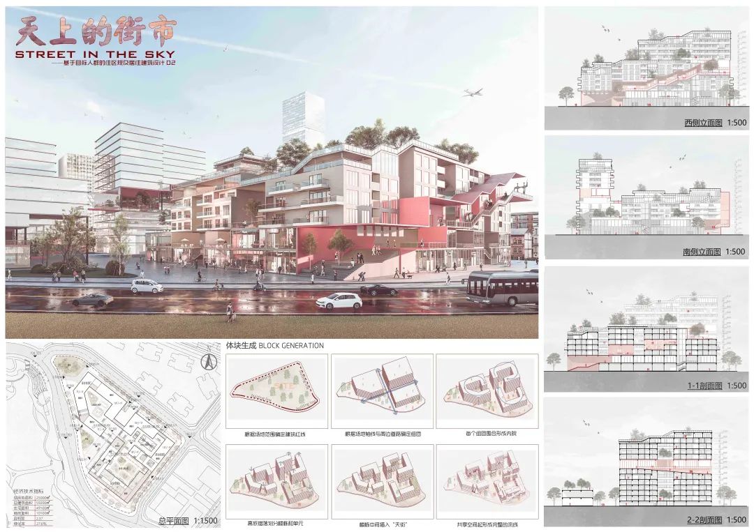
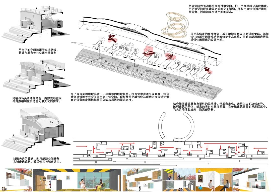
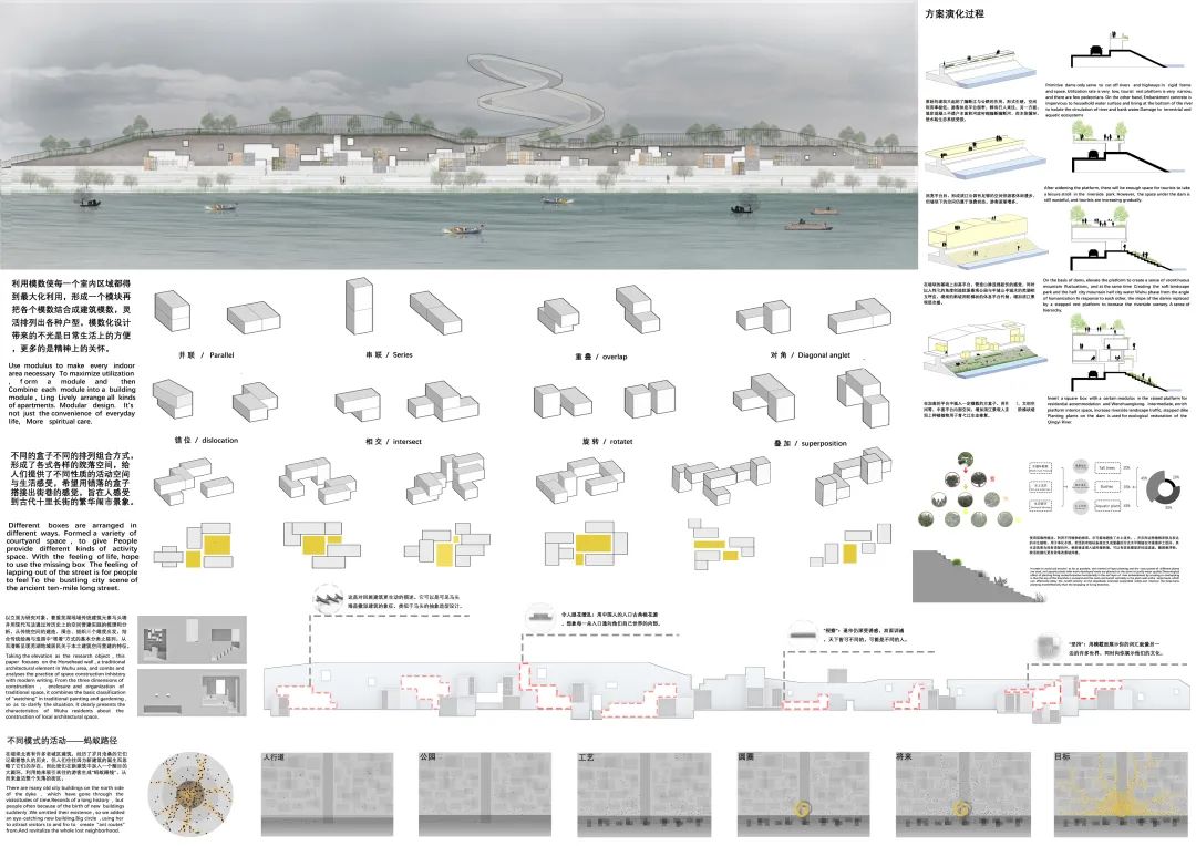
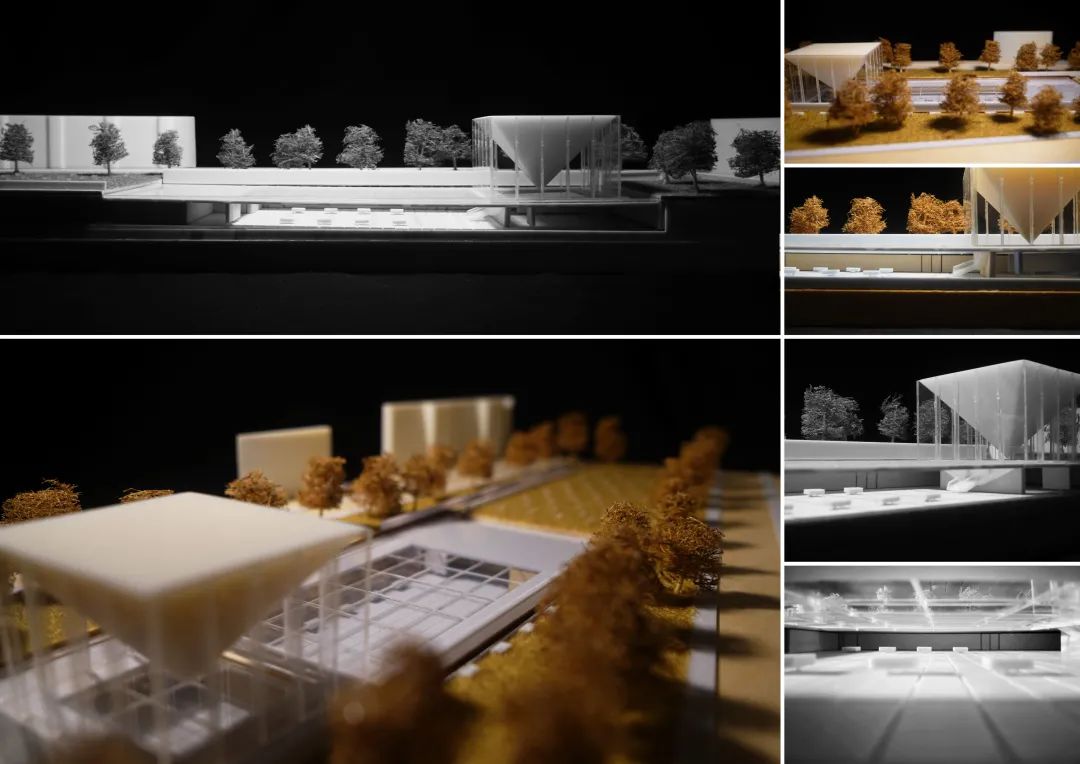
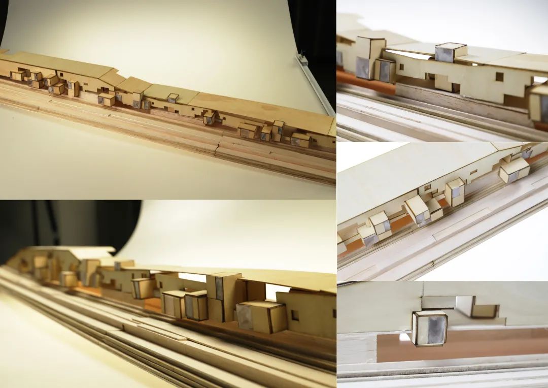
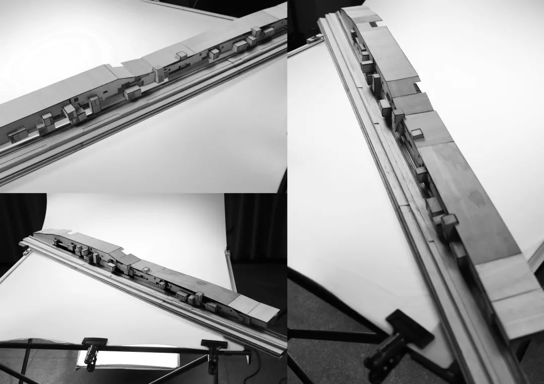
Set the basic strategy of monomer combination, and divide the shape with reference to the ridge line of the high court, especially the natural connection and form unity with the high court, the rhythmic space of retraction and release, the extended roof walkway, and the meditation space of each guest room designed to lower the eaves
. 
The tour experience sequence of the whole museum starts from the hall on the first floor
.
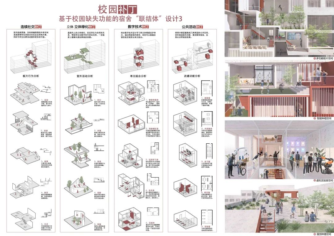
Starting from the perceptual response to the location, create a space to blend with nature, arouse people’s lost senses, create a sense of belonging like home, and bring people a relaxed and pleasant learning and life experience
.
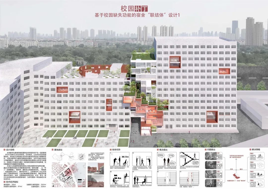
The design site of Peng Sixiang – freshman – Southeast University is located in an imaginary city made of collages based on the architectural plan given in the assignment
.
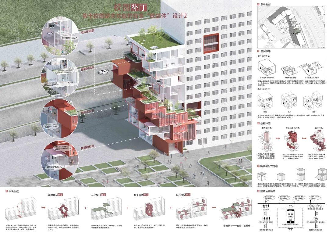
Taking it as the center radiates to the surrounding environment: it not only affects the dormitory in form, but also stimulates the surrounding creative atmosphere in function, giving more possibilities to the university dormitory
.
The protagonists Qiqi and Yaya are freshman girls from two different colleges of W University
. 
Work 4 No.4 box garden Chen Yuhong sophomore Tsinghua University gives people a feeling of “garden in the garden”: the campus environment is a quiet and leisurely garden relative to the external City, and the natural environment of the lot is more quiet relative to the campus environment, so it is called “garden in the garden”
. 
People linger in the light and scenery inside and outside, and finally return to the hall on the first floor, step on the ground, pull away from the unreal and trance feeling given by the museum and return to the present
.
The square on the side of the museum is raised to distinguish it from the relatively busy square on the right
. 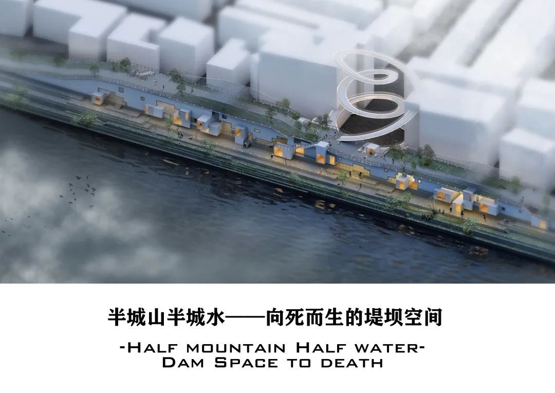
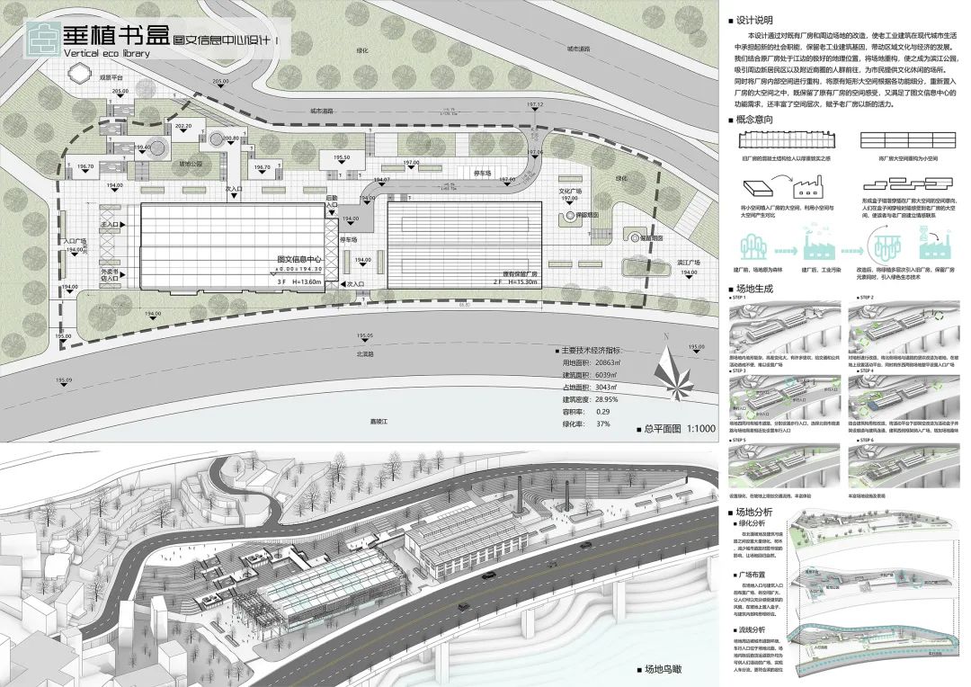
Work 3 No.3 small guest house design · eaves and windows Li Qingzu – sophomore – Xi’an University of architecture and technology guest house design base is located in both a historical block and a commercial scenic spot
. 
Generally speaking, porcelain light and pottery shadow start from the needs of one person; Make two people’s interests collide; Finally, it serves the public near Yishe
.
Through the analysis of the adjacent historical building Gaojia courtyard, the design breakthrough point is found
.
Carry out a series of spatial imagination on the bucket shaped monomer and combination to form a person’s sky, a group of people’s sky, a tree’s sky, a beam of light’s sky, and the spatial intention above and below the sky, inside and outside the sky, pointing to the final spatial generation process
. 

There are two forms of windows, but they show a relatively unified state on the facade
. 

Compared with the more open and bright exhibition hall space, the occlusion and narrowness of the staircase form an internal and external staggered tour experience with the exhibition hall
. 
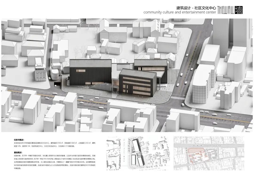
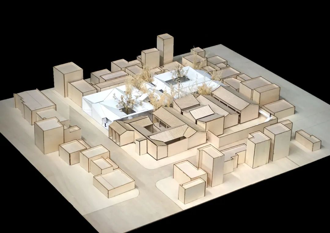
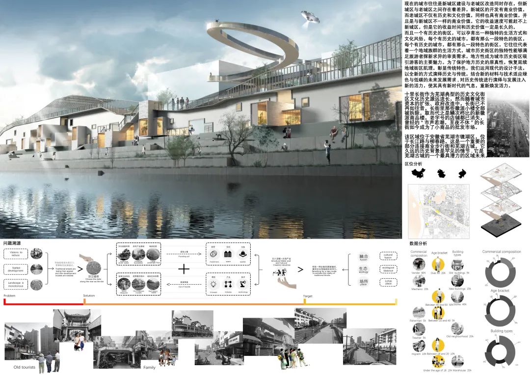
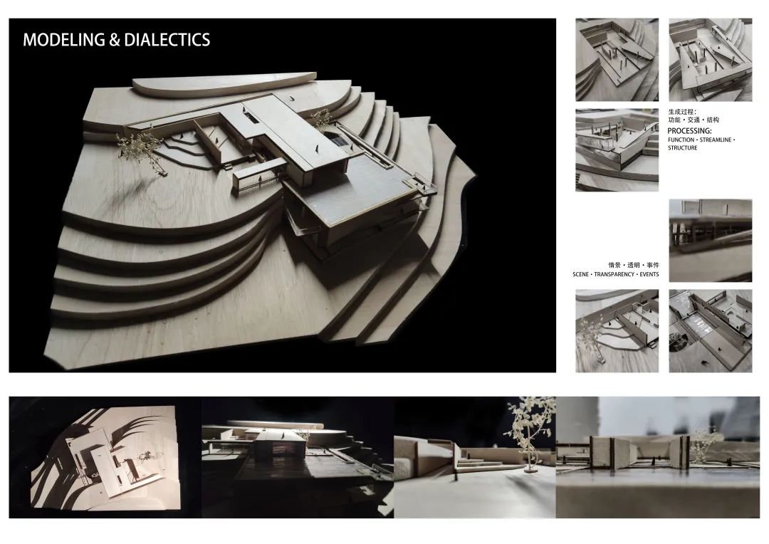
The architectural design takes plate segmentation as the main operation method
. 
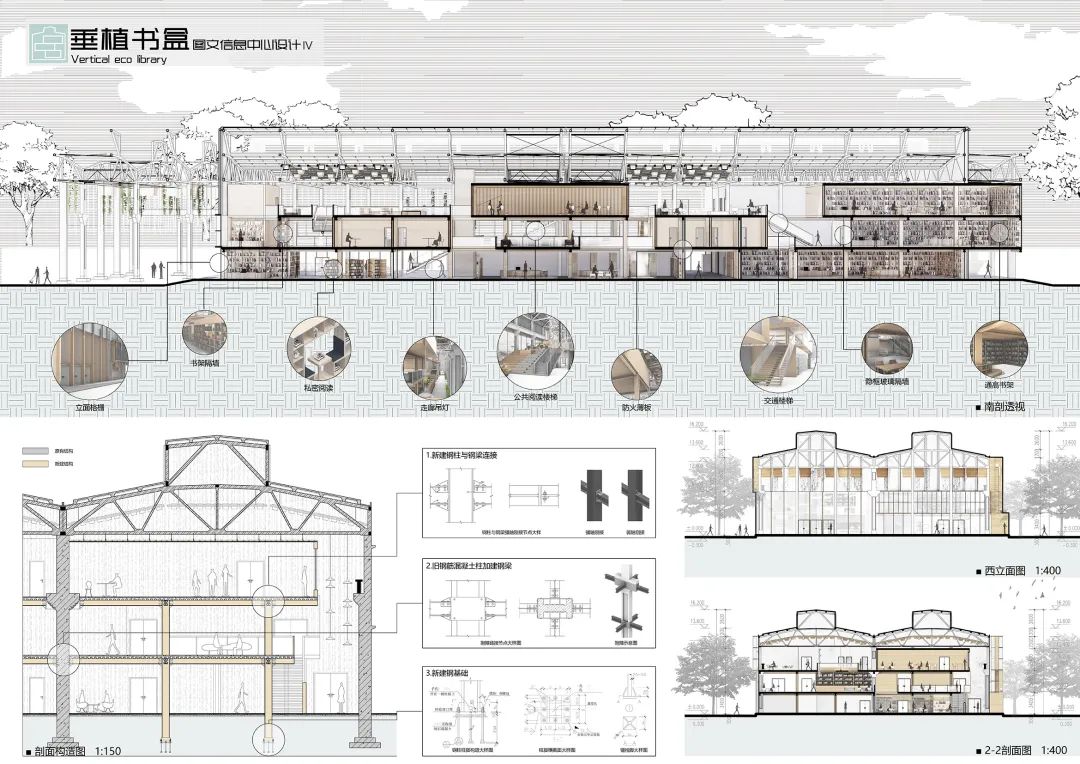
One is directly connected with the exhibition hall space to become the window for the communication between the exhibition hall and the external landscape, and the other is used as the daylighting of the staircase and adjust the balance of the opening of the building facade in the composition
.
Teachers and students of the Institute of architecture can study and live in such an environment
. 
The two-story wall is the load-bearing structure of the building and forms a thick wall
.
Starting from the contradiction between the business and historical atmosphere of the site, the design tries to find a unique perspective to shield the business noise and observe the history
.
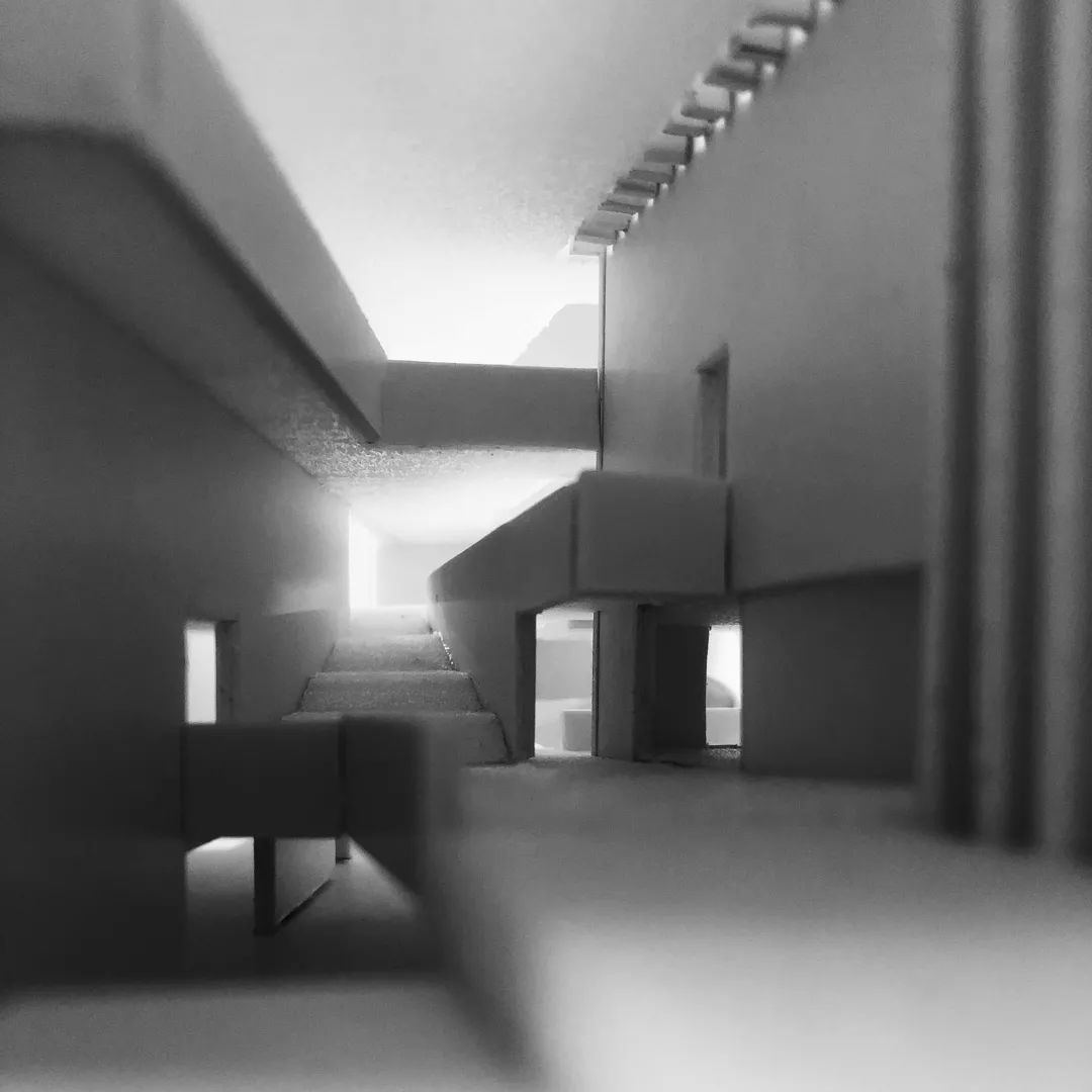
The thick wall composed of stairs regulates the relationship between the interior and the exterior of the building
. 
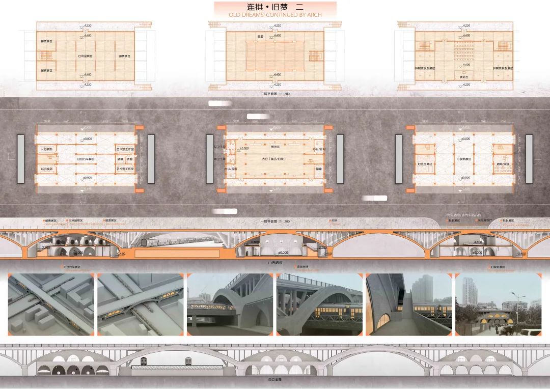
The staggered floor design makes it possible for the mutual space hint between the exhibition halls on each floor
. 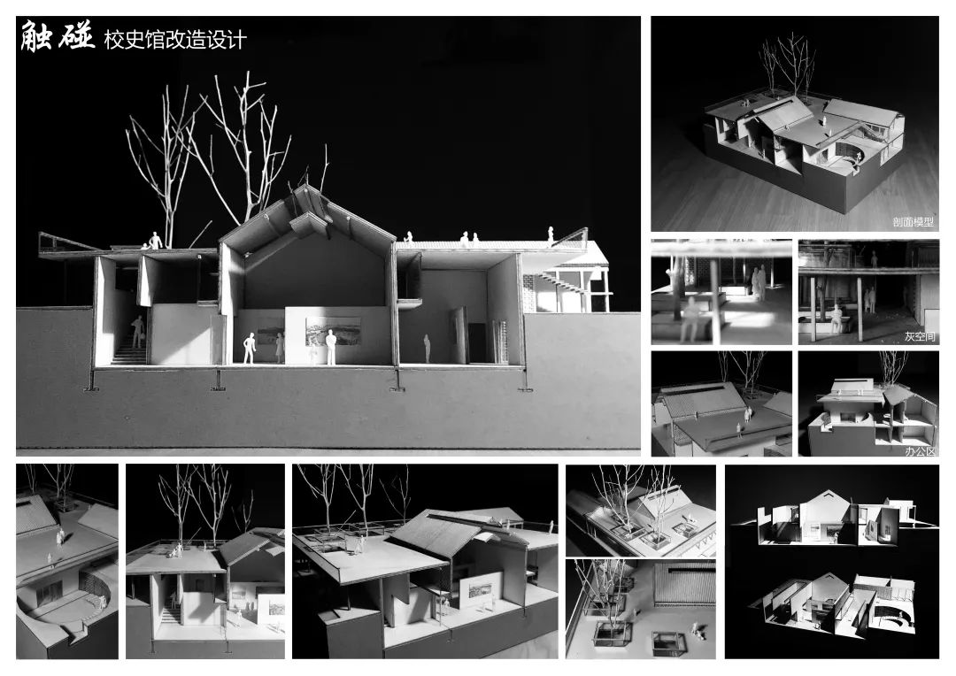
While the staircase wraps and communicates the exhibition space on different floors, the “thick wall” also increases the sense of entity of the building
. 
People come to the exhibition hall on the top floor through the narrow corridor, and experience the staggered tour feeling inside and outside when they continue to pass through the relatively spacious exhibition hall and narrow staircase
.
Maybe there can be some characteristics of residential buildings, so the association of “garden” such as courtyards and gardens naturally emerged
. 
In the 40 ㎡ small building, the scheme also provides public communication space: entrance area, open view discussion area, information announcement corridor and public toilet
.
The program provides them with a private interest work space: Qiqi’s ceramic work area is composed of three stepped continuous spaces: embryo drawing, glazing and kiln burning; Yaya’s photography work area has an independent studio and a multi angle outdoor shooting space composed of roof and corridor
. 
In such a “garden in the garden”, people can awaken the lost senses and return to a relaxed state, which is exactly what we need to find when learning architecture; At the same time, due to the particularity of architectural learning, the student union spent a long time in building the museum
.
