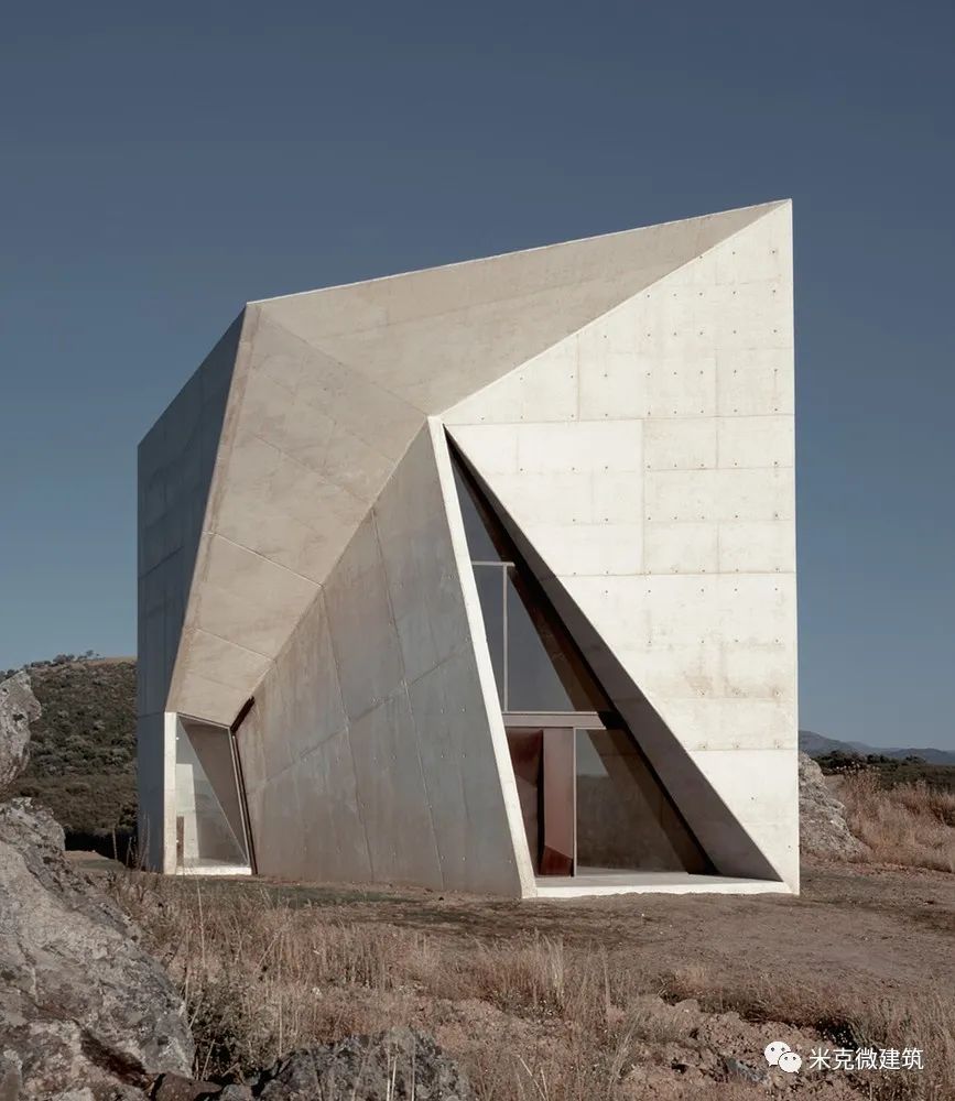
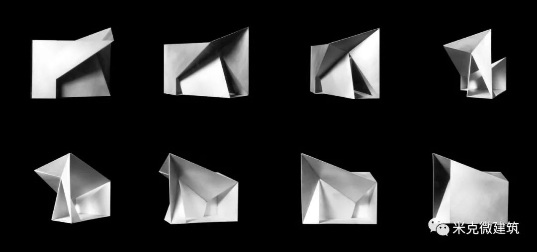
The chapel follows the principle of “folding box” after a period of research and development
. 
The spatial relationship between indoor and outdoor determines its focus and significance
. 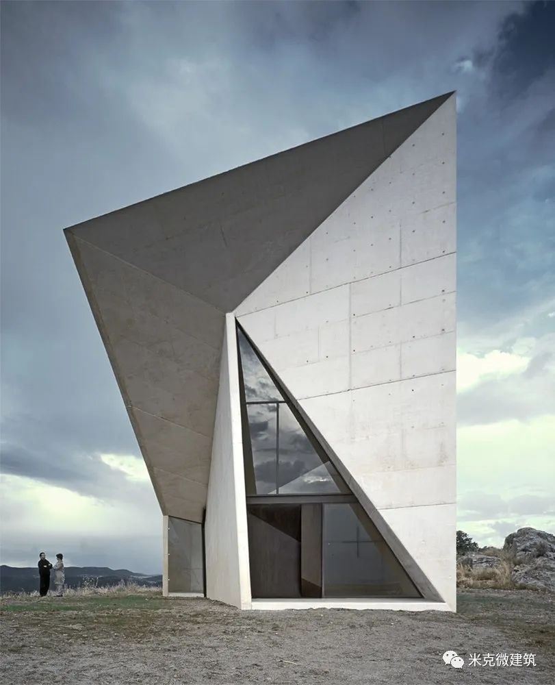
Only one cross element and one image became the focus of the audience, which also emphasized the symbolic significance of the project
. 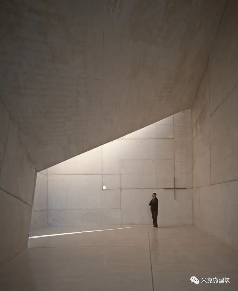
The design style of the chapel is rough and there is no artificial lighting
. 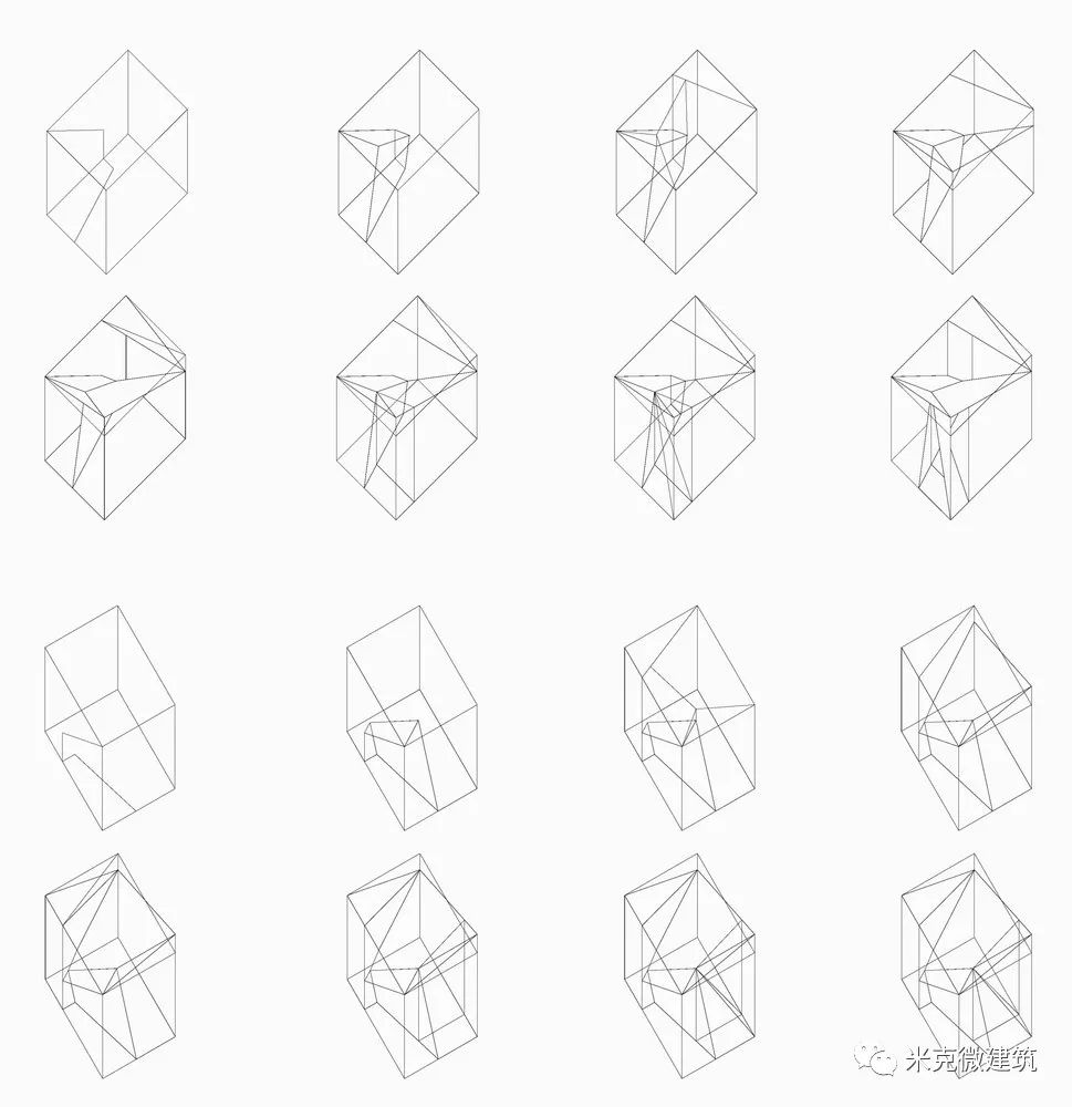
Throughout the whole design, the main line is the concept of folding: folding, as a hidden machine to generate different spaces
. 
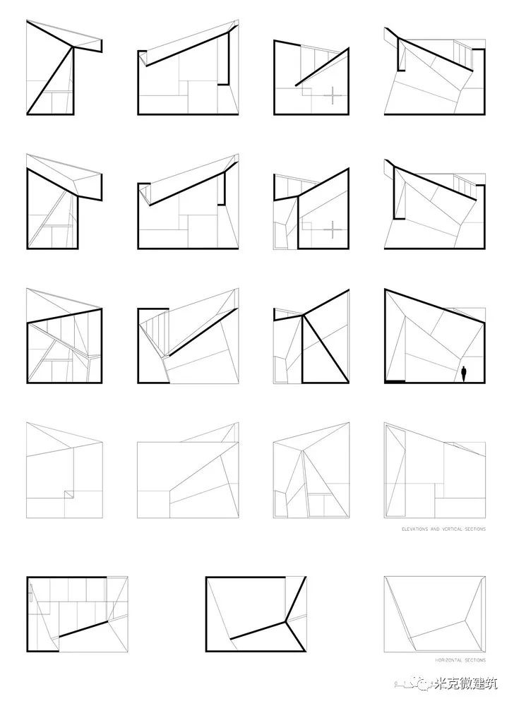
Of course, you can see it from different angles in the whole landscape streamline
. 
The folding change in the box sublimes a simple material: concrete, which can capture the details of the volume, or direct sunlight, forming a new dimension of space, or the faint color melting in the indoor space at dusk
. 
The chapel is located on the right side of the whole layout, so you can see it just 2 km from the entrance of the bottom point of the layout
. 
Therefore, sunlight has become another material in the chapel, a material opposite to concrete: fragile, changeable, moving, weak, sometimes everywhere, sometimes vanishing..
.
How to connect the layout of a series of architectural objects in the site: residence, Chapel and guard Pavilion, this design concept gives the project dual significance: in addition to the close relationship between landscape, architecture and streamline, space and architecture, each object should also reflect different themes, from zuei symbolic to zuei private quiet
.
