Factory buildings are often associated with words such as “huge”, “noisy”, “ugly”, and “dirty”. Some factories that pursue visual identity adopt a “factory public building” approach, but the cost skyrocketes. How to still use the light steel factory building system to shape a distinctive factory area while keeping the cost unchanged?.

The Qidong new factory area, which is tailored for Coca Cola bags, has made some explorations in this regard..
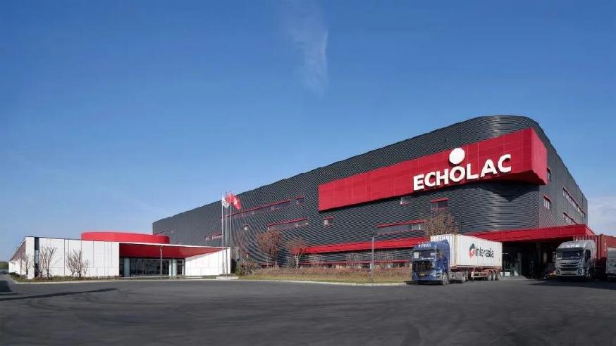
ECHOLAC luggage has a history of more than 50 years, starting from the world’s first ABS suitcase in 1965, and its products have spread all over the world. The project is located in the second factory area of Qidong City, Jiangsu Province..
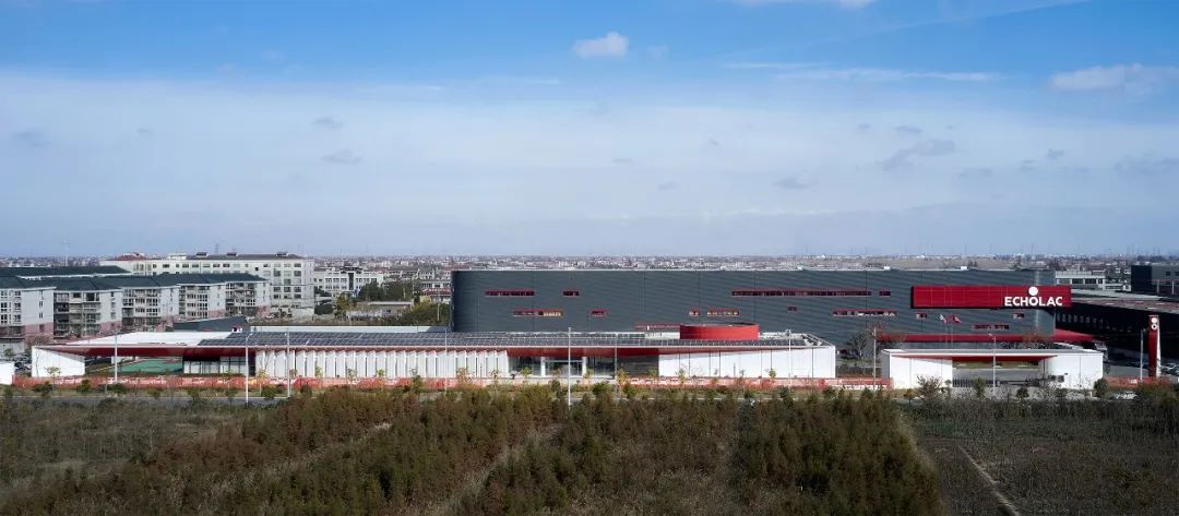
The factory area is divided into two main parts: production and office. The production area is about 20000 square meters, with a height of 20 meters. It adopts the traditional light steel keel factory model and needs to meet the standard product specifications of the current factory construction enterprise. That is to say, the ingredients and cooking methods cannot be changed, and the dishes can only be improved through cooking skills..
The office area is about 5000 square meters and is very small in size within the huge factory area. To achieve this requirement, firstly, the factory building should be elevated from the surrounding buildings through color combinations and local innovations. Secondly, the treatment of office buildings and walls becomes the key to solving the problem..
The office area is only 5000 square meters and is designed as a single floor. Several large functional blocks are connected together through several courtyards, thereby extending the length of the building to 130 meters. However, even so, there is still an imbalance in proportion to the huge volume of the factory workshop. So the “red roof” structure of the office area was extended outward, incorporating the outdoor basketball court and elongating the building proportion. In this way, the entire building formed a balanced relationship with the workshop through a sufficiently long street display surface, and a length of 180 meters formed the overall image along the road..
To avoid the “red top” being too large and boring, a perforated aluminum plate with a “sparse to dense” pattern is used, which gives it a rich texture at a close range of human scale, ultimately presenting a delicate and appropriate beauty. The roof and walls adopt the brand’s iconic red color to enhance the recognizability of the site, making it a distinctive landmark of the entire plot..
A standardized production workshop, due to its functionality and efficiency, inevitably leads to a clumsy, monotonous, and rough facade. However, through the combination of colors and lighting windows, this huge volume presents its unique characteristics. The small arc-shaped chamfer at the corner of the building plays a crucial role in balancing weight..
The tall production workshop uses dark gray to make it “hidden” behind and become a prominent “red” background..
The entire factory area is adorned with the iconic red color of Coca Cola, blending “deep” and “light” together..
The first thing people observe on the road is the white office area ahead, followed by this huge production workshop. The workshop fighter jet like color and texture also make the entire building look extraordinary..
The 2.2 meter high wall was originally a negative factor, but the innovative use of red perforated aluminum panels made the wall a part of the building, emphasizing the brand’s red color and making the space no longer negative..
How to achieve high quality with low cost? The answer is to use money on the cutting edge..
The rich texture of the stone curtain wall is reflected on the main entrance display surface, and local efforts are made to enhance the overall atmosphere of the factory area. And the other parts of the street facade,.
